Despite Mounds’ and Almond Joy’s claims to the contrary, there’s no such thing as a “valuable” ballpoint pen
I’m not certain what metric of value the Peter Paul Candy people were using, but no matter how much 22 carat gold you slap onto a pen, it’s still just a pen — and hence one of the most losable objects on Earth. “But your name is inscribed on the pen for that very purpose,” you might say. And my response would be: Would you really want your name emblazoned on an Almond Joy writing implement? So that, when it’s found, people think “Who the hell would have a gold-plated Almond Joy pen OH LOOK HIS NAME IS ON IT HAHAHA”?
And rest assured, nothing impresses business associates more than brandishing your inscribed candy bar pen when you’re signing important papers. NOTHING. (It definitely wouldn’t generate the awed hush of a combined cigarette lighter/case.)
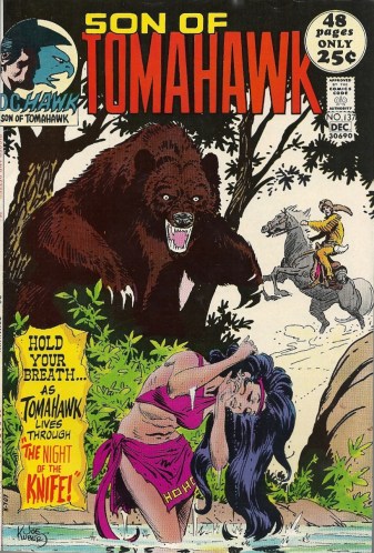
Tomahawk steals his book back from his kid (and Frank Thorne steals the show) – Son of Tomahawk #137
In the dying days of Tomahawk’s long-running eponymous title, he suffered that generational indignity that befalls so many of us: he was shunted aside for a younger model, in this case his own son. Tomahawk, which had been published at DC since the 1940s, and had seen the coonskin capped Thomas Haukins battle foes from Redcoats to beasts to the very elements themselves, morphed into Son of Tomahawk in issue 131. DC had its reasons, but if this was merely an attempt to rescue the title from its dwindling sales, the gambit failed miserably. The new direction only lasted for ten issues, and then the whole thing fizzed out. Tomahawk and Tomahawk had been tomahawked.
Lack of success in this case notwithstanding, the youth movement is a standard trope in the entertainment field. Going with a younger character has an initial burst of cringe-worthiness, mainly because such an artificial jolt is always the defribrillator pads and adrenaline to the heart of a property that’s coding out on the table. Have a sitcom with dwindling ratings? Throw in a cute wisecracking kid! Have a movie that bombed in front of a test audience? Do anything within your power to boost its share of the youth market! Have a comic book whose leatherstocking hero has lost his appeal in the era of free love? Give him a son who dresses like someone strumming a guitar on a 1970s San Francisco street corner!
It sounds like such a douche-chill, but, in a rather remarkable twist, those ten issues of Son of Tomahawk had quality to them. Granted, that non-title-rescuing success wasn’t due to the new direction, but we’re not shooting pool here. Nobody is going to break anybody else’s knuckles if they don’t call their shot. And what made them a moderate success had been a part of the book for a couple of years before.
And that was?
Frank Thorne’s art, that’s what.
The man who would in a few years take Red Sonja and her auburn locks and swords and chainmail bikinis and turn them into the catnip of adolescent male fantasies here did unheralded work in the old American frontier. His rough style, which was so well-suited to unmodern settings, free of cars and skyscrapers and other trappings, was perfectly matched to wilderness environs. The forested borderlands of early America were Messantia sans cities and sorcery, and had an unhewn beauty to them. It was a fruitful marriage of artist and subkect, and had been playing out in the pages of Tomahawk for a long while before the new branch of the family tree arrived.
What makes this particular issue worthy of a highlight post is the cover story. Because here, an old grizzled Tomahawk wrests his own title back from his son and has himself a nice little flashback, to the time he found the love of his life. It’s enough to make you ignore all the eye-roll worthy “white man goes native and bests savages and gets himself a babe” tropes. (Like Avatar. No giant cat people here.)
Scripted by Robert Kanigher, the story is bookended with appearances by the putative new star of the book, who’s unimaginatively and inevitably named Hawk. It opens in silence and wide open vistas, as any Western worth its salt should:
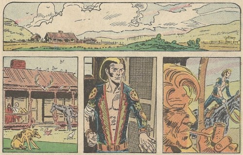
(A note: Son of Tomahawk has a Bride of Frankenstein streak in his air. There’s some manner of cosmic of course wound up in that.)
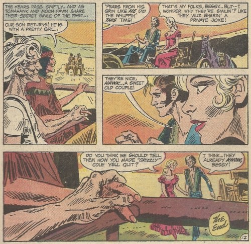
Hawk is off a-courtin’, heading to town to see his girl. As Tomahawk sits back in his chair, puffing on his corncob pipe, he remarks to his bride, Moon Fawn, that all this dash and enthusiasm reminds him of a certain someone else when he met a certain other someone else. CUE THE WAVY FLASHBACK EFFECT AND THE HARP SOUNDS.
A young Tomahawk is riding through the primeval forest when he spies a nude Indian girl bathing in a creak. There’s not time for him to even consider a moment of voyeurism because OH S–T THERE’S A BEAR ABOUT TO POUNCE ON HER. Out comes his knife and the death struggle begins:
I’m not trying to attack this young woman’s courage and/or motives, but could she maybe have helped out a bit instead of standing their like a hieroglyph? Maybe thrown a rock or something?
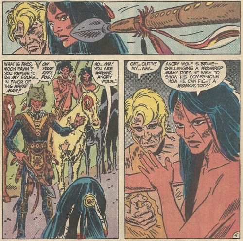
Tomahawk stands triumphant, but the bear has badly wounded him, and as the Indian maiden (yes, she is indeed a young Moon Fawn) comforts him, they’re both confronted by Angry Wolf. Jealous of the attention lavished on this white interloper, he jabs his spear at them, in obvious phallic symbology that you don’t have to be Freud to spot:
(Aside: Does Hawk use this guy’s tailor?)
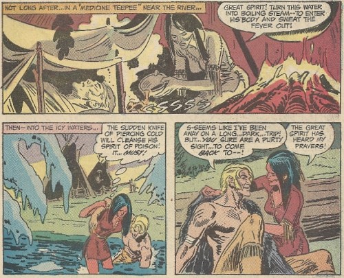
Moon Fawn’s naked defiance — with arm-bra — temporarily stays Angry Wolf’s hand, and she brings Tomahawk back to her village, where her father, the chief, welcomes him with open arms. But his wounds have begun to fester, and he takes a turn for the worse. As fever threatens to drag him down into a delirious death-spiral, Moon Fawn goes into full healer mode, deploying fire and ice methods to return him to life (good thing a certain know it all doctor wasn’t there to stop her):
Hey, wait a second, it wasn’t the depths of winter a few panels before, and now there’s snow clinging to branches. FOUL. Maybe the village is up on a mountain or something. Moving on.
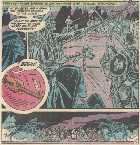
Tomahawk isn’t back in the land of the living for ten seconds before Angry Wolf jabs his spear at him again, renewing his challenge. This time Tomahawk accepts, snapping it in two like Bo Jackson with an uncooperative Louisville Slugger (if we’re still going with the phallic imagery angle — OUCH). They meet in a duel to the death, one centered on — wait a second, they’re doing a medieval joust?:
Seriously, did any Native American peoples settle disputes via jousts? Before the widespread introduction of European horses did they ride at each other on dogs or something? Semi-serious here.
Dubious historical accuracy aside, Tomahawk is immediately unhorsed, but fear not, the white hero triumphs, and he apparently took “spare your foe” cues from Daniel-san and Mr. Miyagi (though he left out the honking tweak to the nose):
And back we come to the present. Hawk returns home having won his girl, Tomahawk and Moon Fawn look on lovingly, and we can all bask in the Twainian lesson of history maybe not repeating itself, but sure as hell rhyming:
I’m not certain what it is about Thorne’s art that really grabs me, but it does. It might be that, though he had a distinct style, underneath it his fundamentals were so sound (and could even be glimpsed in his early days). He was a lot like cover artist Joe Kubert in that regard. You can read so much into certain panels. Hawk’s confident stride out the door in the first scan. Tomahawk’s utter exhaustion after he kills the bear. Moon Fawn’s bold inner strength. The aged hands in the last panel (the eyes seem to always focus on the hands, perhaps activating some tactile receptors in the brain — a stretch, I know). All these things express ideas and notions beyond what’s depicted, and to be able to do so is the height of craft. There’s nothing at all the matter with Kanigher’s script here, but Thorne’s art is so potent, this short tale could easily be dialogue-free. Nothing would be lost. That’s not something you can say about all comic book art, and it’s a mark of distinction.
What you see here is pretty damn good, even for a short-lived reinvention. Son of Tomahawk, we hardly knew ye.
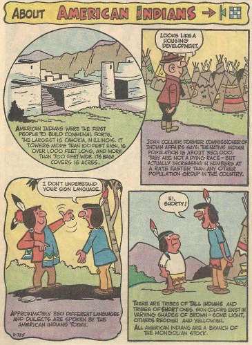
It should be noted that there’s a lot more material in the book, mainly older reprints of Native American stories from earler DC comics, plus an old Tomahawk story where he riled up the British and added a few verses to “Yankee Doodle Dandy.” And then there’s this:
While there’s nothing overtly wrong here, there’s definitely a patronizing sheen. “Oh look at the happy cute Indians. I almost want to pet them.”
Whatever. Don’t let that wash away the joys of Tomahawk’s frontier love. Tomahawk and Moon Fawn actually made a mutual reappearance in the DC universe many years later, in — of all places — the pages of Swamp Thing. This tale of their first meeting was retconned in that arc so as to include the mystical hokum that was the life-blood of that series. I’m not sure if it’s nice that they were brought back or a shame that this Thorne story was painted over. A little bit of both, I guess.
In conclusion: FRANK THORNE IS A REALLY GOOD ARTIST. Have a nice day.
I’ve often wished that I had a Game Genie for my life, so I could at times walk about with a huge head and unlimited ammo
Remember the Game Genie? From back in that Nintendo-dominated middle era of video games, long after the 1-bit back and forth of Pong and long before the cinematic Playstation/Xbox/Wii immersion we have today, the device that would let you cheat and dick around with regular games to your heart’s content? Yeah, I had almost forgotten about it. I didn’t have a video game system growing up (well, actually I had an old Atari, but by the time the 1990s rolled around, that was more embarrassing than anything else), and I only knew one kid who had one of these things. He’d tell tales of the various hacks he’d be able to put into various games, and they bounced off me like tales of cars and computers ricocheting off an uncontacted tribesman. It was lore from another world. I might as well have been Amish.
Nintendo once tried to sue the pants off Galoob for the Game Genie. They (Nintendo) lost, and gamers everywhere (like Kilroy Jr. up there) rejoiced at keeping their god-like abilities to alter the side-scrolling worlds unfurling before them. Even on Game Boys.
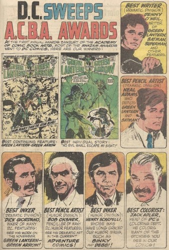
Denny O’Neil’s black turtleneck and contemplatively-held glasses surely must have clinched his A.C.B.A. award
One can forgive DC for taking a moment to toot its own horn, as companies so often did back in the day, letting readers know which in-house writers, artists and comics won awards, while completely ignoring other companies’ hauls. It’s just like broadcast networks letting you know what their Emmy tally was. In this instance it was the Denny O’Neil/Neal Adams Green Lantern/Green Arrow mag that was leading the awards stampede, at the first annual Academy of Comic Book Arts banquet in 1971. Deservedly so, one might add, as it was enormously successful, even when translated into Dutch.
Love the outfit O’Neil is wearing in his portrait (pencilled by Adams). It makes him look like he’s about to go smoke a cigarette at an urban coffeehouse. While reading poetry aloud. Needs a beret, though. And a hirsute Dick Giordano is rocking the old John Madden mutton chop sideburns. He was hairy enough to have played Wolverine in a movie, if Wolverine had been created at this point. A man born before his time.
There was a lot of dweeby overlap between the Bobby Shelby Safety Club and the Jimmy Olsen Fan Club
With the freckles and the sweater, Bobby Shelby could easily have passed for that intrepid ginger Daily Planet photog, the one so beloved by the virgin masses. Concordantly, it would seem that, if you Venn diagrammed their respective club memberships, there wouldn’t be many clubbers outside of the mutual zone. The unifying characteristics would be that they’ve all had their lunch money stolen, their books dumped, and their underwear pulled over their heads in atomic wedgies, all on MULTIPLE occasions.
Bonus: It’s always a corker to see 1950s bike safety propaganda and its complete lack of helmets. “Make sure to smoke at least a pack a day, kids! Keep those lungs open and healthy!”
For all you Taken fans, if you squint real hard you can pretend that’s Liam Neeson on the cover – Walt Disney’s Rob Roy
When I think of cinematic Rob Roys, my first feeling is crushing disappointment. Remember the Liam Neeson film, from way back in the sepia-toned days of 1995? That movie killed me. Not because it was bad, mind you. It’s actually a taut, well-acted movie, with colorful characters and a villain — Tim Roth’s arrogantly belligerent Cunningham — that you want to see run through with a sword from the first moment he shows up on-screen. Neeson’s Roy is a pillar of virtue and strength, and he displays a level of magnanimity and honor that few persons, either real or imagined, could ever approach. Plus, there’s a tense, finely-staged duel with swords at the end, which does with blades what Stanley Kubrick’s Barry Lyndon did with pistols.
And yet left a sour taste in my mouth after the first viewing. Why? Because it wasn’t Braveheart, that’s why. Mind you, that’s as profoundly dumb a reason as you can have. I get that. Though they were released a month apart (Rob Roy first), and shared stirring “man in kilt fights for freedom and love in the Scottish highlands” trailers, to compare William Wallace’s giant action epic with the more personal arc of Roy is silly at best. But I saw Braveheart first, which didn’t help matters, and I was seventeen years old, which helped matters even less. I went into Roy expecting blue face paint and hollered speeches on horseback, and I did not get those things. Hence the disappointment. I craved mass-produced bloodletting, and was given none.
That’s my old reasoning, dumb as it is. So the old-timey Disney take on the character might send me into a deep dark, depression. And God only knows what the comic book adaptation of said take could do. HIDE THE SHARP OBJECTS.
The 1953 film (Rob Roy, the Highland Rogue) starred Richard Todd as Roy, and had that classic Disney sheen to it (see: Davy Crockett), which meant that it was competent, fairly entertaining, and unquestionably generic. Rob Roy, Scottish leader, embarks on his new married life while English overlords, supported by their occupying forces, the Fencibles, try to crush any incipient rebellion. There you have it. The comic, (Four Color Comics #544, for those of you keeping score at home) stayed very close to the what was seen on-screen, and hence both also shared many of the historical personages found in the later Neeson version. Here are the dramatis personae, organized quite handily on the inside front cover (art: Russ Manning):
The story (adapted for the comic by scripter Elizabeth Beecher) gets a bit too wordy, as such projects often do. There’s an understandable impulse to shoehorn in every twist and turn of the plot, and as a reader you find yourself wishing that someone could have taken the editing scalpel to much of the fat. A part of this is the conflict of the mediums. Film is constantly washing past you, while comics allow the eye to linger and contemplate at its own pace. You’d think that the latter is like the former’s storyboards, but it’s not. The choices that go into each should therefore be different, but, as in this book, that’s not always the case.
This isn’t a death sentence, though.
It’s Manning’s art that lends this comic its appeal. The creator of the fistacular Magnus, Robot Fighter knew how to depict action, and most importantly, how to depict action without neglecting the backgrounds. This page, showing Roy escaping from Fencibles via rapids and waterfalls, may trump any of the action in the film:
Love that waterfall.
The same goes for this scene, as Roy makes another escape (the man does a lot of escaping) using a leap and a conveniently placed tree to outdistance his pursuers:
Compare his actual jump above to what’s in the movie. Though I wish the comic could have copied some of the film’s lack of dialogue in the surrounding sequence, I’ll gladly take the breathtaking shot from above over clunky editing. (LOOK OUT HE’S PLUMMETING TO HIS DEATH, no, wait, he somehow reversed gravity and fell upwards so he could grasp that flimsy branch that should have snapped under his weight. Huh.)
As I said/wrote, the story, both on film and on newsprint, has that antiseptic Disney feel. Even when a main character dies, it’s not all that bloody or painful, and the stakes never seem to rise all that high. But so it goes. The comic does a decent job with the materials given (incidentally, it was also the only comic credit that I could find for Beecher, who was likely(?) the same Beecher who did a lot of work in Hollywood around this time). It fits right in with other standard movie comics of the day, especially historically minded kinsmen like 55 Days at Peking and Alexander the Great. You can’t ask for a lot more. Even Liam Neeson, the modern paragon of strapping manliness, would be okay with it, and wouldn’t hunt it down like it was some Eurotrash kidnapper.
I’d like to thank Jerry Sandusky for totally befouling this harmless Ara Parseghian Punt, Pass & Kick ad
Jerry Sandusky’s crimes were so awful, now even the most innocuous of college football related images, like the one above, have the patina of off-puttingness about them. You’re just minding your own business, reading copy about a Ford-sponsored football skills competition, and then OH GOD A FOOTBALL COACH IS TOUCHING A KID QUICK SOMEBODY CALL THE COPS. Which is unfair to former Notre Dame coach Ara Parseghian and all the human race. But here we stand, mired in the post-Sandusky sports world. Now an old Punt, Pass & Kick ad stirs up not nostalgia, but, like an O.J. Simpson promo for footwear, a fight or flight response.
Let’s have some fun and compare and contrast terrible derivative characters (Part 1) – The Punisher 2099 #1
A few weeks ago I was sifting through the comic book detritus in my home office, striving in vain to bring some order to the chaos, when I came across a couple of first issues from Marvel’s old 2099 line of comics. Two books I’ve never read, and probably never would in a million years if not for this blog. Yet there they were, right next to each other in a pile. Made for each other. Kismet. And here we are, with me about to dive into the first installment of what promises to be a hard-hitting two-part series to determine which is the better of this twin bill. Or worse — maybe we should score this like golf, with the lowest negative score winning. We’ll work that out later. Suffice it to say, I SUFFER FOR MY ART, AND YOU MAY HAVE TO SUFFER WITH ME.
If you recall, the most memorable part of Marvel’s misguided attempt to forge a future-verse was how clunky many of the century-later translations of their characters were. Doom 2099. Hulk 2099. Was there a Speedball 2099? I mean, really. The entire premise, that in 2099 humanity would be so enamored of what happened a hundred years before there would be a revival of the icons of the past (they would literally form the basis of new religions in this world to come), was ridiculous. Just imagine something similar happening in our recent history. Was there a Teddy Roosevelt 1999 that I missed? Annie Oakley 1999? No. Been there. We’re through with all that, and have long ago moved on. But not in the Marvelverse. They just can’t get over what happened before, even though they were apparently over it pretty well until new versions suddenly started cropping up all over the place.
STUPID. (I tell you what, though, I can’t wait for Fatty Arbuckle 2017. We’re only a few years away!)
The only chunk of that misbegotten experiment with legs was Spider-Man 2099, and that was mainly because of the root character’s popularity and the variant costume. Most of this sub-universe was garbage. Nevertheless, there was a product line that had to be filled out, and it was practically etched in stone that certain grim, hyper-popular characters in vogue in the early 1990s were going to get the 2099 treatment. And now we get down to the nitty-gritty, the two resultant debut issues which will be the focus of this Special Eyewitness Action News Report. Because when the Punisher and Ghost Rider get dreadful high-tech makeovers, it’s a recipe for clichéd storytelling disaster, and, like a red asphalt wreck on the side of the highway, it’s hard to look away.
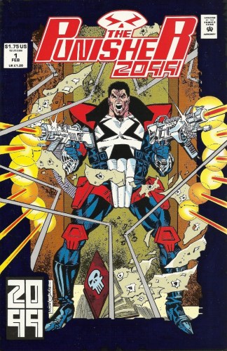
We’re going to tackle Punisher 2099 today because it was published first, in 1993, while Ghost Rider 2099 made its debut the next year. And GOOD GOD ALMIGHTY, IT IS TERRIBLE. I’m not the biggest Punisher aficionado, though it’s sometimes nice when he finds himself in Riverdale or featured in one of the greatest cover paintings ever to grace a comic magazine. But even I’m offended by this treatment. Frank Castle’s stubbly mein would glower darkly if he had lived to see what his name became. As it is/was, he was likely rolling over in his skull-adorned grave when Jake Gallows took up his mantle.
Yes, the new Punisher’s last name is Gallows. If this naming convention had been followed more often, we might have had characters like Peter Webb and Tony Spark. And Frank Cill. (Cill my landlord. C-I-L-L my landlord!)
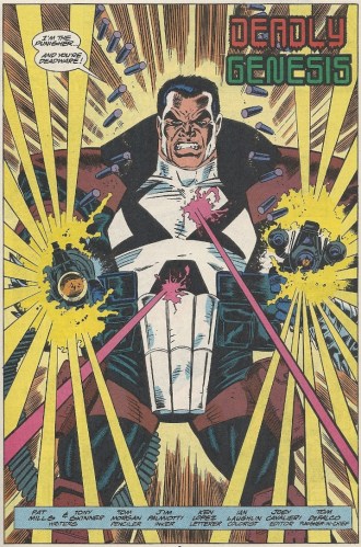
Before we delve into the mess of a story (Script: Pat Mills and Tony Skinner, Pencils: Tom Morgan, Inks: Jim Palmiotti), let’s first deconstruct the costume seen in full on the cover (a cover printed with a shiny reflective border and thick, price-augmenting stock). AND WHAT A COSTUME IT IS. In case you want a closer look at the upper half, here we have it again — the red accents are a bit more muted inside:
Glad to see tights and Liefeldian thigh-holsters lasted until 2099. Excelsior. And what the hell is the point of the skullish kneepads? I’ll let the toothy loincloth/codpiece slide, as it forms part of the requisite stylized skull emblem, but the legwear is a bridge too far. Instead of striking fear in the hearts of future criminals, it would likely generate more of a “good heavens you are a douche” reaction. Just a hunch.
And you have to love his poofy jacket (which is futurey body armor). The lapels and shoulder pads make it look like something right out of a 1980s Talking Heads video. PAULA POUNDSTONE’S BLAZER 2099.
Mr. Gallows works by day as a police officer, one whose advice is sought in this first issue by fellow future-cops befuddled by the new Punisher’s hyper-violent war on crime. One of the things that makes him so hard to track down in this camera-riddled era — with all the cameras we have around now, imagine how omnipresent surveillance will one day be — is that he uses a device that scrambles his face, allowing him to maim and kill in broad daylight without using a mask. And he doesn’t just settle for bargain basement pixelization, or even the blue dot that covered Mike Tyson’s dick in that classic SNL sketch. No, he goes for a goofy two-dimensional skull:
…
We get the senses-shattering origin of future-Pun right here in the first issue. It’s presentation is a bit confusing, as it’s told in flashback, but there’s nothing within the story to let you know that what you’re seeing is a flashback. You just kind of vault right into it without warning. Maybe some ruffled edges around the panels would have helped. Something, anything, because you’re thrown in, and you’re left thinking “Wait, he’s becoming the Punisher now? I thought he already was the Punisher. I HATE THIS COMIC BOOK.” (It’s also possible that I wasn’t reading the text with the Talmudic intensity a project like this so richly deserves. If so, my bad.) Anyway, Gallows has a similar impetus as Castle, as a day at the zoo (a zoo with dinosaurs — JURASSIC PARK 2099) with the family turns ugly when his brother, sister-in-law and mother are all killed by a white-haired villain who cooks them with a microwave gun. Here’s some of the carnage:
Note Mom’s necklace. The Gallows folks are members of the Church of Thor. Yes, in Marvel 2099, Mjolnir will one day trump the cross. Move over Jesus, there’s a new hammer-swinging deity in town, though this faith sure didn’t do the Gallows clan a damn bit of good.
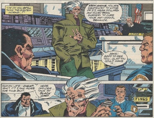
The murderer, Kron Stone, is apprehended, but in this corporate dystopia those with wealth and power are only a debit card swipe away from freedom:
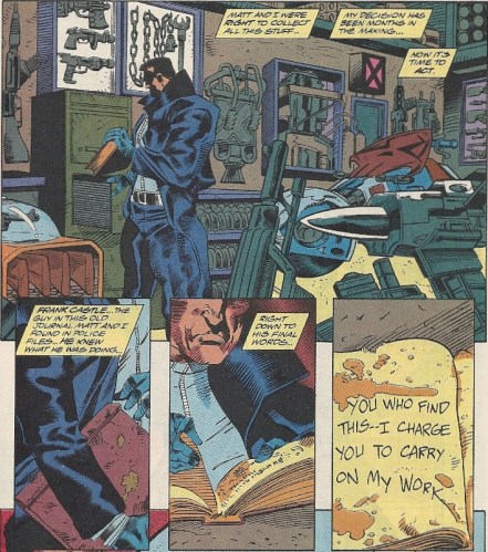
This sends Gallows into a frothing, life-altering rage, and he decides to become a vigilante, modeling his new persona on the author of a certain war journal he discovered in the police archives:
Apparently this old paper journal was given a liberal dosing of Walter “Rorschach” Kovacs trenchcoat stains. Maybe it was taken to the Gunga Diner one too many times.
And that’s pretty much how the story ends, with the last panel being another stiff, full frontal of our “hero” and his giant guns. That’s all this thing is: a lame gun delivery system.
I’ll hold off on any deeper commentary until the Ghost Rider 2099 post. but a few things can be said here. First, the art is unappealing, and that’s being charitable. Maybe my tastes are the ones that are skewed, as the style you see in the above scans was standard back in early to mid-1990s Marvel — like a hacky interpretation of Mark Bagley. Maybe the market demanded stuff like this. But to these eyes, it’s rigid and awkward and rushed and goofy looking. Again, being charitable.
The story? There are two scripters credited, which leaves one wondering what the division of labor was at the helm, especially seeing as the wafer-thin plot in this premier was so numbingly predictable, with nonexistent pacing that lurches like a new driver learning to shift gears. It might be that they were tripping over each other, in a classic variant on the old “too many cooks in the kitchen.” In any event, this is poor storytelling. There’s not much to work with, granted, but still…
Okay. Enough. Stay tuned for the second part of this painful feature, which should be posted sometime next week. Scores shall be settled. Until then, just ponder whether or not things can get any worse. They can’t, can they? CAN THEY?
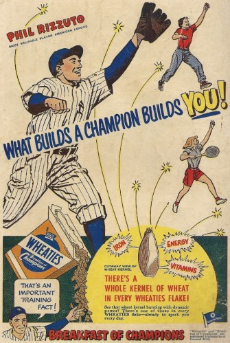
Wheaties will make you big and strong, kids. Unless you’re Phil Rizzuto. Then it will make you neither.
Maybe, in certain isolated cases, instead of honing you into a rugged hardballer in the strapping Hank Greenberg/Ralph Kiner/Frank McCormick mold, Wheaties turns you into a funny, quirky little old guy with huge, thick glasses who likes to belt out “Holy cow!” at every opportunity. Caveat emptor.
Whatever the case, the Phil Rizzuto diet regimen, whole kernel of wheat in every flake or not, would have to rank right up there with the Jimmy Stewart bulk-up exercise routine in effectiveness. Aim high!
All this isn’t to bash the Scooter. Believe me, I watched and enjoyed many a Yankees game on WPIX in my day. That said, I’m pretty sure the girl with the racket could take him, even at his Wheaties-engorged physical peak.
This old-timey book will help you learn to rhumba, samba, jitterbug, and square dance. But not, sadly, hustle.
While you’re idly fantasizing about one day being simultaneously famous enough and washed up enough to appear on Dancing with the Stars, maybe you could track down this old instructional book on dancing. Its title? Dancing. Imaginative. The fox trot beckons to your two left feet.
Maybe have a friend pluck out some depressing music on a Sparkle Plenty ukette to accompany your practice steps.
Here’s a sampling of an old Golden Age Blondie/Dagwood Bumstead knockoff. You’re welcome. – Dotty Dripple #20
If you look at the above cover, at that poor sap in the red sweater going ass first into a tub of suds after rocketing down a bannister, and your brain screams DAGWOOD BUMSTEAD, you wouldn’t be wrong. I mean, you’d be wrong, but you wouldn’t be wrong wrong. Because, though Dotty Dripple wasn’t Blondie, she was Blondie. A Blondie by any other name. And creator Buford Tune was no Chic Young, but he was more than capable of strip-mining (literally) that other newsprint universe bare and generating his own long-running toon. Dotty Dripple was a Blondie clone before people knew what clone’s were.
For the uninitiates out there (like me until I saw this thing), Dotty Dripple was the matriarch of the nuclear Dripple household, with bumbling Dagwoodish husband Horace and clone-looking daughter Taffy rounding out the ensemble. She was your typical housewife at the middle of the century, in that she had a fairly empty head and sufficient balance to be able to do housework in heels. And, lest you think that her strip and her dalliance in comic books (at Harvey and later Dell) were blips on the cartoon radar, her and her family’s newspaper appearances stretched from the 1940s to 1974. It’s a testament to how popular newspaper strips — hell, newspapers — once were that even blatant knockoffs could last for decades. America’s hunger for three-panel amusements was insatiable.
And make no mistake, Dotty Dripple was a knockoff. When something is created over a decade before something else (Blondie started up in 1930), and that something else obviously capitalizes on the previous something’s popularity, then you have the very definition of a knockoff. Or ripoff, depending on what mood you’re in. All due respect to Tune, who “created” a strip that lasted for thirty years and may very well have been a kind gentleman, but his product was embarassingly close to Dagwood Bumstead’s milieu, right down to Horace’s overbearing boss and difficult work environment — all that was missing was Mr. Dithers occasionally lifting him overhead in an ass-kicking rage. But this was close enough:
Could Horace look any more like Dagwood? He doesn’t have the Paulie Walnuts hair that springs out from his temples, but the cowlick is certainly suggestive of it.
EVEN WHEN HORACE DIPPLE SLEEPS HE’S RIPPING OFF HIS DOPPELGANGER:
I realize that there are only a certain number of ways that you can draw a man sleeping on his couch with his back to the viewer, but when you type “Dagwood napping” into Google, the first image that comes up is this. You cannot get any more similar without tracing one over the other.
But hey, the Dotty Dripple comic book wasn’t just about vignettes that aped a more famous property. It was educational, too. Why, children could learn utterly useless arts and crafts, like making a cork face pin!:
I’ll take Vincent Price and dried apple heads any day, thank you very much.
There you are. Dotty Dripple. I’m out of things to say about her and her strip, though I do wonder if there was ever some secret convocation of the International Brotherhood of Cartoonists, one where Tune was called upon to answer for his crimes. Also wonder how much Chic Young’s teeth were ground down from seeing Dotty, Horace and Taffy on a daily basis, or if he had some assistant scissor out that section of the paper.
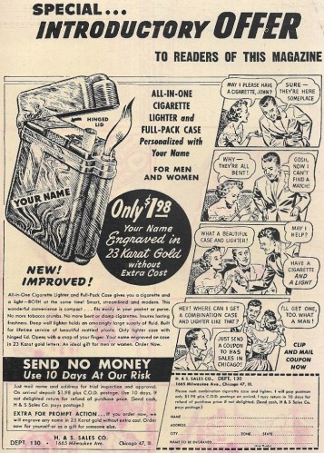
This combination cigarette case and lighter will make men respect you and fickle women swoon
Apparently this lighter/case combo made its bearer an unstoppable Casanova, one who could steal women with impunity and so overawe the cuckolded male, he’d offer to bring the new couple drinks. It’s like some amorous Ring of Power with a lighter fluid center. Really puts the dancing girl embossed wallet to shame. LONG LIVE THE 1950S AND THEIR CIGARETTE-LOVING, RHETT BUTLER MUSTACHE WAYS.
You have to love a woman who’d bitch about the quality of the cigarettes you’re providing her. Hey, wasn’t this shrewy, open-legged broad in the old Jowett bodybuilding ad?
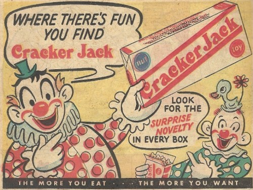
AHHHHHHH IN YOUR FACE CRACKER JACK CLOWNS KILL KILL KILL!!!
You can highlight Cracker Jack’s intimate connection with baseball, or you can send people into coulrophobic seizures. Your move, marketing department.
Where there’s horror, you find Cracker Jack! Fuel your nightmares!
Wolverine is going to berserker rage THE HELL out of hunger (and maybe Oxfam America, too) – X-Men: Heroes for Hope #1
I always jumble the title to this mid-1980s benefit book with the similarly intentioned DC effort, Heroes Against Hunger. So that they both become Heroes for Hunger and Heroes Against Hope. Wonderful.
In my defense, it should be pointed out that the confusion is rather easy. Both comics were produced a year apart — Hope in 1985, Hunger in 1986, and both had Marvel and DC casts battling African famine, the roiling cause celebre of the time. Both had all-star “We Are the World” assemblages (with some overlap) of talent pooling their efforts to craft a meaty comic book to raise some money. So a little cerebral blending is permissible. So lay off.
And this jumbling, this natural juxtaposition, also invites an obvious question: How do they stack up against one another?
In simple story terms, both comics share similar villains, each of whom psychically “feed off human misery” or similar gobbledygook, and hence have found a bountiful feast in sad, dry, dusty, rib-protruding Ethiopia. Both books also suffer from difficult narratives, since no amount of coordination can easily streamline artistic talents (some not familiar with comics) that naturally want to pull things in a thousand directions. When you have a page like the following, that reads like an FBI map of a mafia hierarchy, you’re going to have trouble:
Hope has the X-Men coming face to face with the worst of human suffering, and the larger roster of characters perhaps contributes to the somewhat scattered feel of the story. Hunger focused on Superman, Batman and a reformed Grinch version of Lex Luthor, and that unfurled in much more linear fashion. Much of the division of labor in Hope comes by allowing the different teams of creators to depict harrowing visions caused by the X-Men’s unknown adversary, and things hence scat and bebop all over the place. Some of these digressions work. Some don’t.
But really, all of this is skipping the big story associated with this effort, one that Marvel Editor Jim Shooter recounts quite bitterly (justifiably so) here. It’s worthy of a digression. To give you the bullet point version (though I suggest you check that link, if only to savor such golden nuggets as Stephen King dropping a 5,000-word brick of a script for his three-page contribution), Shooter conceived the project and herded the cats needed to fill out the talent pool, and agreed in principle with Oxfam America, a famine relief charity, that they would receive the proceeds from the book’s sale. Things went along smoothly, the project was completed and ready to head to the printers, but Oxfam had requested to see the finished product before it was released.
And they hated it. More specifically, they were offended by it, calling it racist, sexist, and everything else under the sun. It was none of those things (maybe for someone living in a vanilla bubble), and Shooter and Marvel kindly requested that someone from Oxfam come to the Marvel offices and explain just what the goddamn hell the problem was. Oxfam obliged, sending a high-priced attorney (Shooter’s venom darts for him still have potency even at this remove of years) who amplified the idiocy and lobbed gems like accusing Marvel of stealing the book’s logo from Janet Jackson, and refusing to hear Marvel’s explanation that the Janet Jackson who designed it was their graphic designer Janet Jackson, and not the one that would one day flash a pert breast for all the world to see.
So Marvel wound up giving a pile of money to the American Friends Service Committee.
No good deed…
Back to the comic itself, just to wash that sour taste out of out mouths.
This was set during one of Magneto’s 729 babyface turns, when he was leading the X-Men in the absence of Professor X (Magneto’s mutability made him the comic book equivalent of pro wrestling’s Ric Flair — WOOOO), and the roster — Wolverine, Storm, Rogue, Kitty Pryde, Nightcrawler, Rachel Summers and Colossus — was all second generation. One of the nicest features of the comic was the return of John Byrne and Terry Austin to illustrating the X-Men Universe. Here they are picturizing a Louise Simonson penned discussion between Colossus and Nightcrawler, as Colossus gives a RUSSIAN MACHINE NEVER BREAK lecture and has a Frank Drebin fight with a towel:
Of the various writer contributions, the only one that truly stands out is Alan Moore’s. He never really dug into the Marvel Universe they way that he did for DC, and his short Magneto vignette really steals the show (hey, it has Hitler!). I don’t know if it’s “worth the price of admission” good, but it’s close. Artistically, a person would likely be most taken with what Frank Miller and Bill Sienkiewicz did with Harlan Ellison’s words. Wolverine is out in the wilderness, tracking and doing his general Wolverine thing, when he has one of those nightmarish visions just like all his teammates. IT’S NUDE LOGAN VERSUS WOLVERINE, PEOPLE. Thanks to Miller’s unique Sienkiewicz-amplified style, what follows reads like a combination of the Batman/Mutant leader fights in The Dark Knight Returns and the Evil Superman vs. Clark Kent junkyard fight in Superman III:
Just from a plot perspective, though, these few spectacular interludes aren’t enough to rescue a book that wanders around far too much and has far too little resolution of any sort. (The villain is unspeakably lame, like something sprung from the worst of the original Star Trek.) Of course, satisfactory resolution was impossible, because the X-Men couldn’t fix a famine any more that we mere mortals could, and the DC counterparts would have the same problem the next year (and they had to sit through a lecture from a Peace Corps ninny to boot). What you get instead are small, schmaltzy victories like this (Archie Goodwin, Howard Chaykin, Walt Simonson):
I should conclude by emphatically stating that I’M NOT CRITICIZING THE BOOK’S PURPOSE. Only it’s storytelling merits. I find DC’s later version to be a marginally better product, but that might be my anti-mutant prejudice shining through. Whatever its qualities, and outside of the money that it raised a quarter of a century ago, Heroes for Hope now exists mostly as a lesson that no good deed goes unpunished.

