
I mean, these guys do finish each other’s sentences. And they’re nefarious. Granted, neither has a scar, but whatever — close enough.
Also, if Batman had waited a few more minutes I’m sure the Hostess Fruit Pies would have put them in a diabetic coma, negating the need for fisticuffs.
Joe Kubert. Walt Simonson. The senses-shattering origin of Dr. Fate. BE THERE. – 1st Issue Special #9

It’s one thing to open with a Joe Kubert Doctor Fate cover, but it’s another thing to look inside that cover and find some delightful Walt Simonson artwork waiting for you. That’s a chocolate-and-peanut-butter level treat, friends. There might be 0ne-two combos with greater combined tallies of critical adulation, but you’ll seldom find two artists more well-liked than the late Mr. Kubert and the still truckin’ Mr. Simonson. The former’s classic work, whether it was searing your retinas with a Sgt. Rock cover, or illustrating damn candy ads, always charmed. And Simonson, who has had a long and prolific career, had his place in comicdom assured with his definitive run on The Mighty Thor. No one thought Stan Lee and Jack Kirby could be surpassed, and maybe they never will be, but Simonson, with his Mjolnir KRAKATHOOMs and Beta Ray Bill, came as close as anyone. It was quality storytelling and it was fun. Stellar.
Simonson is the component that makes this edition of 1st Issue Special in particular so interesting. Published in 1975, it came early in his career, and you can still see his distinctive style being honed. This isn’t to say that the artwork is rough. Far from it. Just fresh, with all the components readers in later decades would recognize, but not quite in that groove. And as an added wrinkle, this early jaunt into the realm of costumed superheroes crosses into the territory of the Egyptian gods. We all know what wonders Simonson worked with the Norse pantheon, so it’s interesting to see him heading south in this mid-70s book.
Before we get to the comic, a word about Dr. Fate: Of the second — or third — tier of DC superheroes, Fate is a personal favorite. The helmet. The colors. All good. When I was a kid, he was the character I most liked to draw — mainly because his helmet didn’t have tricky facial features like irised eyes and noses, but still. And Fate’s single appearance in Smallville, a stupid show I loathed with a white-hot passion, was one of the few times where the WB/CW/Whatever got a DC character right.
That helmet.
The action here in this 1st (And Only) Issue Special (scripted by Martin Pasko) opens with a mummy coming alive in Boston and killing a museum curator and a wealthy benefactor. Enter Fate:

(Aside: I knew KRAKATHOOM. I served with KRAKATHOOM. You, WHAM, are no KRAKATHOOM.)
What’s Khalis’ big gripe? It’s — literally — the age-old battle between cats and dogs. We’re treated to an ancient Egypt flashback, where young, unbandaged Khalis topples a Bast-loving city (yes, that Bast, known to most comic readers as the horny, blue, bipedal, breasted cat goddess in the Sandman comics), all in the name of Anubis, the jackal-headed funerary god of old. He’s stopped by the spell-casting derring-do of Nabu, and condemned for failure to his mummy fate (no pun). But now he’s back with a vengeance, and stomps all over Fate before taking the poor guy’s amulet (it’s like one of us getting mugged).
So off Fate goes to lick his wounds and plot strategy, but not even DC’s premier master of the mystic arts can escape relentless yenta-ing at home:

Poor Kent Nelson. I know, honey. You’re right, my dear. Yes. Yes. You’re right. Did Kent Nelson ever slam his hands down on the kitchen table and bellow out “I BET CLEA NEVER TALKS THIS WAY TO STEPHEN STRANGE”?
This wouldn’t be a “first” issue without some exposition on the beginnings of our character. Behold, the origin of Dr. Fate, conveniently condensed into one gloriously constructed Simonson page:

Khalis eventually converts Boston into a simulacrum of ancient Egypt (no great loss), which fails to impress his dark idol (look at the wonderful hieroglyphic two-dimensionality of the clouds — a great Simonson touch):

It seems doubtful that Anubis’ “Shame and Mockery” management style is being taught in any business school.
Fate carries the day, and the story ends with an appeal for fans to write in and let the DC editors know whether or not they want to see an ongoing series. There wasn’t one, so evidently no mail carriers were hunched over beneath giant sacks of mail. Oh well. There’s also this behind-the-scenes talk on the making of the comic, where Simonson both provides a self-portrait and gives away the game on his famous signature:

Alas, Dr. Fate has never had much run as a solo star — maybe there just isn’t enough meat on those bones, at least not enough to support a monthly. Maybe Fate’s fate (had to do it once) is to always be part of DC’s strategic character reserve, to fill the breach when a golden helmet or timely spell is needed. So be it. But we can all look back at this “first issue” and wonder whether the god-friendly hands of Walt Simonson could have worked their magic with him a decade before they resuscitated a different legend. Simonson hadn’t fully embraced the aggressive style that raised the God of Thunder to new (or different) heights, but all the elements were there. Look at the origin sequence. Look at Anubis. Look at them and see the (past) future.
Want to know when there are new posts? Follow blogintomystery.com on Twitter.

It’s not that a devoted fan of Evel Knievel, one not satisfied with the usual assortment of Knievel action figure merchandise, shouldn’t have even more junk to buy. Whatever scratches your itch, the more the merrier, etc. But the “Antique” verbiage in this ad for Knievel coins is a bit of a head-scratcher. Were they a means of exchange when the Pilgrims landed at Plymouth Rock? Were bags of Knievels paid in tribute to Roman proconsuls? Had Nostradamus foreseen the death-defying exploits of a man in a white jumpsuit? (Maybe it’s the bronze that’s antique, if that makes any sense.)
Dumber than Conan coins? YOU DECIDE. E Pluribus Knievel.

There’s something so trustworthy about the old NASA look. Even though Vern Estes’ province was model rocketry, not the real version, one look at those horn-rimmed glasses — which surely were accompanied by a short-sleeved white shirt and a thin black tie — and you’re ready for anything. What’s that? I have to repair a fuel line in my orbiting spacecraft with duct tape and dirty underwear? Whatever you say, Vern. In Vern I trust.

Of the legions of mass-produced trading cards that came out in the early 1990s, few overshot the mark more than The Valiant Era from Upper Deck. Riding the wave of popularity that then still propelled Jim Shooter’s Valiant Comics, they were supposed to be that company’s prestige entry into the still-new and very successful comic book card marketplace (not counting the second-rate Unity set from Comic Images). That they were, but they had a print run that made the Jim Lee X-Men #1 seem scarce by comparison, a proliferation that undermined the collectibility of what were, as we shall see, an attractive product, if one with few surprises. It was perhaps appropriate that this set, which celebrated what had been up to that point a string of triumphs for the upstart critical darling, also had overproduction and speculation to blame for its downfall, much like the comic book mothership. These cards were just another hemisphere of that bursting bubble.
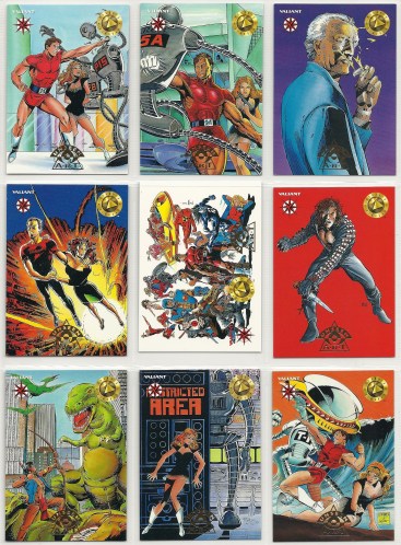
The base set consisted of 120 cards, all (except for two checklist cards) reproducing covers from Valiant comics up to that point, while describing events from the stories on the backs of each. This sounds lazy and it is, but bear in mind how delightful the Valiant covers were. There was an excitement in them, an energy, a synergistic build as an expansive, brand new shared universe was molded before our very eyes. Shrunk and reproduced on the shiny lacquered stock, the cards offer an 118 slide show of what was a glorious failed experiment. All the major titles are included: Magnus, X-O Manowar, Solar, Harbinger, Rai, Bloodshot, Archer & Armstrong, et cetera, et cetera.
Two months ago I bought four boxes of the cards on eBay for less than twenty dollars, just to see if tales I had read of atrocious collation were correct and to see what spread of chase cards (there were many) could be had. As far as collation goes, after four boxes, which should have yielded 8+ complete sets if the distribution was perfect, I only had four complete sets — indeed, it was only at the last pack of the second box that the first set was completed. Collation is a fine line, in that you don’t want to make putting a set together too easy, but you also don’t want to frustrate the buyer so much they want to drive to the factory and torch it. This verged a bit too far towards the latter for my tastes, but I have a short fuse. Your collation mileage may vary. (And, for Upper Deck cards, I’ve seen worse. More on that in future editions of TCSotW.)
That said, the cards are nice. Here are some samples of the memory lane finery offered by the base cards, starting with the first in the set, with Magnus, Robot fighter with his miniskirt and go-go boots karate chopping his way into our hearts:
Hey, this neato Barry Windsor-Smith Archer & Armstrong card looks familiar:

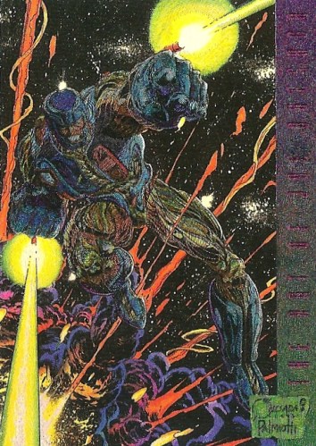
There were two subsets of chase cards, Unseen Art and First Appearance(s). The Unseen Art cards are just that: unpublished artwork that was shelved for various reasons, and the only thing to differentiate them from the set corpus is a dash of gold foil. Behold:
The First Appearance cards look a bit different, with their “Light F/X Technology” wonderment. Behold again:

The final two cards are odd, in that they’re supposedly “rare,” and one is unadvertised. The unadvertised card is a hologram header, which functions as a memorial plaque for what promised to be an enduring, fruitful trading card empire (and wasn’t):

The big card of the set was a Joe Quesada X-O Manowar Chromium card, which reproduces both the X-O Manowar #0 cover (just about the only special cover from that era I like all these years later) and all its shininess (the scanner doesn’t really convey its gleam):
The odd thing is, though this card is only found once in every three boxes, it’s actually easier to find than any of the other chase cards, which come one in every twelve packs. Do the math, and you see the problem. If there are nine chase cards in each subset, that means, if you get a perfect spread, to have all eighteen you’d need 216 packs. As it turned out, I had two X-O cards in the four boxes I opened, and was missing one Unseen Art card and five First Appearance cards. THEORY AND PRACTICE ARE CONVERGING TO PROVE MY POINT.
A note about the gloss used in this set: It’s all well and good when cards are fresh and good, but compact storage makes them stick together. Some cards were fused together in the packs I opened, and, when I bought a complete set later on that had all the chase cards (what I really wanted), the 120 card set was as solid as a brick. Lesson: Either store these things in pages or sleeves, or you’re not storing them at all.
There would be another Valiant Era follow-up from Upper Deck, and an abortive Deathmate set, which would, like the crossover namesake did with the comics, signal a death knell for the comic-card connection. Like going back and reading the Valiant books, this set is a bittersweet experience, but it’s nothing if not pretty. Should you ever want to buy an unopened box, beware of the collation and super glue gloss, but prepare to smile a little bit.

Next time a hurricane tears through the East Coast of the United States and reverts those in its path to Stone Age living, maybe the folks that are without power and running water can sate themselves by playing the old Marvel Super Heroes board game from Pressman. An opiate of the masses, as it were. Judging by this site’s description of the gameplay, by the time the rule’s are deciphered everything will be back to normal. Why does such a small board need so very many rules? Can’t we just roll some dice and advance a thimble?

Really, who wouldn’t want to add glamorous curves to their figure? I can’t tell you how many times I’ve stared in the mirror at my lean, narrow-hipped man body, cursed the fates for blighting me so, and wished that there was some old-timey pocket gym that could magically give me the full, attractive figure that I so crave. If only I had known that there was this contraption, which promises to cure both Oliveoylism and Shirleyhemphillitis, like a 1950s workout equivalent of quantum physics’ elusive theory of everything. And it doesn’t look like it could maim you, like some of its ancient cousins. (Note: I’d like to personally thank the chunky broad in the ad for wearing a one-piece. Thank you, chunky broad.)
Alas, I’ll probably just stick with my broad-shouldered man body. What? This thing helps with that, too, and builds muscles as a complement to any Atlas regimen? Behold, ladies and gentlemen, the Swiss Army knife of workout apparatuses.

Of the mid-1990s hyper-popular cartoons, Ren & Stimpy — beloved by many, an oddball SpongeBob SquarePants of its day — never registered on my radar. It was too cartoony a cartoon, if that makes any sense, and more “mature” fare like Beavis and Butt-head or the criminally underrated Dr. Katz was preferred stock. But that isn’t to say that R&S‘s popularity went by without notice. John Kricfalusi’s fat cat and scrawny Chihuahua characters struck a nerve, as did Billy West’s latter-day Mel Blanc vocal stylings. I still remember classmates getting their “Hey mon” imitations in.
It’s no surprise that they had a Marvel comic book, though — again, this might be personal preferences coming into play — the Beavis and Butthead book from the House of Ideas was of higher quality. Not much else to say besides that, but there’s actually some scientific value to this post, in a “How many looks to get to the center of a Tootsie Pop?” sort of way. How long do scratch and sniff items last? A year? Two? A decade? Two decades? Until the sun finally burns out? Well, I can’t speak to that last marker, but we can go up to two decades. And, as the giant nose on the plastic bag above attests, there’s a free Air Fouler enclosed with the comic before us today, the premier issue of Ren and Stimpy’s senses-shattering comic. Wonderful! It’s like a box of Cracker Jack!
You may wonder what the secret message also promised by the cover is. Here’s the unbagged cover:

Sorry, Ren. I had to open it. I needed to smell your Air Fouler.
As far as content, the comic gamely ties to replicate the manic pace of the cartoon, though it’s an uphill climb:

We come to the piece de resistance, the promised Air Fouler. No, it’s not (mercifully) based on Stimpy taking a dump in the kitty litter. Behold, Ren Höek in all his aromatic glory:

I’m happy to report that, in a triumph of scratch and sniff technology, the Fouler has retained its twenty-year old odor, surely helped by being sealed for the interim. Thank you, polypropylene. The barest tickle from a fingernail unleashed its smelly wonders. The question remains, though: What does it smell like? There’s no easy answer. If I had to describe the scent, it would be as follows: Imagine putting a wet towel in a plastic bag, putting some dried cranberries in the bag as well, putting that plastic bag in your car and letting that car bake in the hot sun for a week. Then remove the bag, open it and take a big whiff. It’s not that pungent, but it’s a distilled version of what such a nostril blast would be. I actually crinkled my nose and turned my head when I whiffed this thing, like it was smelling salts. So be warned, should you ever want to scratch Ren’s face and do our own evaluation.
I came. I smelled. I blogged.
Want to know when there are new posts? Follow blogintomystery.com on Twitter.
1950s children were either so gullible or so imaginative, they accepted a painted bucket as a Tom Corbett space helmet

This 1950s ad promises that “no one will be able to recognize you” when you where the specially made Tom Corbett, Space Cadet helmet. What that vow fails to account for is the “look it’s that idiot with his bucket helmet” factor. This makes Ed Norton and his Captain Video gear seem understated and dignified.
Then again, if you saved it for twenty years or so you could use it for Celestial cosplay. You be Jemiah the Analyzer! I’ll be Arishem the Judge! Of course, you’d be well into your thirties by then — not that that’s ever stopped anyone.
Roger Ebert, 1942-2013. Carmine Infantino, 1925-2013.

There was a hell of a two-fer yesterday. In the afternoon word came down that Roger Ebert, movie reviewer extraordinaire, had finally lost his long, grueling battle with cancer. As a person who reviews comics — and yes, occasionally movies — this hits hard, because Ebert was in many respects the Babe Ruth of his trade — this trade. He brought a perspective that melded both scholarship and fandom, and his writing celebrated even as it scalded. You could see how much he loved the medium that he made his life’s work, especially when he tried to process some misguided bomb that had just screened. His reviews, even when you disagreed with his take, were always must-reads. And, important to people reading this, he was someone who understood and wrote intelligently about the challenges inherent in bringing comic book properties to the big screen. He knew when to praise films that got it. Go read something like his old review for Superman: The Movie. He was a kindred spirit.
I imagine there are any number of people running or writing for newspapers, sites, blogs or whatever, who have Ebert’s voice in the back of their head every time they write or edit an article. Preferably bickering with Gene Siskel, their back and forth like an internal id and ego (maybe they’re at it once more). And his struggles this past decade, which left him mute, disfigured but unbowed, brought him new layers of admiration. In short, he will be missed.
Then the other shoe fell. Then came word that Carmine Infantino had passed away, which, though not a huge surprise, was a personal gut shot to end all gut shots. There’s no artist out there that I connected with more than Infantino. None. My sadness of course pales in comparison to his loved ones, but its real nonetheless, and my thoughts, though I don’t know a single one of them, are going their way right now. Yet Infantino’s place in comic book posterity has been assured for so long, any encomium seems to small, an hors d’oeuvre after the main course has already been served. God knows I’ve gone over my love for his artwork over and over again.
But there’s one more tribute I can share, and it’s this: I was at the Washington Nationals’ Opening Day on Monday, and those first moments of a fresh new baseball season were made even more special by Bryce Harper, the young, budding superstar, crushing home runs in his first two turns at bat. He clobbered those damn things. And one of the small parts of his game, one thing that marks him out from other sluggers, is the way he circles the bases. There’s no slow, meandering trot for Bryce. He tears around the diamond like a racecar. Full-bore. SPEED. And speed, at least for my two eyes, will forever be associated with Carmine Infantino. I was fortunate enough to grow up on the Infantino Flash, in the final run (no pun) that brought the curtain down (for about twenty years) on the Barry Allen version of the character. I will forever — FOREVER — associate the upper echelons of human speed by those wavy lines he put behind the Scarlet Speedster. I did the other day at Nationals Park. It’s always there in the subconscious.
That’s it. That’s all I’ve got. Farewell, Mr. Infantino. And Mr. Ebert.
The new 1950s electric sprayer can meet all your spraying needs! DDT! Or lead paint! Or both at once!

You have to admire the terrifying versatility of this novel 1950s invention, an electric sprayer that did away with cumbersome equipment and brushes and rollers. Who wouldn’t want to paint their kitchen cabinets with the same device that they used to commit ant genocide out on the sidewalk? Do you get your money back when the kids sprout that third arm?
Lois Lane gets a papoose, and subtlety gets a 2X4 to the head – Superman’s Girl Friend, Lois Lane #110

Like Madonna, Lois Lane has made up her mind, and she’s keeping her baby. So Superman, don’t preach.
One of the most memorable comics from the early 1970s was the (in)famous issue #106 of Superman’s Girl Friend Lois Lane. It was a clunky, silly switcheroo masquerading as incisive social commentary, as Lois Lane switched bodies with a black woman and much stern moralizing ensued. Maybe its heart was in the right place, but it fell with a bit of a thud, with the historically lily-white world of comic books lecturing readers about racial rights and wrongs. Even if they were on the right side of the issue, arguing for equality and against racism, overdue as that might have been, it nevertheless dropped like a lead balloon. It certainly wasn’t impossible for Lois Lane to tackle the weighty issue of the day, but it was unlikely, especially coming off the silly track record of the book.
Lost in the shadow of Lois’ big race switcheroo is this issue, and it may be even more cringe-worthy. Yes, Lois goes native and straps a papoose to her back, igniting the rock-throwing ire of a central casting angry mob (fresh from karate chopping the Flash). Oy. She might never don the attire worn on the above cover, but she assaults our senses in a plot that touches every awkward base imaginable.
The story, written by Rober Kanigher with art from Werner Roth and Vince Colletta, begins when Lois is on assignment, doing a soft-news “People, U.S.A.” feature, searching for the Mother of the Year (being in the business for decades hasn’t kept her from getting jobs normally handed out to freshly hired cub reporters). For her troubles she gets a remarkably shrewy tongue-lashing from what has to be the iciest bitch ever to squeeze out a baby — and Clark Kent isn’t much help afterward:

The cure for Lois’ ills? Perry White sends her out to cover what’s been advertised as a Native American rain dance, on a parched, drought-ridden reservation near a dam — another peachy gig. Clark again tags along, and, after he gets in a smattering of mildly politically incorrect dialogue, we see antsy ticket holders morph into an angry, racist mob:

Two questions are begged here: Most importantly, who the hell buys a ticket to a rain dance? What, the arts and crafts exhibition at the local library was sold out? Second, who buys a ticket to a rain dance only to uncork witticisms like those seen above? Were they expecting a Klan rally rain dance?
I mean, really…
It turns out the rain dance was just a bait and switch. A Russell Means-ish young man named Johnny Lone Eagle, who’s filled with spite for the white men who have taken his land (understandable, but he’s still an ass), leads a group of Native Americans in–well, in nothing. Just the lamest protest/practical joke ever. Get white people really desperate for entertainment to come out to a hot, sunny dam site, have them stand outside for a while, turning that delicate white skin a raw chicken pink, and then shove them back on the bus. A MLK Jr. Johnny Lone Eagle ain’t. In response, the white folks who’ve already made their injun-hatin’ proclivities clear, mainly the cigar-chomping construction workers, start a Braveheart battle to the death. Enter Superman, who separates the parties, and Lois finds herself alone with Johnny Lone Eagle and a squaw (his sister), the latter of whom brought her papoose to a sight of potential hostilities. (She is NOT the Mother of the Year.)
Johnny Lone Eagle gives Lois his stock Native American gripes (which are very much the old “Keep America Beautiful” ad put into words), including the nearby dam, which has contributed to the drought crippling his reservation. Lois tries to talk him out of his next course of action, which is detonating a bomb to blow the damn straight to hell. (Though this is unpleasant violence, at least it’s more direct than the “Trick Fat Tourists” gambit.) She fails, which leads to Natives vs. Hardhats II. And Superman once more flies in to save the day — and the dam.
But in the meantime, the squaw has fallen and mortally injured herself. (She fell on her face, which is good because she didn’t squash the papoose, but one gets the feeling that she would have dragged the poor baby with her to the dam explosion, so…) Her dying request is that Lois take her papoose, Little Moon, and raise him as her own, as the father, an Native American serving in the Army (this potential for irony is never explored) is missing and presumed dead. Lois agrees and takes Little Moon, despite Johnny Lone Eagle’s misgivings.
Now behold, Lois Lane: Mother:

I swear, when I read that “Little Moon will be shiny as a new moon” line, I wanted bury a hatchet in this book. AND NOW I’VE STARTED IN, JUST LIKE THE BOOK. THANKS, KANIGHER. (No word on whether Lois starts lactating.)
Long story short, Miss Lane adopting an Indian boy improbably leads to mass protests fer and agin, Little Moon’s father is actually alive, he accidentally almost kills Lois and his son, Lois sacrifices her life for the boy but is saved, and our last panels offer one last chance for tendentious moralizing:

We can all agree with the sentiment, but it’s understandable if some of us find the presentation more than a little off-putting. We can all applaud — or perhaps golf clap — the abandonment of the shallow, vapid “boy crazy” Lois stories that were the staple of the earlier romance-themed segment of the title’s run. But this is clumsy. Dumb. It undermines its own message with ham hands (Lois wearing full garb on the front doesn’t help). Though the art is some of the better than you’d see in Girl Friend, (it makes Lois, with her ’70s styles, look a lot like my mother, for whatever that’s worth), it’s caught up in the big MESSAGE OF THE DAY. Kanigher was more than capable of crafting a decent script — his war story work was always decent at worst — but here he laid an egg. The whole thing reeks of trying way too hard, and drowns in its own goofy earnestness.
After all this, what we really need is some Rose and the Thorn ass-kicking from the backup feature — you know, just to cleanse the palate. Why? Because THIGH-HIGH BOOTS (art by Ross Andru and Mike Esposito):

There. That’s better.
Want to know when there are new posts? Follow blogintomystery.com on Twitter.
Yes, it’s baseball season, but we can still gape at the ugliest football-themed car ever: the Gridiron Grabber

What the hell is this thing? Shoulder pad fenders? Would you pick up a date in this monstrosity? Would you even drive it in a parade? What exactly is the Grabber supposed to be grabbing? Footballs? Girls’ behinds (theoretically)? Is the chrome helmet dumber than the chrome pickelhaube on the Red Baron model car? Less safe? Which car is more ostentatious? Again: WHAT THE HELL IS THIS THING?
I’ll leave such existential quandaries, and their possible answers, to more incisive minds than mine.
Travel back to 1952, when huge, clunky TVs were still so neat and novel, small piggy bank versions were all the rage

Can you still get a TV with wood paneling? My dear departed paternal grandparents, a couple who started dating in high school as the Great Depression began, still had a TV surrounded by wood (a Zenith) right up until the turn of the century– fake drawers on the bottom and everything. Granted, it wasn’t the stand-up, radio-ish type you see above, but I always wondered if their early familiarity with a primitive first set was what made them gravitate towards boob tubes that looked like they could double as cabinets.
Anyway, if you believe this ad’s puffery, TVs were so whiz-bang and cool back then, you’d be the envy of all your friends by just owning a small, coin-gulping facsimile, one that wouldn’t have to show any pictures, just flash its lights a little bit, like an early Star Trek console. Remember this as you’re watching TV on your Slingbox, or some other modern marvel. Perspective, baby. (One gets the impression that the dazzling pictures purchased by deposited coinage would be a COLOSSAL disappointment.)
Would you prefer this, or a pirate treasure chest bank? YOU DECIDE.
Today is baseball’s opening day, a magical moment where all teams, whether their payrolls are Yankees high or Astros low, have dreams of Autumn success. Some squads are prohibitive longshots to make the World Series, but everyone starts with zeros in the win column. Everyone’s equal, and everyone can dare to hope — even Cubs fans, who wear their Wrigley ivy like a crown of thorns. This optimism is a feeling so well suited to the season, as the blossoming of flowers and the renewal of life surrounds us all.
And it’s a time for love, baby, when warmer weather makes men’s thoughts turn to those of fancy, not just Runs Batted In and Earned Run Averages. The shorts are getting shorter, and awkward parent-to-child talks about birds and bees suddenly have new relevance. Put love and baseball together, and you may very well have a chocolate and peanut butter sort of natural combo.
Hey, wait a second, The Natural had baseball and love (both false love that brought Roy Hobbs down and true love that lifted him up), and it was a classic. Maybe we’re onto something.
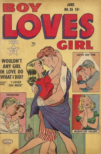
This particular issue of Boy Loves Girl has two sports-themed stories inside, but since we’ve already done some romance comic boxing action, we’ll steer clear of the pugilism and stick to the outfield amour. “Love on the Diamond” is set in spring training — doubling down on the season theme — as a squad in Florida gearing up for the big season. The skipper’s tomboy daughter, Bobby, has tagged along every year, and her skills have matured just as much as she has — which prompts some mild old-timey sexist talk:
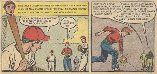
Bobby isn’t as interested in bats and balls as she was when she was younger, as her, how shall we say, tastes have evolved as well. Now she has her eyes not on the ball, but on Cliff, the team’s dashing star pitcher. Unfortunately for her, he doesn’t notice her, as she’s become just one of the guys, which is just fine by her grizzled, square-faced papa (who looks like a chainsaw sculpture):
Bobby goes on a full-on charm offensive, doffing the cap and trousers and dressing in as alluring a manner as 1950s social norms will allow. (We should note that Bobby is of age, though while she’s on the field, shagging flies, she looks like a freckled young boy.) Still she has no luck — at least, not until another player puts unwanted moves on her (mashing, as the kids used to call it) and summons her knight in shining armor:
KRAKATHOOM!
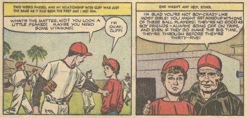
So begins their romance, but one that’s conducted on the down low, as the father/manager both disapproves of his daughter dating a ballplayer and a ballplayer dating at all. But it’s only when Cliff puts their relationship on hiatus (in favor of his career) that his arm gets rubbery:
Bobby explains to her father just why it is that Cliff has lost his focus, and when Cliff shows up, it’s tears and reconciliation and love all around:
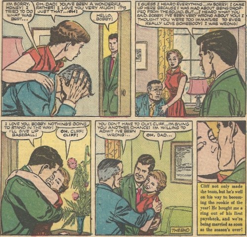
And so begins their young life together, filled with hope and optimism and a limitless future. Like the 2013 MLB season. Play ball.

