Crom himself heralds the triumphant return of Marvel Super Special March – Marvel Super Special #35, “Conan the Destroyer”

One of things I’ve derived the most enjoyment from in the few years of this blog’s existence was last year’s Marvel Super Special March, in which we looked at some of those fun old mag adaptations of Hollywood productions big and small. They’re great (and not so great) interpretations of sometimes beloved, sometimes loathed films that often have odd variances with the celluloid originals. And guess what — they’re back for another go around this year. Commence rejoicing. Eat, drink and be merry.
We’ll start it off with a sequel that underwhelmed after its predecessor outperformed. Conan the Barbarian, while not pleasing to Cimmerian purists, those who know the chapter and verse of Robert E. Howard’s blood-soaked warrior, was a movie greater than the sum of its parts. It launched Arnold Schwarzenegger’s film career. It had James Earl Jones in a goofy wig. It had that great CRUSH YOUR ENEMIES line. It had Mako. It was bloody. And it had a magnificent score from the great Basil Poledouris that likely did more than anything else to elevate the movie above what might have been mere pulpy mediocrity. (Seriously, if you can listen to “Anvil of Crom” and “Riders of Doom” without getting the urge to grab a sword, you might not have a pulse.) Add them all up, and you have something bordering on great.
Director John Milius turned in a movie that out-delivered. But he wasn’t on board when producer Dino de Laurentis came back for more cash, and the follow-up, Conan the Destroyer, though still decent in certain respects, failed to live up to its forbear. Arnold returned to the title role that really gave his acting career its turbo boost (Not Hercules in New York? NO.), and Mako was back in his quirky wizard role, but gone was the steppe-born Subotai. Valieria, Conan’s great love, had died thanks to a Thulsa Doom snake arrow, and that uber-villain had himself been beheaded. Their replacements were basketball legend Wilt Chamberlain as the club-wielding Bombatta, Tracey Walter as a cowardly thief, Grace Jones as an image-defining warrioress, Sarah Douglas parlaying her icy Superman II Kryptonian Ursa into an equally frigid queen, and young, fetching Olivia d’Abo as a princess destined to deliver a relic and die by sacrifice. All were fine, but they didn’t click like the cast in the first — and, after typing them out, I might add that there could have been too many ingredients in this reheated stew.
(Confession: I had a major thing for d’Abo way back when, when she was Kevin Arnold’s hippie older sister on The Wonder Years. Dear Lord, was she ever pretty, and she established for me some baseline of what a beautiful blonde is supposed to look like. Just wanted to disclose that. D’Abo for the win.)
In addition to the downturn in chemistry, there was the content. While no one would confuse Destroyer with family friendly fare, it was neutered (or doubly neutered, for those devotees of the un-Arnold Barbarian) in a quest to amplify the potential box office take. Thus there were no more bared breasts, and much of the lusty life of Conan was scrubbed from the palette. What was left was a straight-forward quest film that could, at best, only be thought of as Kind Of Good, not Good/Great like the first.
That said, Destroyer has its charm, and can’t be completely dismissed. And it’s Arnold being Arnold, which, for a generation weaned on Predators and Terminators and who understand the accented joy of GET TO DA CHOPPA, is a gratifying force unto itself.
Michael Fleisher (no relation to sequel director Richard Fleischer — the c is a clue) scripted the Marvel adaptation, while Conan comics veteran John Buscema provided the art (both having done the same duties for the first film’s comic). The latter’s talents give the Super Special version an odd feel, in that it becomes more a Conan comic story and less a Schwarzenegger movie story. The two versions of the character are, for various reasons, two distinct entities, and Buscema’s lines go a long way towards scrubbing the Austrian Oak from the character and meshing him with the regular comic book goings on (and some of the irregular). It makes sense in a way, but for those who like the films — the second to a lesser degree — it’s a touch jarring. Where’s Arnold and his PED-enhanced jawline?
The plot has Douglas’ Queen Taramis recruiting Conan to guide her niece, Jehnna (d’Abo), and Jehnna’s bodyguard Bombatta on a journey to locate first a key and then a treasure, the latter of which she promises will bring dear dead Valeria back to life. (Actually it will bring to life Dagoth, a hellish god of old, but that comes later.) No offense to Douglas, who did her Cruella de Vil act as well as anyone, but I buy Buscema’s curvy take on the queen as one more likely to seduce a rutting barbarian:

(Olivia who?) (Just kidding, Olivia.)
The characters not already on board are soon added to this unlikely Fellowship of the Babe, and the first significant set-piece is soon upon them. Thoth-Amon, the holder of the Part 1 key, kidnaps Jehnna and spirits her (literally) to his lake fortress. There our heroes eventually rescue her and find the key — a gem — but not before Arnold gets to flex his sword-swinging muscles against the evil wizard and scream in that most Arnold of ways. In the film, their hall of mirrors battle looks like this:
In the comic, Thoth-Amon morphs into a more apish looking dude — if you’ve ever wanted to see Gorilla Grodd do a Hulk Hogan shirt rip, voila:

An aside: Thoth-Amon was played here by Pat Roach, the wrestler/actor whose most memorable role was the burly German who boxed Indiana Jones under the flying wing in Raiders of the Lost Ark and was made into tomato puree for his troubles. His character’s appearance and demise were also altered in that film’s Super Special. COSMIC.
The escape from this gorilla-laden hall of mirrors presents a natural break, and indeed, this was the point where Marvel divided the story so that it could also be published in a regular comic-sized two-parter. Here in the full mag, the central portion is filled by a lengthy article on the making of the film , including some black and white set and publicity photos. Wilt the Stilt in costume reading the sports page stands out, as its gargantuan subject always did:

Here’s a shot of the ladies of Destroyer. To appropriate a line from Rocky IV and make it a tad vulgar: HIT THE ONE IN THE MIDDLE:

(Really, how could a man resist young, nubile Miss d’Abo, whether the d is capitalized or not? My God in heaven.) (Okay, enough, this is starting to sound like Brent Musburger salivating over a beauty queen. ESPN will soon have to issue a statement apologizing for retroactive lechery.)
After the filler, the adventure proceeds apace, with time for Conan to consider romancing the princess. There aren’t many men that could mack while wearing furry briefs and a headband, but he’s one of them — Where you got to go, baby?:

One sequence that isn’t changed up as much as it gets a different paint job comes towards the end. The clam shell thingy in the tomb that holds Dagoth’s horn — the ultimate treasure of their quest — was fairly bland in the film, but in the comic it becomes a venus fly trap crossed with Darth Vader’s mask from the first Star Wars comic’s cover:

And Dagoth? The evil god who will be awakened when his horn is placed once more on his forehead, and who will only be tamed by Jehnna’s blood? In the movie, the marble statue comes alive when re-horned and becomes a giant man-in-suit monster (actually Andre the Giant in uncredited work — really). Here? Here it’s a winged red demon that goes on a rampage and impales the evil queen:

AND ONLY CONAN CAN STOP IT/HIM/WHATEVER.
Thanks to Buscema’s art, the comic may be better than the source material in certain ways — despite the lack of Schwarzeneggerian elements. Things that couldn’t be done adequately with the special effects of the day (1984) get more dimensionality on a flat page. Sounds odd, but it’s true. And on that note: The great Roy Thomas and Gerry Conway wrote a treatment for the film and are given a story credit for the final product, though their work was changed a great deal before the final film. What did they do? They rejiggered some of the character nomenclature and morphed their story into another comic: Conan: The Horn of Azoth. Track it down and decide which is tops. You know, if you want to go deep into your Conan research. And what does the existence of Azoth tell us? Thomas’ and Conway’s disappointment with the finished product, which was so pronounced that did an end-around and redid it their way, gives you some idea of how it failed to live up to standards and expectations.
Personally, while I love the original, the sequel is only entertaining in an unremarkable way, and that seems to be the consensus verdict of history. At best.
As a corollary, there’s movement in Hollywood to make another Schwarzenegger Conan movie, one that builds on the promise of Conan the King that ended both prior entries. What are they doing with the developments in Destroyer? Nothing. It’ll be ignored, much like how Bryan Singer just used Superman and Superman II as the backdrops for his 2006 film and rendered Richard Pryor and Nuclear Man mere apocrypha.
I’m a bit sad about that. It’s okay to like Destroyer, and it’s okay to like its Buscema-infused Super Special. Not everything can be super special, even if it’s a Super Special, you know? There’s no need to do a full-on Amish shunning of Wilt and d’Abo, but that seems to be their destiny. Oh well. So be it.
And so begins Marvel Super Special March. This won’t be the last time Mr. Schwarzenegger makes an appearance this month, though. Stay tuned.
My Mother the Car joins the Kat’s ranks of Model Kits No One in Their Right Mind Would Ever Want

My Mother the Car might be one of the most insipid ideas ever to spring from the well of insipidity known as Hollywood, taking as it did the talking conveyance premise of Mister Ed and shifting it over to internal combustion engines. Nevertheless, it existed, and it most assuredly had its share of fans, devotees that might jump at the chance to own their very own AMT model kit of the eponymous haunted automobile. It’s your call on whether Mrs. Car was better or worse than the Munsters DRAG-U-LA.
Li’l Eight Ball sends Black History Month out on an unfortunate down note – New Funnies #96

It’s always said that you have to take the good with the bad, and this applies to history just as much as anything else. This means that, while we can take time in February to celebrate comics that honored African-American paragons, we should also carve out a moment or two to look at more unpleasant chapters in the stapled newsprint genre. God knows, there are enough low lights to be had in our beloved comic books.
And there are few more offensive chapters than the one inhabited by Li’l Eight Ball. Get out your surgical masks and rubber gloves.
A cartoon creation of Walter Lantz, Li’l Eight Ball was a vaguely human black character amongst the identifiable animal members of his creator’s stable — draw whatever unpleasant connotations that you wish from that company. Make no mistake, Li’l Eight Ball wasn’t some lame idea from a going nowhere hack. Lantz was an established creator who molded a toon titan in Woody Woodpecker as well as lesser but still viable characters like Andy Panda, Charlie Chicken and Homer Pigeon. He crafted gems. Yet there Eight Ball is amongst those old treasures, the proverbial you know what in the punch bowl, coalescing like racist force of nature.
Though he only had a couple of cartoons, Eight Ball was a fairly long-running feature in Lantz’s New Funnies publication. He was — and there’s no pleasant way to say this, so we might as well come out with it, like ripping off a band-aid — a pickaninny. That’s right, folks: a pickaninny. For those blissfully unaware of that old racially loaded trope, it was part and parcel of the whole blackface motif, and depicted young black children with big eyes, huge red lips, their hair excessively nappy (though Eight Ball, as his name attests, was smooth), and speaking in the ignorant, deeply accented English internalized by every devout segregationist. Dis for that, dose for those, dem for them, etc. Oh Lowdy Lowdy, I’s seen a g-g-ghost! That sort of thing.
Merely talking about this or typing it out makes your eyes involuntarily roll. Ugh. Li’l Eight Ball sharing a tailor with that wretched plague-carrier, Mickey Mouse, didn’t help either.
There’s nothing inherently offensive about the plot of the six-page Eight Ball story in this issue. But my God in heaven, is it ever cringe-worthy. Here are the first few panels, as he explains his idea to become a U.S. Marine:

Yes, that’s a mammy. All we need is a Sambo and we’d have a race caricature hat trick. None are available, though. Our loss.
Here’s some more:

And it goes on like that. What’s worst about it is how unnecessary the pickaninny angle is. You can have stupid characters interacting with other stupid characters and hijinks and all that without it. It’s gratuitous (much like Eddie Cantor in blackface, come to think of it), and its pointlessness amplifies the offensiveness, like fart jokes in a Michael Bay movie.
The rest of the material is your standard Lantz and Co. fare. Here are Andy Panda and Charlie Chicken meeting a very Betty Boopish, very nude mermaid:

Two things: 1) You don’t often see mermaid’s without their green scaly swimwear (see Lemaris, Lori), and 2) are there male mermaids? Merbutlers?
The Porky Piggish Homer Pigeon pursues love, Woody Woodpecker engages in his usual madcap hooliganism (though on the printed page he lacks his distinct staccato cackle), and others like the big-cheeked Oswald go in and out. Raggedy Ann and Andy have a distinctive visual component to their short, with unique artwork and no panel borders, and you can OH CRIPES THEY HAVE A MAMMY TOO:

Belindy, ladies and gentlemen. The mammy of the Raggedy-verse.
To wash that (dat) taste from our mouths, here’s the title panel from Frank Thomas’ (not that Frank Thomas — or that one) Billy and Bonny Bee , which is kind of awesome:

A Bug’s Life, Bee Movie, eat your hearts out. Also, UP YOURS, SMURFS.
As unpleasant as Li’l Eight Ball is to our eyes and inner ears, he and his blackface kin shouldn’t be forgotten. They’re testaments to things overcome, which is a necessary component of fully honoring trailblazers. It should be noted that the limited Li’ Eight Ball cartoons, long in mothballs alongside Song of the South and other victims of a PC-aware world, have seen the light of day in recent years. I think I read somewhere that one had made it onto a Woody Woodpecker DVD, so track that down if you want — Mel Blanc did the voice of Eight Ball, for whatever that’s worth.
And I’ve now typed as much as I ever will about the little guy. Farewell, LEB. A flight of Aunt Jemima-looking mammies sing thee to thy rest.
Build your Arsenal of Democracy, Young America
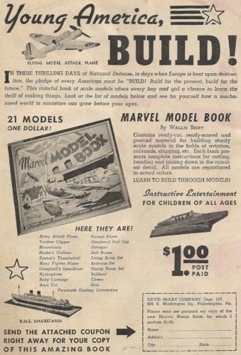
Though this model kit ad was pulled from a mag with an early 1942 cover date, the verbiage would seem to indicate that it was crafted pre-Pearl Harbor, what with terms like “National Defense” and references to the far away war in Europe. You know, when America was still in its “help others defend themselves” mode, before the full-on “KILL THE JAPS AND NAZIS” mentality. Hell, a kid may have been looking at this very ad, pondering the fun he could have with a whole book of cardboard cutouts, as his parents listened to the “Infamy” speech on the radio.
Regardless, you’re never to young to learn to build paper death engines. (Also, I’d think that the Captain Marvel flying paper toy would have been more than enough to terrify Tojo and Hitler into immediate unconditional surrender.)
A potpourri of Dorothy Lamour, Gloria Swanson, Lou Boudreau, Bing Crosby, Fred Astaire and Jimmy Stewart awaits – Magic Comics #32

Is there some manner of kismet involved with a book called Magic Comics reaching its 32nd issue? Earvin says “yes.”
Unlike the Eddie Cantor-infused Super Magician Comics, this book doesn’t have much in the way of “magic” going on in its innards. In fact, the only magician to make an appearance is the one appearing above the title: Mandrake the Magician. And even the cape, wand and top hat of this venerable sorcerer don’t get a lot of abracadabra in during his few pages of action. But, well, there’s this — poor Lothar:

Oh, artificial respiration. Is that what the kids are calling it these days? [Does quiet Leslie Nielsen Airplane! cockpit turn and exits room.]
Moving on.
There may not be much magic, but at least there’s some groan-inducing “humor.” I double dog dare you to read “Dollar-A-Dither” and not grind your molars into oblivion:

And here we have a precursor of the long-running Sports Illustrated “Faces in the Crowd” feature:

The line-up of character talents within is, lack of magic aside, quite impressive. There is, as the cover indicates, a dash of Chic Young Dagwood Bumstead strips, to go with the sampling of great Thimble Theater Popeye material, and lesser, largely forgotten personas. One star who’s not forgotten — in fact, he has a big-budget screen revival coming soon — is Fran Striker’s Lone Ranger. Here he and Tonto battle and impersonate thugs who prove that, if you want to maintain your menacing aura, you shouldn’t have nose-holes in your conical hoods:

The biggest selling point of this one issue might be the star-laden Feg Murray centerfold, which has a whole lot of moving parts:

Is Jimmy Stewart’s stamp a precursor of the Marvel Value Stamps, the removal of which scarred so many wonderful 1970s comics? If so, thanks for nothing George Bailey. But there’s Fred Astaire golfing. Or GOLF!ing, as it were. And there’s Gloria Swanson looking a tad frigid, especially next to Dorothy Lamour’s come-hither pose, which lives up to her last name. The love, indeed.
Cleveland Indian manager Lou Boudreau’s smiling face (in an page that lacks a Wheaties box) approves!:

There you go: some Magic Comics. Try and track down Zatanna, and see if she can mind-wipe Mandrake’s “artificial respiration” on poor unconscious Lothar from your memory.
According to the imagery in this ad, cankles are preferable to bamboo shoots. Your move, women of Earth.

Do you want to be Kate Moss, or do you want to fill out your nylons? Do you want to be Olive Oyl or Big Ethel? How’s a woman to decide?
I suspect the “Exhilarating Effects!” that supposedly herald your new, shapely gams are merely the first signs of complete pituitary shutdown. Just a hunch.
Cross-company crossovers rarely succeed. They just have too much “cross” in them. Meaning? Meaning most of the time they operate in that fuzzy, two-layered “imaginary” imaginary story zone, where characters meet and on a neutral field with neither side carrying their steamer trunks of established continuity with them. The first encounter of DC and Marvel characters, the famous Superman vs. The Amazing Spider-Man, set that pattern, with the two heroes running up against each other for the first time within those pages despite both being established do-gooders within that pocket shared universe, and with both apparently the world’s sole champions of truth, justice and the American way. As if they both appeared fully formed moments before the events of the first page.
It’s not that this is a terrible device. In fact, it’s probably necessary. You can’t craft anything lasting out of chance meetings, one-night stands that will be forgotten the next month, so there’s no use in having them carry any plot souvenirs with them or back through customs. This undercuts the storytelling, though. It robs the plot of permanence, and turns it into nothing more than a Dallas dream season. Bobby Ewing may not show up in the shower on the last page of these crossover comics, but he’s there in spirit.
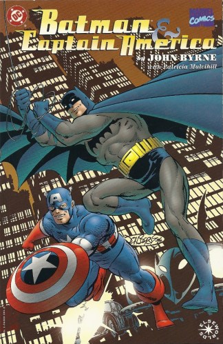
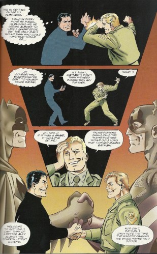
So you have to go in with these things in mind — actually, you have to read the book with them out of your mind. And if you do that? Then you might find some fleeting but real pleasure in the double layers of imaginary. And that’s just what happens in John Byrne’s Batman & Captain America.
There are no Byrneian giant, page-hogging signatures with accompanying footnotes in here (though the cover signature is, as usual, a bit too front and center). There’s no breaking of the fourth wall. There’s just two classic heroes doing their hero thing back in the decade that saw their earliest stardom. This is John Byrne doing what John Byrne does best: taking established characters and maximizing their iconic potential. And the Elseworlds brand, with its track record of quality, helps excuse some of the one-off finality of the book. This is a plus. (Though, since Marvel has no real Elseworlds equivalent, it oddly marks the comic as more a DC book than a Marvel. Part of their herd, as it were.)
Published in 1996, the square-bound comic is set in the 1940s, the decade which saw both characters establish themselves as newsstand titans, one in his nocturnal crime-fighting exploits, the other battling Hitler and his Nazi hordes in a most fistacular manner. This Golden Age temporal placement makes a great deal of sense, and leads to such delightfully appointed sequences as this chase between the Joker’s speedster and Batman and Robin in their secondary Batmobile, both cars looking like they come straight out of an episode of The Untouchables:
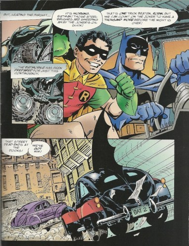
Meanwhile, Batman and Robin speed towards Cicero and the Joker’s speak-easy hideout…
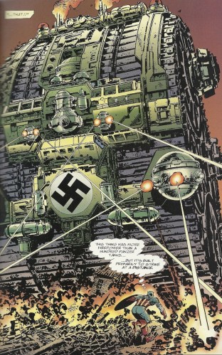
Captain America? He’s over in the ETO, predating the Tiananmen Square tank protester (as an aside, it’s utterly chilling that his identity and fate remain cloudy twenty-plus years on) by staring down one of those secret mega-weapons upon which der Führer pinned so many hopes:
What brings these two titans together is some shady goings on around the top secret Gotham Project, the Elseworlds equivalent of the Manhattan Project, with Gotham standing in for the Big Apple. Steve Rogers is sent in to figure things out, and suspects that the secretive Bruce Wayne, who’s providing some of the project’s funding, might have some nefarious motivations. Just what is he doing sneaking out at night, anyway? This leads to the stalemate battle of equals “fight each other before they triumph side by side” that any crossover of this type demands:
Bucky and Robin are both along for the ride, and there’s some wife sidekick swapping as the two young partners team with their opposite’s mentor. (There’s no reason for this, but it’s so apt and fun, who can complain?) The Joker and the Red Skull are naturally the real villains behind the doings with the bomb, and their team-up is the one that provides the most surprises. Which is a more potent killer, the Joker’s laughing gas or the Skull’s Dust of Death? Who will be the first the double-cross the other? Which of the two will make an oddly heroic late in the game stand?
It’s worth it to track down the book to answer those questions alone, and it’s a fine read apart from the settling of nerdy debates. A simple one-shot romp with big guns is right in the wheelhouse of John Byrne’s skillset. This is one cross-company mixer that rises to the top of the pile — or as high as one can go with the narrative boat anchors that always hold them down.
It’s simple: sell seeds, earn live canary

The American Seed Co. was well-known in its day for roping kids in (perhaps with a singing lariat) by incorporating celebrities and popular characters in their sales team pitch. The presence of Red Ryder’s and Gene Autry’s names in this one helps confirm the pattern. The promise in this ad of a live canary is a different wrinkle, though. Maybe you could team it with a mail order monkey and open your own petting zoo. Or it might have the gift of speech, and then you’ll have an insufferable Tweety on your hands. Pick your poison.
Also, I notice the electric baseball game doesn’t guarantee “you’ll never tire of playing” it. THERE IS A REASON FOR THIS.
Trading Card Set of the Week – Marvel Masterpieces (SkyBox, 1992)

Robert K. Massie, Pulitzer-winning biographer of Peter the Great and all things Tsarish, once stepped off the beaten Romanov path and wrote a great book called Dreadnought. It chronicled the Anglo-German naval arms race leading up to the First World War, as admirals and monarchs fell in love with the bright, shiny steam behemoths that replaced the old sail fleets. Professional, personal and imperial jealousies drove governments and their beribboned military staffs to develop and procure bigger and better battleships (culminating in the eponymous vessel), and the floating death-dealers helped propel the downward political spiral that would turn pastures into moonscapes and engulf a continent in trenches and barbed wire. The book is a great read, a striking reminder of how keeping up with the Joneses can drive both sides towards disaster.
It’s dangerous to compare something as real and tragic as mechanized mass death with a hobby, but let’s try — and please, take everything that follows for what it is: an extended analogy.
In 1989 the baseball card marketplace was turned on its head when an upstart company called Upper Deck entered the fray. Up to that point there were four companies making baseball cards, ever since Donruss broke the Topps monopoly less than a decade earlier. (Fleer and Score, the latter of which debuted its line in 1988, were the other two.) All produced perfectly fine cards, some packaged with bubble gum, some not, some with better stock, some with lesser. All had their charm, with pictures of players, distinctive designs and those wonderful lines of stats on the back that hardball nerds so crave.
Then came Upper Deck. Their cards were printed on fine, bright white stock, with excellent photography, action photos on the backs of the cards as well as on the front, and small, neat-o holograms that were anti-counterfeiting security. More importantly, the cards were sold at double — DOUBLE — the price per pack. I recall my typical price for a pack of Topps those days was 42 cents, while that first Upper Deck year had packs available for 89 cents per. Again — DOUBLE (plus, actually). And you know what? People gladly paid for those snazzy cards. I did. (Their success was helped immeasurably by their being the only company with a Ken Griffey, Jr. rookie card in their base set that year.)
So what did the rest of the companies eventually do? They ramped up to match this new kid on the block. They sharpened up their own lines, and they introduced separate, more expensive sets. Topps no longer only had their regular set, there was also the slick, glossy Stadium Club brand. Score had Pinnacle. Fleer had their Ultra line. IT WAS WAR. All this was going on as the hobby enjoyed its great speculative boom, when people started regarding cards as investments, and something to turn more than a few bucks off of.
And, much like comics, the boom went bust. There was too much variety, it was all too expensive and bewildering, and a lot of people lost interest as they realized that this mass-produced menagerie wouldn’t retain value, much less accrue it. (Just look at eBay and the lots of unopened product from that era, all sold at a fraction of the original price — without an adjustment for inflation.) Companies went bust, jobs were lost, and remnants merged to form hodgepodge conglomerates, echoes of the glories that had once been.
Sound familiar? Comics, cards or countries, it really makes no difference.
Which brings us to this week’s trading card set. Marvel Masterpieces were magnificent, but they were the 1989 Upper Deck of comic book cards. They were a high point that presaged a whole lot of dreck. They were dreadnoughts.
Put out by SkyBox in 1992, they followed up on the excellent sets that Impel had produced for Marvel yearly since 1990. (SkyBox had at this point melded with Impel in a corporate amalgamation.) With Masterpieces, however, the idea of the character trading card was taken to the next level. Each entry in the maiden voyage of this prestige line was painted by Joe Jusko, he of THE GREATEST PUNISHER COVER OF ALL TIME. His work, filled as it was with glamour poses and beefcake shots, was perfectly suited to a colorful, glossy trading card set, and, no surprise, he knocked this assignment out of the park. These cards were a hit.
(A friend of mine once called Jusko “the poor man’s Alex Ross.” He meant it as genuine praise in light of Ross’s mega-stardom, but it came across as a backhanded compliment. Though both have much to admire in their styles, I find myself preferring Jusko’s vibrancy, even if it might lack a bit aesthetically, to Ross’s posed, idealized figures.)
There were 100 cards in the base set (including a checklist card) and 5 “Spectra Etch” chase cards, as well as 5 “Lost Marvels” cards that were only included in the factory set tin. Folks, they were — and are — beautiful. There were no borders, and the gold box and lettering on the fronts didn’t stand in the way of the artwork — it let it speak for itself. You can quibble with the hamminess of some of the poses (the Hulk card above looks like he’s about to drop a deuce on a terrified Bruce Banner), but even the flaws are part of the charm. Though each pack cost more, and there were fewer cards per pack than normal, you were happy to have them. Just like those 1989 Upper Deck cards.
The consistent quality makes it hard to pick a favorite card, but there are a number that can be singled out. The Punisher’s certainly lives up to Jusko’s aforementioned cover:

HEY, WATCH WHERE YOU POINT THAT THING.
Speaking of “things” — the Thing’s puts the grim in Ben Grimm:

While the men are mostly depicted as the hyper-muscular physique gods that superheroes evolved into over the years, the women’s breasts are more pendulous here than ever, mammary endowments that are only accentuated by their poses. The Black Cat, the Enchantress and Silver Sable fully represent the thrusting/draping/jutting gamut:

You know, if there had been a little more of that spirit in the first issue of Silver Sable’s book, the whole endeavor would have gone over a whole lot better. Also: OH GOD ENCHANTRESS KILLED VINCENT AND MADE A RUG OUT OF HIM.
(And in this pin-up vein, one of the Lost Marvels cards has the Scarlett Witch posed like that time Alex Rodriguez decided to show off his swollen pectorals by sunbathing shirtless in Central Park. I only bring this up to zing A-Rod, because, really, who can resist at this point?)
I asked a comic-shop-owning friend of mine which of the card images was his favorite, so as to give a little more diversity of opinion about what cards stand out (he’s the “poor man’s Alex Ross” guy). He chose Bullseye’s, mainly for the grisly shadow behind him:

Mine? If I had to choose a favorite, I’d have to go with Dormammu’s. Not only does his flamey orange head make it the most colorful of the whole lot, there’s a certain Ditko feel to his hands that harkens back to the glorious Strange Tales origins of the character:

The rear of the cards contained the usual details: the character’s real name (if any), their first appearance, and a block of text describing them. The wrinkle here was an inset of the first cover appearance of the character, which was a decent innovation. Apart from that, there’s really nothing at all remarkable about any of the card backs, though Northstar’s caught my notice. Read the back and see if you can tell what’s missing:

Does he belong to a basket-weaving club? Does he go to Star Trek conventions every weekend? Is that what the “personal relationships” verbiage means? I don’t know if it was gutless to not just come out (no pun) and say that Northstar was gay on the back of the cards, or maybe it was just assumed that everyone already knew. Seems that they were dancing around it, though. (Was the 69 numbering a sideways, juvenile dig? Is that Beavis I hear cackling?)
The Spectra cards were classic battle showdowns between the bigwigs of the Marvel U — Thing-Hulk, Spider-Man-Venom, etc. — which had foil coloring in sections. I was only able to afford a few packs of these cards when I was a kid, and was lucky enough to get the Silver Surfer vs. Thanos card. Partly because of that lucky pull, it remains my favorite of the five:

Marvel Masterpieces were followed by other sets that carried that name, but this first effort was the only one that was worthy of the label. Having Jusko as the sole artist gave the product a stylistic unity, while successors, where duties were split, were more hit and miss, more disjointed. Twenty years after these were released, it’s still nice to pull them off a shelf and look through them, and that can’t be said for man of the kinsmen. These were distilled portraits of all that was and is fun in the House of Ideas.
And yet…
Quality aside, they were a bridge between the gluts that simultaneously brought down two freight train industries. They were pricey and spectacular, and other card sets took on their gloss and the painted look. And the price. DC was getting in on the card game in 1992, and soon every company that sold a comic felt that they had to have packs of cards next to cash registers, preferably more expensive versions — because nothing says “desirable” quite like big numbers. Endless tiers of chase cards became the norm, to the point that five Spectra Etch cards felt quaint. Bigger. Better. More money. And the lights were going out all ever hobby shops, and would we see them lit again in our time?
The 1989 Upper Deck baseball cards are some of the few that have held a modicum of value from that late ’80s, early ’90s era, and unopened boxes of this first set of Marvel Masterpieces fetch some of the higher prices on the late-term secondary market. Is there a lesson in this? Something beyond the rough comparison between cards and battle fleets? Probably. Draw your own conclusions. And if you have fond memories of the Masterpieces, they can be procured fairly easily online — if not quite as cheaply as others — and they were also published in comic book format around the time of their initial release, if that would make you just as happy. (You get more detail with the bigger pictures.) No matter the means of viewing them, and no matter what they spawned, Jusko’s little treasures remain a rainbow of delight.
But they were the dreadnoughts of cards.
Subtext: Buy Fleer baseball cards, kids, or Roger Clemens will travel to your home and bean you in your damn ear

Ah, the happy days of Roger Clemens, before his career took a downturn, before he left the Red Sox and found an allegedly steroid-fueled pitching rejuvenation in Toronto, and before he joined the Yankees and became the mound-dwelling lightning rod of baseball’s inflated numbers era. Yes, in 1992 he was still a figure viable enough for a baseball card chase set and “superhero” puffery. (In some ways, this part of Clemens’ career was much like David Hasselhoff’s pre-burger “One to Grow On” era.) This was when all he had was a heater, when he had yet to add an on-field temper to his arsenal, one that fueled bat-throwing incidents and inspired potential targets to take karate lessons to protect themselves from the Rocket’s wrath.
Fleer baseball cards. 1992. BE THERE (OR ELSE).
“Hey, let’s get Ron Lim and Terry Austin to illustrate our dopey phone line money grab…”

Ron Lim could invest even the degraded “Cripes, Thanos put me in a dog collar” Silver Surfer with a certain degree of shiny dignity, and Terry Austin’s inks graced any number of classic comics. Yet here they found themselves illustrating a poster with a haphazard assembly of characters, one that was supposed to entice kids to call a 900 number. Granted, it was a flat fee to play the phone line’s contest (it looks to be a variant on the “Where will the cow crap?” county fair grid game, but with trivia), and there’s the usual disclaimer on getting parents’ permission to call (how many times was that sanction really sought?), yet this carries an unseemly taint. A money grab — pretty certain this wasn’t done for charitable ends.
The big prize you could win with your phone call? The poster. That’s it. No cash. No vacation. The poster. Never mind that it was a bit more nicely colored in the non-grid version. (You can find pictures of the finished product on eBay, with many listings trying to sell it for inflated prices.)
And by the way, for your “cramming characters into a rectangle” dollar, nothing beats the George Perez/Alex Ross Crisis poster.
A Black History Month Special – Classics Illustrated #169, “Negro Americans: The Early Years”

Comics have a checkered history when it comes to including black characters, a deficiency that extends to minorities in general. Any non-white figure, especially in the dominant superhero part of the industry, was ever in danger of being portrayed as a disturbing racial caricature at worst, a disposable cipher at best. And black heroes that didn’t have “Black” appended to their moniker — like Black Goliath or the Black Panther (and his dopey family) or others — were few and far between. The lily-white 20th century in comics has such a strong aftertaste, it’s no surprise that Marvel making the new Ultimate Spider-Man latino generates charges of pandering. Because, really, from these people and at this point, what else could it be?
All this makes a Black History Month retrospective through a comic book prism relatively slim pickings. But the comic in today’s post is a healthy buffet, a history of Black Americans from the colonial beginnings of what would become the United States, right up to the early part of the 20th century that would see so few strong black comic book characters — and up to the point where “Negro” was still an acceptable descriptor. Though Martin Luther King, Jr. and Rosa Parks are nowhere in these pages, it’s a solid primer, like something you would have read in an elementary school class in February. In that vein it’s a great success, yet by stopping short of the mid-century turmoil that finally sealed many antebellum promises, it’s a very bland, very conservative selection. It’s hard to imagine that it wasn’t a conscious decision on the part of the editors to play it safe and not touch on any people and events that had so recently roiled the country. The 1969 publication date was only a year after MLK’s assassination — perhaps he was still too current, and feelings still too raw. And Malcolm X would have caused some people to faint dead away.
This final issue of the venerable Classics Illustrated line (as we’ve seen, the brand at times went beyond the usual adaptations of great works) opens with Crispus Attucks, the free black man who many think was the first colonist slain in the Boston Massacre. Fast forward towards the Civil War and Harriet Tubman enters the narrative accordingly. Her delivery of slaves from bondage via the Underground Railroad is chronicled, including the rescue of her very own parents:

Either I never knew that Tubman was called Moses or I had forgotten. So this comic either taught me something or refreshed my lapsed memory. Which means I’m already on the plus side of the ledger.
Frederick Douglass, owner of one of the most distinctive profiles in all American history, also has a number of pages devoted to his life and career. Here’s a selection of quotes suitable for framing:

His coiffure was the Einstein of its day, no?
Anyone who’s watched the Matthew Broderick/Morgan Freeman/Cary Elwes/Denzel Washington-infused Glory knows about the 54th Massachusetts Regiment, the first all-black regiment in the Civil War — and if they have a soul, there was no dry eye as the soldiers bravely marched on Fort Wagner. The glistening bayonets are also recreated here:

Going into this comic, I’d never heard of Daniel Hale Williams, a pioneer in the field of medicine. (Unlike the Harriet Tubman/Moses connection, there’s no ambiguity here — this is a void.) He started life working as a barber and wound up an M.D., and in 1893 he performed the first successful surgery on a human heart:

Now that, friends, is boldly going where no man has gone before. Kirk, Picard, eat your hearts out. Pun intended.
Booker T. Washington, author of Up from Slavery and long a paragon of how far from humble origins diligence, work and education can take anyone, black, white, Martian or whatever, also gets time. Others who came along later contested his doctrine as meek accommodation, but many of his words have undeniable resonance:

(Did the Joker inherit Washington’s purple wardrobe?)
There are more black Americans profiled, including that mainstay of the Black History Months of my youth: George Washington Carver and his miraculous peanut. Track the book down if you want to sample their tales.
Norman Nodel both painted the cover and provided the art within (Gray Morrow also illustrated two of the stories not discussed here). A mainstay of the CI adaptations, his work could often be stiff and flat, but at other times, when given the opportunity to depict a posed scene — like the Frederick Douglass scan — he could offer up a certain measure of preserved grandeur. And, accordingly, the comic reads like a book out of time, an amber-encased relic of celebrated African-Americans past. Indeed, nothing says “another time” quite as much as the “Negro” in the title. It would be another decade before that term would vanish from popular usage and Supreme Court opinions, and take up its primary residence in hip hop lyrics alongside its nuclear “N” cousin.
Take the book for what it is, and send out some psychic dap to all the brave black men and women who blazed trails for themselves, their race and us all, and even made it into the world of comics. This is one time when we can truly say: EXCELSIOR.
Let’s travel back to the Bizarro World of the 1950s, where women were ashamed of being too thin

There’s some retroactive conflicting feelings generated by this ad. On the one hand, we should all applaud a time and place that didn’t pound body issues into women and plunge them into lifelong eating disorders — even though, in fairness, girdle ad after girdle ad, not to mention Kelpidine pep pills, were saying the exact opposite. On the other, this crap couldn’t have been healthy. A sawbuck says that this product’s nutritional label — if there was such a document — contained the words “100% pure cholesterol.”
And were you still supposed to cram all this lovely, ample flesh into a girdle? Or would said girdle be throwing off seams like a semi losing wheels on the highway?
Don’t be fooled by Baby Blue Eyes. This doll will kill you cold.
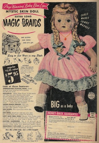
Even dolls kneeling in sweet, adorable prayer can be terrifying beyond words, so Baby Blue Eyes, with her demonic Magic Braids, is the embodiment of freeze-you-in-you-tracks evil. Beware, humanity. Beware. And don’t come crying, saying that blogintomystery.com didn’t sound the warning klaxon when the dolls rise up and slay us all.
Not even Spider-Man and raised breasts can save this “solo” debut – Silver Sable and the Wild Pack #1

Silver Sable, like Doctor Doom the ruler of a tiny fictional European nation (they’re neighbors), the lady whose tresses divorce the blonde from platinum, who, instead of lounging in her wealth and power like most of us would, runs a private Seal Team 6, had her own book for a while.
What’s that? You don’t remember it? How could you not?
Well, she did. Not that there was any overwhelming demand for a Silver Sable series, mind you. These were the boom years, though, when Marvel and DC and upstart publishers couldn’t churn out enough material, no matter how derivative or vanilla it might be. And, in that spirit, enter Miss Sable.
Her series was no diamond in the rough, and the debut issue says it all. Everything about this book screams GLUT. From the thick card stock cover, with its raised metallic image of our racky, hippy heroine (to answer the question of the hormone-addled boy in us all: yes, the breasts are molded and raised too), to the uninspired material inside, what you’re looking at is an embodiment of an industry gone mad, drunk with its boom and throwing off product as fast as it can be printed. (And what exactly would you call a cover like this? It’s not just foil enhanced — or is that chromium? And what was chromium, anyway? THIS IS WHY THE INDUSTRY ALMOST DIED.)
I put “solo” in quotes in the post title because Silver Sable is far from solo in what is, Wild Pack aside, her Mary Tyler Moore “How will you make it on your own?” moment. Spider-Man and the besweatered Sandman are both along for the ride, the former filling his usual contractually obligated duties to nursemaid any number of debuting or floundering titles. Before he shows up, though, we get the Symkaria series set-up, with Sable training the Wild Pack in an insufferable combat version of capture the flag, and then a meeting with Uncle Morty and a rubdown:

Yes, kids love it when a woman is massaged by a spinster’s thick, meaty forearms as Mr. Peepers briefs her with Ozymandias’ bank of television screens. Children will fork over their allowance money month after month for such thrills!
You want mandatory regurgitation of her senses-shattering origin? Here you go:

Sable jets off alone to rescue a girls’ school held hostage by HYDRA — one that Peter Parker is (conveniently) covering for the Bugle — and Flint Marko (in one of his several face turns over the years) convinces the rest of the pack that, despite their boss’ orders to stay away, they should go help her out. HYDRA pummeling ensues, and the student body, which has Sable’s niece among its numbers, is saved. How does it end? With Silver Sable displaying the sort of classy leadership that will get readers coming back month after month:

Our heroine, ladies and gentlemen. Who wouldn’t want to get to know her better? (And do you think Marko turned to Spider-Man off-panel, shrugged his shoulders and said “Dames, huh? Oh, and sorry about all that Sinister Six stuff. Water under the bridge, right?”?)
The comic reads like an awful pilot for an action-centric TV show, with some bimbo in the lead and a name actor roped in, one who turns in a performance that screams IN IT FOR THE MONEY, FOLKS with every gesture, i.e. the kind of masterpiece that used to be burned off as a TV movie during summer reruns. I hold scripter Gregory Wright and artists Steven Butler and Jim Sanders III utterly blameless in all of this. They got an assignment and they did their best — much like the commando teams upon which the Wild Pack was based. But this was a mission with a slim chance of success, and while the Silver Sable premise surely has potential (SPY FIGHTER RULER BABE), it wasn’t potential that was going to be exploited successfully in the early 1990s publishing climate. This was the age of quantity over quality, and this was simply a part of the quantity bombardment.
Yet Silver Sable and the Wild Pack lasted for a whopping 35 issues, which is about 34 more than I’d think a sensible market could sustain. Maybe there was some excellent storytelling on the way, but most would be forgiven for skepticism on that count. If this cliche-riddled opening salvo can be taken as an indicator, they couldn’t have been scintillating reads, tight, shiny, lycra-wrapped bods aside.

