
WrestleMania 29 — 0r XXIX, depending on your numeric preferences — is a week away, with all the attendant pomp and pageantry that has helped make it a transcendent sports entertainment spectacle. The Rock, the current champ and star of the abominably awful G.I. Joe: Retaliation, faces John Cena in a rematch of last years match. The Undertaker, he of the god-awful eponymous comic book, tries to push his 20-0 WrestleMania undefeated streak to 21-0 against C.M. Punk. AND SO MUCH MORE.
What does all this mean? That there will never be a better time to shoehorn a WrestleMania-centric product into the Trading Card Set of the Week feature. So here we are: “The History of WrestleMania,” from Classic.
In 1990, as cards were cresting in popularity and wrestling was still milking the Hulkamania glory days, a little company called Classic came out with an attractive, if bare bones, set of cards commemorating the superstars of the WWF. This was by no means the first time that the beefy titans of the squared circle had found their way onto cardboard. Topps had issued several WWF sets in the 1980s, and there had been sporadic wrestling card appearances for as long as there had been such things. Classic, a company that got its start with cards that were tied into a baseball-themed board game, entered the fray when they got the WWF license. Their first set had eye-appeal, with decent photography and clean white borders like the first Marvel Universe cards from Impel, and focused on individual cards for the major stars of the day. The only c0mplaints were that the stock was a bit thin — like glorified business cards — and there was far too much repetition, with multiple cards for the wrestlers — how much Hacksaw Jim Duggan can one set endure? But they sold, at least well enough to justify a second edition. And, having exhausted the WWF roster with the first, centering the next on WrestleMania, the primary showcase event for Vince McMahon’s scripted gladiators, seemed a natural progression.
They looked exactly the same as the first set, so much so that there’s some confusion to this day as to which is which — the gilded WrestleMania logo on the front, though, providing an obvious clue. The photography, while clear, was a bit of a downgrade from the first series, which had studio publicity shots as the backbone of the series. Here, the card fronts are, naturally, action-oriented, and the sometimes wide-angle, through-the-ropes perspectives can make what you’re seeing a bit murky.
Still, they’re a smile-inducing trip down memory lane for any kid who grew up in the age of Hulkamania. Indeed, the Hulkster is very much the star of the set — though the Ultimate Warrior, who had (briefly, as it would turn out) supplanted Hulk Hogan as the top headliner, was featured on the box top you see above. The first six (VI) WrestleManias all had Hogan involved in the main event. In the first he had teamed with Mr. T (who, one imagines for rights issues, is mentioned but not seen here) against Rowdy Roddy Piper and Cowboy Bob Orton, while in the second he took on King Kong Bundy in a cage match. But it was WrestleMania III, held in Detroit’s Pontiac Silverdome, where the event simultaneously hit its stride and what was perhaps its high water mark, with what remains the most memorable main event of them all: Hulk Hogan vs. Andre the Giant:

The match wasn’t much to look at, as Andre’s acromegaly, the disease that gave him his legendary “8th Wonder of the World” dimensions, was exacting its final, crippling toll on his body — and Hogan, always a big lug, was no high-flier himself. But the crowd was into it, going wild as Hogan “cinched Andre up into the launch position,” and what a crowd it was. The total attendance number has shifted over the years, depending on whatever huge, record-setting number suited McMahon’s ego purposes, but it was certainly a sea of humanity:

The card back lists the attendance as 93,173, for whatever that’s worth:

Like many wrestling memories, what endures isn’t what happens in the ring, but the build-up, and in this case the build was as epic as Andre’s size. It all started in Piper’s Pit, Roddy Piper’s interview segment, with instigator Jesse “The Body” Ventura rabble-rousing and Bobby “The Brain” Heenan, the greatest heel manager of all time, lighting the gasoline. Ignore the initial VHS tracking lines (they go away quickly) and bask in the drama:
“Tehk yoah hunds awf muh shoaldairs” remains a personal catchphrase to this day. And the match contract signing, with Andre’s contemptuous “Au revoir” at the end, kept the ball rolling:
Magnifique.
The Andre-Hogan bad blood would last for years, but there were other feuds where Andre’s unique thespian gifts could be put on display, including the build to his WrestleMania V match with Jake “The Snake” Roberts, which is commemorated here:

Watch this clip and try to not smile:
As many opportunities as there are to warm yourself in nostalgia’s glow, there are just as many sad moments unearthed going through the cards. Premature wrestler deaths have become an all-too real, all-too sad meme over the years, and the faces of those who have passed away stare out at you from these twenty-plus-year old cards. “Mr. Perfect” Curt Hennig was a personal favorite wrestler of mine, a cocky heel whose intro vignettes were so magnificently ridiculous you couldn’t help but love to hate him. He died in a hotel room in his 40s, of drug-assisted heart failure. Owen Hart, younger brother of Bret “The Hitman” Hart, was a hated heel beloved backstage, everyone’s friend. He died, famously, in the ring in 1999, a victim of a stunt gone wrong. Here they are, wrestling each other at WrestleMania V, Hart in his “Blue Blazer” superhero gimmick (the gimmick he was using when he died):

Depressing. To lighten the mood, here’s Bobby Heenan in an Andre the Giant unitard at the same event:

There. That’s better.
WrestleMania V also saw the sundering of the Mega Powers, the short-lived alliance between Hogan and the briefly babyface “Macho Man” Randy Savage. What drove a wedge between them? What else — a broad. Savage’s jealousy concerning his manager, Miss Elizabeth (The First Lady of Wrestling) drove him nuts. Macho is another who died too young, and, since he was one of the greatest entertainers I’ve ever seen — he committed to a role like few others — here’s some of his vein-popping interviews from the build-up:
And here’s Hogan bashing his head into a turnbuckle — no, WrestleMania V did not end well for the Madness:

The last five cards of the set are a strange assemblage of character cards, which look and feel much like the predecessor set: “The American Dream” Dusty Rhodes, the Rockers (Shawn Michaels and Marty Jannetty), the Ultimate Warrior, Brutus “The Barber” Beefcake, and the Bushwhackers. The last are oft-lamented as a really dopey, too-silly tag team. I loved them. They were ridiculous, but perfect fodder for comedic minds like Bobby Heenan. They were also, until the Lord of the Rings movies came out, the only New Zealand export I knew of (I still have it in the back of my head that all people down under walk waving their arms around like they did). I mean, how can you not love these mugs?:

Their best move was when one would take the other’s head and use it as a battering ram on an opponent. Again: HOW CAN YOU NOT LOVE THESE GUYS?
The History of WrestleMania is a nostalgic, if somewhat bare-bones, set of cards. Fair warning if you ever want to buy a box, though: The collation is atrocious, with poor distribution of cards — you’ll open three packs in a row with cards 16-30. But, even with that, they’re perfect for this coming week, the buildup to the Christmastime of pro wrestling. Like a chair shot sent from above.
Want to know when there are new posts? Follow blogintomystery.com on Twitter.
Was Deckard a replicant? Does a Marvel comic hold the answer? – Marvel Super Special #22, “Blade Runner”

Saying Blade Runner was a visionary take on the future (or some similar verbiage) has become so cliché, even calling it out as cliché is cliché. But, as with all clichés, there’s some truth in its origin. Blade Runner set the benchmark for futurey cinematic cityscapes upon release in 1982, and its moving megalopolis tapestries were so definitive, all that have followed, from The Fifth Element to Coruscant, are just trailing in their wake. Along with Alien, they cemented director Ridley Scott’s reputation to such a degree, he can fling out undercooked tripe like Prometheus and still retain his auteur luster. Blade Runner is one half of Scott’s two-prong Hollywood Teflon, a protective treatment that has mediocrity slide right off.
The film itself has a degree of resilience, having survived an ambivalent critical reception during its initial release and the muddle of the various editions that have been marketed over the years. Scott’s 1992 director’s cut excised Harrison Ford’s soporific, studio-mandated narration and the road trip footage from The Shining, but apparently wasn’t quite the cut it was — HAHA — cut out to be, since in 2007 there was a “Final Cut” where Scott had full control. Only time will tell whether there will be any more versions, whether this supposedly ultimate edition will fall by the wayside — much like many of the once-dominant companies whose advertising litters the incandescent billboards of the film’s 2019 Los Angeles.
I first experienced Blade Runner as the middle director’s cut, which, through the inclusion of one little Unicorn dream, suggested that Deckard, the eponymous android-hunter, was himself a replicant. This was a surprise to Ford, Deckard himself, who stated numerous times in interviews that such interpretations were hogwash. But the dream was there, and so was Scott’s insistence that yes, Deckard, who ran off with replicant Sean Young at movie’s end, was just like the nigh-human machines he hunted down. Did this add to the cerebral drama? Detract? I don’t know. I never really thought that it was all that clear he was a replicant, and to me it always sounded like Sir Ridley was trying to retrofit something that the story just couldn’t hold. (Kind of like how post-Prometheus interviews have suggested that the event which made the Engineers want to kill humans on sight was that we crucified Jesus, who was himself an Engineer. WHAT?)
There’s still he is/he isn’t debate surrounding Deckard, and no, the Marvel Super Special offers no indications one way or the other. There are no CASE CLOSED clues to be found in its pages. (Speaking of pages, this Super Special is, like Rock & Rule, comic-sized, and not the usual magazine dimensions.) Adapted by Archie Goodwin, with pencils by Al Williamson and Carlos Garzon, and inks by Al Williamson, it’s a bit too heavy on the dark noir of the film’s dystopian palette. The heavy shadows render the colors flat and uninvolving, and the presence of Deckard’s narration makes reading simple scenes like this extraordinarily claustrophobic:

It’s all the rainy nighttime scenes, and none of the brilliant, lingering sunsets that would make you hear the Vangelis score even if you’re watching a DVD with the TV on mute. You get the feeling that the art would look a whole lot better in simple black and white, even though iconic establishing shots like the next one are replicated (no pun intended) rather well:

The Asian babe on the Jumbotron may be the most memorable character in the entire film.
For whatever it’s worth, the art is very much suited to Edward James Olmos’ Gaff, the creepy LAPD apparatchik who hovers around the story as a origami-loving ghoul. That rough face of his translates well. And one of the few human/replicant scenes that matches the success of the cityscapes comes at the end, as Rutger Hauer’s super-soldier android calmly laments, then meets, his doom:

The back of the book has the usual cast bios and production photos, but a nice addition is a behind-the-scenes on the making of the comic itself. It’s interesting not so much for the inside dope on the bullpen staff, but for the nice shot of Archie Goodwin’s workspace, which looks a whole hell of a lot like the blogintomystery.com home office:

Blade Runner: good movie, okay comic book. This concludes 2013’s Marvel Super Special March. Will it return next year? Are there more Super Specials to be examined? The answer to the latter is yes, so it’s ditto for the former. THE HUMAN ADVENTURE CONTINUES…

Want to know when there are new posts? Follow blogintomystery.com on Twitter.
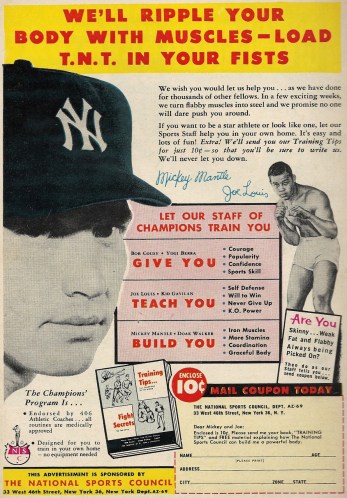
Is there a greater symbol for both the indestructibility of youth and the fragility of the human experience than Mickey Mantle? The man whose very name — alliterative and straight out of a comic book — screamed larger-than-life manliness nevertheless tore through his body like a cheap pair of drawers. The fresh face you see above is forever young in our baseball diamond memory, but our last look at Mantle, emaciated and more than a bit embarrassed by how he abused his gift of life, will endure just as long.
So maybe this course had “drinking yourself to a kidney transplant and an early grave” as part of its curriculum, to go along with greats like Joe Louis imparting their Charles Atlas-ish “K.O. Power” wisdom.

Apart from the surprisingly entertaining first entry into the live action Transformers series, Hollywood’s adaptations of treasured 1980s Hasbro properties have been flat out bad. Outings II and III of the robots who are More than Meets the Eye were increasingly crude blockbusters with crescendoing levels of mind-bending stupidity, and the first installment of G.I. Joe was just as dumb, a muddle that nearly smothered a franchise in the cradle. Rise of Cobra turned out to be a Wayans-infused pile that forgot what made the Joes so great in the first place, and had all the principals connected from their youths in a way that shrunk a universe that should have been expansive. Part of the charm of the toys, cartoons and comics was that the warring rosters of Real American Heroes and Cobra were seemingly infinite, a covert ops equivalent of life’s rich pageant. Need a Cajun Marine? We have one! Twin brother arms dealers? We have them! A sailor with a parrot? Those too!
It just didn’t get it.
The almost year-long delay for the release of the follow-up, G.I. Joe: Retaliation, did nothing to evaporate the fog of concerns about whether it would be more of the same. Well, I’m here to tell you that it’s not just as bad. No. IT. IS. WORSE. Remember in the cartoons when they’d have the five-part miniseries where Cobra would develop some improbably weapon of mass destruction, something that would harness oddball energies and then threaten global capitals with annihilation? Sitting through this mound of awful feels like Cobra founded a movie studio for the sole purpose of crafting a soul-crushing film, one that would succeed where their other schemes failed. If you watch this film, you will yawn. You will check your watch. You will cover your face in embarrassment, and thank the dim light of the theater for obscuring your face, because God help you if anyone knew that you bought a ticket to this drivel (though the other person would have bought one too, so you’d both be standing in barrels of gasoline while holding matches).
Some thoughts, including a few spoilers, so tread carefully (though being spoiled might save you time and trouble):
- Most of the rumored reasons for the delay from a Summer 2012 to a Spring 2013 release revolved around reshoots that would have fleshed out the screen presence of Duke, played by the newly Magic Miked Channing Tatum. (He is, for some unholy alchemy, now a star.) SPOILER: He dies about fifteen minutes in, after several bro bonding scenes with Roadblock (played by the Rock), which feel tacked on and feature inane dialogue that might have been written by a team of gibbons. If these are the products of the reshoots, then the delay was a complete, utter failure. Remember in Iron Man 2 when Tony and Pepper would talk over one another and you just wanted to scream shutupshutupSHUTUP at the screen? Same here. Except the words that you can make out in this case make that other sequel look like King Lear. And yes, the Duke death scene that wasn’t a death scene in G.I. Joe: The Movie, where he was speared through the heart by one of Serpentor’s snakes, was better executed. The flimsy cartoon had more emotional heft. Unreal.
- The cast of characters has undergone a massive overhaul. Gone are Scarlett, Hawk, Destro, etc., with Snake Eyes (sans lips, one of the few improvements), Storm Shadow, Duke, Cobra Commander and Zartan-as-President returning. Flint (played by DJ Cotrona, who was Superman for about five minutes), Lady Jaye, Roadblock, Jinx and Firefly round out the new additions. If it’s possible, the cast seems more claustrophobic than the first time. All of G.I. Joe, an organization that had a damn aircraft carrier — repeat: AN AIRCRAFT CARRIER — back in the day, can apparently be wiped out by one desert attack with a few heavily armed choppers. Fantastic.
- Editing is like refereeing in a basketball game, in that you only notice it when it’s bad. There’s horrendous editing in this movie, a dizzying back and forth between things you could hardly care less about to things you couldn’t care less about, with clunky ADR tacked on in a vain attempt to grease the skids. It’s choppy storytelling, though the profoundly stupid script carries most of the blame for the whiplash. You’d think there could have been some extra time in the editing bay during the lengthy delay, though. (Maybe there was. And maybe that’s the problem.)
- Walton Goggins shows up as an over the top warden for a super-duper-max prison. He used to be on The Shield. Remember how great The Shield was? Yeah, focus on that.
- Last week I wrote a brief post about one of the fun old Larry Hama G.I. Joe comics, which had Storm Shadow and Snake Eyes fighting side by side. SPOILER: They do here, too, though Storm Shadow’s sudden turn makes absolutely no sense, in that there’s no personal revelation that would make him turn his back on Cobra Commander and about-face to the Joes, just something he’s apparently known all along. It’s a “twist” straight out of the Michael Bay School of Just Because Filmmaking.
- If there’s one thin root that you can cling too as you’re plummeting over this plot cliff, it’s — oddly enough — a raid on a mountain Cobra/ninja redoubt carried out by Snake Eyes and Jinx. You’ve seen some of the rock-face fighting in the commercials and trailers, and there’s indeed some speed and acrobatic action to be had, though the editing, once again, often renders it a whatjusthappened mess.
- Cobra Commander is called Cobra Commander and wears a silver mask this time around, which is a plus. But he’s barely in this and has very little to do. So that’s a minus. A huge part of the old cartoon’s success was that it understood that good vs. evil stories, like professional wrestling, really connect when the villain/heel is one you love to hate. (The producers should have picked the brain of the Rock, a man who’s had major heel heat more than once in his wrestling career.) You never get a chance to know this Cobra Commander, so it’s really hard to hate him. He’s nothing, a cipher. Give me the screeching schemer with the hissing lisp any day of the week.
- There are leaps of reasoning and logic in this movie that threaten to tear a hole in the space-time continuum. Lady Jaye figuring out that the President isn’t the President (WHICH WE KNEW A MOVIE AGO) is riddled with such pseudo-science babble, you’ll shoot whatever you’re drinking out of your nose. (The guy in the seat behind me laughed out loud as she prattled on. In that one moment, I didn’t feel so alone.) And there’s the point when they go to rescue the real President — without ever figuring out where he’s hidden, they just know all of a sudden — where I had to restrain myself from standing up and bellowing WHAT THE HELL IS GOING ON HERE to any who would listen. (In retrospect, maybe Storm Shadow told them off-screen. Or maybe it was onscreen. I was probably bashing my head into the back of the seat in front of me when this secret was revealed.)
- Bruce Willis plays the founder of the Joes, Joe Colton, a retired general with a home arsenal that would make Mayor Bloomberg faint. I have no great love for Willis, but seeing someone with genuine movie star stature slumming in this was rough. The first Die Hard was so, so long ago. So was Moonlighting, for that matter.
- This is also playing in 3D. I didn’t see it in 3D. My mind can’t even process how awful this would be in 3D. It might be the thing that starts the Zombie Apocalypse.
You have been warned. G.I. Joe: Retaliation feels like someone welded Zero Dark Thirty to a Justin Bieber concert. It’s that awkward, and that bad. I thought last year’s Ghost Rider: Spirit of Vengeance retired the Awful Sequel That Should Never Have Been Made trophy, but this movie outdoes it, as hard as that is to believe. Avoid it like the plague.
One half of a Snake Eyes tattoo out of five:

Behold, the most nondescript Spider-Man- and Captain America-infused subscription ad in the Marvel repertoire
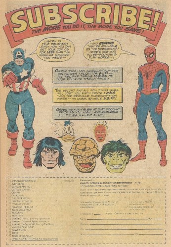
Subscription ads tend to have a hook, something to draw the reader’s attention and, hopefully, comic book dollars. You know, a poodle jumping through a flaming hoop or something, like an implied threat from the Kingpin or a frustrating Mxyzptlkian word scramble. This one has little of that, just some smiling faces (Conan’s is a tad out of place) and some weak alliteration from the web-slinger. Maybe the hook is the cigar that looks to be burning through Howard the Duck’s beak.
Indiana Hulk and the Raiders of the Lost Whatever

Memo to Hulk: If you’re entering a dusty room/cave/crypt/whatever, and you plan on removing a gleaming golden object from a pedestal, make sure you bring a bag of sand equal in weight to the object about to be removed. And be sure to measure said bag of sand down to the last milligram (though any giant rolling ball booby trap would present less of a challenge to you than certain 1930s archeologists).
This dictum applies even if you’ve entered the room/cave/crypt/whatever through the 2001: A Space Odyssey monolith.
Wow, the first appearance of the Stranger sure has a great Jack Kirby cover! And that cover also makes no sense! – X-Men #11

It’s hard to quibble with the layout genius of Jack Kirby, but sometimes even the giants, in their desire to craft an image that looks good, create a visual muddle that makes no sense whatsoever. X-Men #11, featuring the first appearance of the Stranger, and whose classic cover is seen above, seems to fit right into that good/bad dual groove. Let’s consider all that’s right and wrong with it (inks by Chic Stone):
- First, it has to be said: this cover is nothing if not visually arresting. Our first — literally — impression of the Stranger is that he’s some giant nightmare mustachioed pharmacist. Here he’s attired in slacks and a white lab coat, the latter of which is oddly appropriate for his quasi-scientific inter-galactic collection of mutants, and his red and green tights and cape have yet to make their debut. And you know what? That’s not such a bad thing. He’s crouched down in a pose you might find in an old Bruno Sammartino publicity photo, and he’s ready to lunge his way into our hearts. That’s he’s set against the detailed but gray background of the city skyscrapers only accentuates his dominance of the image. However…
- The people on the sidewalk appear to be watching the X-Men. Fine. Dandy. But what are the X-Men doing? Professor X and Marvel Girl are the only ones who seem to notice the giant septuagenarian with the bushy eyebrows coming at them. And the others…
- What are Angel, Cyclops, Iceman and Beast doing? Where are they going? Are they fleeing from the Stranger? I’d say no because they look like they were going this way in the first place. And just when you think you might have it all explained, you come back to the spectators, none of whom are craning their necks to get a gander at the giant dude hovering above them. If the Stranger just appeared out of thin air or strode out of the building behind him, then why are the X-Men there in the first place? And why are they fleeing/flailing? Were they doing gymnastics in the middle of the street, tying up traffic and making a mess of everyone’s commute? Would this explain mankind’s hatred of mutants?
Sadly, there are few clues to unravel these mysteries found in the story within, in a plot that has the Stranger completely outclassing Magneto and his Brotherhood of Evil Mutants. The cover scene is never replicated, and the closest we get to it is when the newly arrived Stranger (after renting a furnished room — how delightful the Silver Age could be) goes out for an Earth-acclimating stroll, which includes walking on air and phasing through walls. Go ahead and bask in one of the innumerable 1960s Marvel scenes set on Stan Lee’s verbose New York City streets:

And that’s it. So the cover stands as an appealing muddle. Should we treat the damn things like puzzles, waiting to be parsed and solved? No. But that doesn’t mean that they can’t make you scratch your heads now and again. Even the King could throw out a “Huh — what?” on occasion.
(Note: This could simply be me having a brain lock. Wouldn’t be the first time.)
Cyclops and his off-puttingly tiny hands would like you to fall into step with the Merry Marvel Marching Society

There seems to be an implied threat with Cyclops here, in that his itty bitty right hand his only inches away from tapping the side of his ruby-quartz visor and zapping you into oblivion. JOIN THE M.M.M.S. OR DIE, MARVELITE. Another cross to be borne for the leader of Professor X’s gifted youngsters, I suppose. The guy can’t even look at you without making you flinch in fear.
I recall the Lord of the Rings trilogy giving Middle Earth nerds the chance to have their names in the credits to Expanded Edition DVDs. Same principle here, I guess.
This Life Savers find-the-words puzzle comes pre-marked to jump start your comic book defacement day

Every time I see this 1980s ad, I think that someone — who appears to have little patience or perseverance — has already taken a pen to it and ruined an otherwise pristine comic . But then it becomes clear that the red outline around “APPLE” is a built-in guide, should the slower young readers not pick up on the gist of the exercise. So it’s still just defacement in waiting, like any number of Oreo or Fruit Stripe Gum ads. Breathe a sigh of relief, everyone.
When an adaptation of an adaptation of an adaptation flops – Marvel Super Special #38, “Red Sonja”

There are times when a film adaptation of a comic book property hits all its marks — last year’s Avengers being a prime example. In those magical moments of cinematic alchemy, everything from casting to costumery comes together to bring newsprint panels to three-dimensional life. Fans sit back together and sigh with relief, letting all their trepidations, their invested agita, out as they exhale. Church bells peal, strangers embrace on the streets, and Jupiter aligns with Mars. Those are rare times, and rare films, to treasure.
Red Sonja was not one of those movies.
It’s easy to forget how utterly dreadful the Dino De Laurentiis production of one of Robert Howard’s distaff creations was — indeed, it made the underwhelming Conan the Destroyer look like Ben-Hur. A lot of that forgetfulness has to come from the viewers’ brains going into survival mode as soon as the credits rolled, suppressing all memories of the cast and plot and expunging them from the books like old misdemeanor arrests. Because if it didn’t, if there wasn’t this palliative amnesia, how could any of us face the day? How could anyone bring children into a world where such darkness existed?
I’ve watched Sonja three times in my life, each viewing coming about a decade apart from the other. By then I’ve forgotten everything about the plot, and just recall that Arnold Schwarzenegger is in it, that it shares a sword and sorcery sheen with the Ahnuld Conan films, and hell, how bad could it have been? And then I watch it and feel like someone from Monty Python has just slapped me with a fish.
Crom, it is awful.
Brigitte Nielsen, whatever her 1980s charms may have been (she was great in her way as the icy Mrs. Drago in Rocky IV), was woefully miscast as the titular auburn-haired warrioress. Her Sonja seemed put upon, thrust into a role she hated, while the Sonja of the comics reveled in bloody combat, making her name not just about the tresses. The character onscreen might as well as been Vanilla Sonja. Or Beige Sonja. Take your pick of bland Glidden paint colors. Whatever you call her, her swordplay was weak, and her presence was weaker. It was as if no one involved in bringing Sonja to life had ever even flipped through one of the glorious Frank Thorne comics. Which is some sort of crime, right?
And Schwarzenegger? Roped into the production with the bait-and-switch promise that his role would be minor, he turned in one of the weaker efforts of his glory days. He wasn’t into it and it showed, and his flirtations with the man-hating Sonja were stab-yourself-in-the-face awful. If nothing else, the film stands as proof as one thing: Arnold can be a fun part of a good film, but can’t elevate a terrible film.
The general malaise that stuck to the whole enterprise carried over to the Marvel Super Special adaptation. Keep in mind, this was part of the marketing for a big-screen Marvel property. If there was ever a time for the House of Ideas to pull out all the stops for a book, this was it. But, perhaps reflecting the god-awfulness of the movie, the MSS is a skeletal, pro forma effort, like a DVD with only the movie lasered onto its surface. There are no behind the scenes photos, no lengthy articles detailing the ins and outs of the making of. Just the comic, and even that had a flat, rushed feel to it. The talents of scripter Louise Simonson, penciller Mary Wilshire and inker Vince Colletta are too well-established to blame them. The only explanation(s) for the drab affair? Poor source material and the debilitating misuse of a fantasy icon.
Imagine this as a tennis match, with Marvel serving a pristine ball over to Hollywood, and it coming back covered with slime and manure. Is it any wonder that Marvel volleyed the return into the stands?
The “plot” reproduced therein (quotation marks are very much in order here) copied many elements from Conan the Barbarian, including Sonja being orphaned by an attack on her family and wrenched from her pastoral existence. There follows a quest, as Sonja seeks something or other and revenge upon an evil queen (played by Valeria of CtB, the sleep-walking Sandahl Bergman) who’s still peeved about Sonja scarring her face years before. Arnold strolls into frame long the way, as do a bratty prince sans realm and his long-suffering manservant. Here’s Richie not-so-Rich getting a swords(wo)manship lesson from Red, with all the phallic implications that could drive a confused youngster wild:

Panel #3 — we get it, kid.
That is, in some respects, the high point of the adaptation. Well, unless you count the sparkling wordplay between our two romantic leads:

Whatever.
Instead of the omitted special features, there are several pages of Sonja pinups, i.e. the things artists can churn out in a few minutes and slap in as filler. It’s safe to say that this one, from the back and doubling as an ad for the regular Sonja series, outclasses everything slapped onscreen:

Red Sonja popped up in entertainment news relatively recently, when Schwarzenegger confirmed the long-rumored affair with Nielsen during the movie’s filming. Other than the well, yeah reaction (and rendering her brief marriage to Sly Stallone sloppy seconds), that served to bring a mercifully forgotten film back, albeit briefly, into the public consciousness. Thanks a bunch for that. And this Super Special stands as some permanent grave-marker of the failed experiment.
We can at least take solace that the Nielsen She-Hulk never got off the ground. One property saved.
Relive the Spider-Man Atari 2600 game, and all its two-dimensional, bottom-to-top, frustrating wonderment

Spider-Man was the first video game for a Marvel Comics character, and it occupied a prime spot my old Atari 2600 cartridge line-up, right alongside Asteroids, Combat, the bewildering Raiders of the Lost Ark and the ghastly E.T. debacle. It was great having the web-slinger under your control, but the limitations of early 1980s gaming meant that he was shorn of all powers but his webs (which, this not being the modern Raimi interpretation of the character, wasn’t a power at all), and was thus made little more than a becostumed George of the Jungle. The object of the game was to scale a yellow skyscraper (Follow the yellow brick building…), and avoid letting your web-lines fall on windows (either they were open or Atari 2600 webs couldn’t stick to glass) and henchmen that could interrupt your progress. The meter that measured your web reserves was like a countdown to doom because, most crushing of all, if it went down to nothing, Spider-Man would plummet to his doom on the sidewalk below. He’d splat right onto the ground, his limbs raised to the mocking heavens like one of his flattened arachnid cousins.
Relive some of the gameplay, complete with Spider-Death:
At the top of the building lurked the Green Goblin, and it’s hard to put into words the icy fear that would grip five-year old me when he’d appear, moving from side to side and presenting a challenge that infantile reflexes and motor control could never hope to match. And if you were lucky enough to get past him and defuse the bomb he guarded? You got to do it all over again on a differently colored structure, with things moving a bit faster as the rounds advanced. In short, like every Atari game, things got repetitive, and the game was inevitably shunted to the side. What kid wants to kill Spider-Man on a regular basis?
And the print ad? Not much to comment on, other than the Jazzy John Romita stylings lacking the in-your-face nightmare fuel of the TV commercial, with its cackling live-action Goblin — GAH KILL HIM:
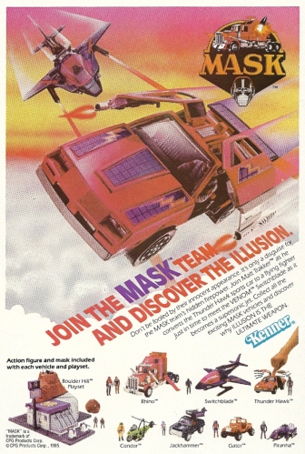
Take note, Mr. Mxyzptlk subscription ads with backwards-spelled words: THIS is how you get a reader’s attention. A kid sees a flying car with DeLorean door-wings (it’s actually a Camaro) soaring above the clouds, its machine guns blazing, and can’t resist. It would be a miracle if he didn’t rob his mother’s purse and hitchhike to the nearest toy store. Or hell, carjack his way there. This was Kenner-made crack. The Matt Trakker action figure with the removable mask was just gravy.
Trading Card Set of the Week – Marvel Universe (Impel, 1990)

Behold, the granddaddy of them all.
Though there had been several comic book-related trading card issues before Impel got into the game, none had taken the serious, company-wide approach that was seen in the first of many Marvel Universe editions. Character cards. Original art. Statistics and summaries on the back. It was like a bell went off in someone’s head and they realized, Wow, if we took what they do with baseball cards and did them for the comic book characters that the kids seem to love, we might be able to make some real scratch. Yes. Yes they could. And did.
This inaugural edition hit like a bolt out of the blue. If a kid was at all susceptible to the twin temptresses known as cards and comics, seeing the display box above on a countertop was irresistible. And if there was any allowance money left over, there were packs to be bought.
Packs? Someone say packs? Here are the wrappers — try to resist the urge to reach through your computer screen and tear them open:

There were 162 cards in the base set, and five hologram chase cards (since they were just holographic reproductions of regular cards, this is the last we’ll speak of them). Marvel and Impel didn’t half-ass it with the design, either. They were printed on smooth, pristine white stock, as opposed to the more cardboardish material that was by then falling out of vogue — the kind of material that made the backs of treasured oldies like the Close Encounters set so dim.
The best way to appreciate them is to look at a few, so let’s get to it.
Just gaze on the beauty of the card commemorating Cosmic Spider-Man, the frontcard as it were of the line:

For some reason, the Shadowcat card is another from the hero portion of the set that stood out when I was 12, and it still does. She’s looking a bit coquettish, perhaps further exploring the burgeoning womanhood heralded by the Kitty Pryde & Wolverine mini — not to mention she’s carrying Lockheed around like one of Paris Hilton’s purse-dogs:

The card backs for most characters had the stats you would expect: Name, Height, Weight, etc., as well as brief bios and trivia. There were also wins and losses tallied up, with arbitrary amounts of each (Galactus had a surprisingly high loss total — were there Fantastic Fours on multiple worlds?). Then there’s Aunt May’s card, which has a totally different slant:

I have to admit, the “Life-Threatening Illnesses Recovered From” generates a chuckle every time.
What’s that you say? You want super-villains? Well, how about one that’s going to be in the next Marvel movie, Iron Man 3? Here’s the Mandarin, who looks like he’s wearing the Silver Samurai’s armor and, thanks to perspective, appears to be the size of the Statue of Liberty (Attack of the 5o Foot Mandarin):

I highlight this Mephisto card back only for the Did You Know? on the bottom, which reads like a desperate Dear Parents: We Aren’t Selling Your Kids Satan Cards disclaimer:

Among the subsets are some featuring Marvel “Rookies.” A few, like the Dan Ketch Ghost Rider, would have some legs. Foolkiller? Not so much. The Guardians of the Galaxy are amongst the new blood and they have a movie coming out next year, but good luck finding any members of the cinematic roster in their team photo:

There are a ton of Famous Battles cards, and, like the favorite chase card from the first Marvel Masterpieces, the Silver Surfer vs. Thanos card takes the prize here — couldn’t get enough of these guys back then:

Though the cards are awesome, that doesn’t mean that there aren’t a bunch of duds. M.V.C. (Most Valuable Comics) cards show off the covers to pricier comics, and a bit of info about them — including their (then) current Overstreet book value — on the back. The usual suspects are there: Amazing Fantasy #15, Fantastic Four #1, Journey into Mystery #83, etc. But — who the hell let The Punisher #1 in?:

The set wraps with cards featuring Spider-Man doing “humorous” interviews with other Marvel characters. There are a couple of problems with this: First, we’re suffering Spider-Man overload at this point. He’s already had three individual cards (original, black costume, Cosmic) and multiple Famous Battle appearances, and enough is enough. Second, they’re beyond stupid:

And that’s one of the better witticisms. (Here’s a suggestion, Thor: Bash both your heads with Mjolnir, and end our suffering.)
The set ends with a horrifying Stan Lee card, where his smiling face takes on characteristics of his myriad creations. The less said, the better.
These last bits are downers, but should in no way negate how magnificent the cards were when they came out, and how neat they remain to this day. Like pretty much everything produced back then, you can still find unopened boxes on eBay, but you’ll likely have to pay upwards of $50 for an unopened box of these. (I lucked out once and got a bargain on two. I opened one, and managed to get two full base sets out of it, for whatever that’s worth. The other is salted away in the archives.) That latter-day price point has more to do with quality than scarcity. This set understood that simplicity could sell, a principle that would be abandoned soon enough, as it became more and more important to throw in bells and whistles to distinguish products from the crowd. These cards were colorful. They were fun. There was some dreck, but it was made irrelevant by all that felt oh so right. Twenty-plus years on, they still shine.
When Snake Eyes and Storm Shadow team up, readers smile while the heavens (and Cobra) tremble – G.I. Joe #46

There’s another G.I. Joe movie coming out in two weeks, after a bizarre delay that saw its release pushed back from last year’s natural summer window. Instead of coming out alongside other dopey “blockbusters,” G.I. Joe: Retaliation will have a spring opening, and we’ll see if the re-shoots and the promotional tie-in with the Rock’s upcoming Wrestlemania appearance will help. Color me skeptical for any number of reasons, mainly because the first one was so juvenilely bad. (That Duke and the Baronness and Cobra Commander were so personally intertwined made it feel like G.I. Degrassi High: The Motion Picture.) Couple that genetic coding with the odd, lengthy time in the can, and Retaliation has TRAIN WRECK written all over it. Yes, in bold caps.
That the cinematic Joe universe is so underwhelming is a shame. Why? Because there’s so much to build upon. Not just a venerable, multi-generational toy line, not just the colorful Sunbow cartoon so revered by boys of a certain age (who can quote its G.I. Joe is the code name for… mantra by rote), but also a classy Marvel comic book series. The last, though the least flashy of the bunch, was perhaps the best, as it brought a degree of veritas to the fantastical and consistency in the form of its beginning-to-end scripter, Larry Hama. A veteran himself, Hama grafted off the tough as nails reality of the original toy line and pasted it over the outlandish uniforms and tech of the new Joes, not to mention that Ruthless Terrorist Organization Determined to Rule the World. (This was a very good thing, because as much as we kids loved Shipwreck, a supposedly elite fighter wading into battle with a wise-cracking parrot named Polly on his damn shoulder would have stretched even childish credulity to its breaking point.) That he was there from pillar to post, 1-155, occasionally tackling the art duties as well (his silent issue (#21) remains an industry touchstone), brought long-term vision and stability that can be cherished in retrospect. Yes, new toys and new characters had to be incorporated from time to time to appease the Hasbro overlords, but it was done with a minimum of upheaval. Is it any wonder that it pretty much doubled the run of its corporate cousin, The Transformers? (Even I, an wild-eyed Optimus Prime partisan in my youth, can admit the superiority of the Joe comic.)
To coincide with the release of the new movie, it seems a fitting time to look at a comic, any comic, from that venerable run, and the one whose cover you see above seemed perfect. Two reasons: 1) Snake Eyes, 2) Storm Shadow. Really — when you put these ninja mofos, these erstwhile sword swinging, scissor kicking enemies side by side, how can you look away? They’re the very essence of what has made the 1980s version of the line last to the present day. Seeing the two of them together is like in the old days of the World Wrestling Federation, when uber-good guy Hulk Hogan teamed with the once uber-villain Macho Man Randy Savage to become the Mega Powers. Foundations were shaken, poles shifted, and everyone got the hell out of the way.
Well, same here. Snake Eyes never went rogue, but Storm Shadow was a bit more mercenary in his allegiances, and his code of honor allowed him to be on the side of good from time to time and hence align with his blood brother, Mr. Eyes. This happened more often in the comics — another plus in their category. And when they started swinging their swords and firing assorted projectiles in one direction, as they do in this issue, batten down the hatches.
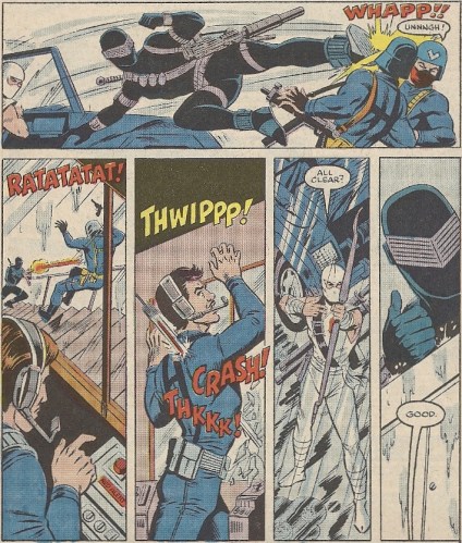
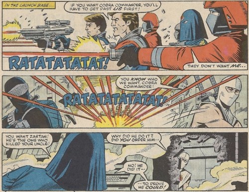
Here, in the midst of a multi-comic arc, they infiltrate a Cobra base in search Zartan, the object of their ire and their revenge target (he killed Hard Master). How efficient are they as ninjas? Their silent-but-deadly skills get a much-valued Snake Eyes thumbs up! (Rod Whigham: Pencils, Andy Mushynsky: Inks):
Eventually they ass-kick their way all the way to Cobra Commander, who was a bit tougher in the comics, instead of the oft-bumbling, RETREAT-bellowing cartoon coward who got replaced by nutcase Serpentor in a palace coup. But comic-CC isn’t so brave that he won’t hide behind Tomax and Xamot and immediately give up the goods:
(Personal note: Never liked Cobra Commander’s Hate Monger hood. Mirror visor mask for the win.)
And there you are. Snake Eyes and Storm Shadow, together again for the umpteenth time. Do you really need more? And who knows if the latter will make a face-turn in a couple of weeks, instead of trying to kill his former dojo classmate. More importantly: Who cares? It seems like whatever we have in store will be just as insipid as the last installment. And could it ever hope to live up to the depth that Hama offered during his 150+ epic?
This Mr. Mxyzptlk ad appears to offer you a deal, at least it does if you can wade through the backwards spelling

Mr. Mxyzptlk and the backwards speech that’s supposed to send him back to his 5th dimension home are fine in small doses, but when you have to machete your way through a whole paragraph of that crap, it’s a bit much. It’s like a Zatanna spell straight from Hades. Aren’t ads, even those for comic book subscriptions, supposed to be straight-forward and easy to digest? Isn’t that the point? Wasn’t this principle well-developed even in the late 1960s? Isn’t an ad that gives you a headache and makes you quit reading it halfway through just about 180 degrees away from where it should be?
The least DC could do is give you three months free on each book ordered, in honor of Mxyzptlk’s 90 day return ban. Or a complimentary purple bowler/derby hat.

