Elementary, my dear Blog into Mystery – Classics Illustrated #33, “The Adventures of Sherlock Holmes”
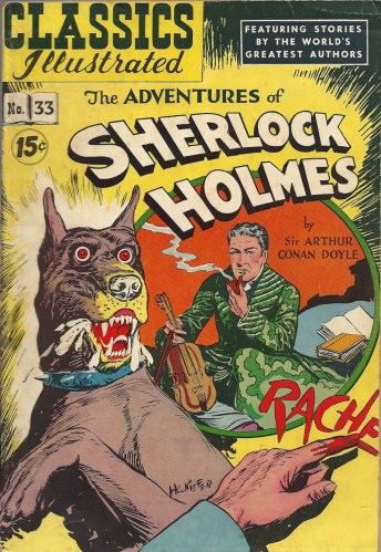
The dog on the cover looks like a possessed Scooby-Doo, no?
I’ve taken a quick gander at a couple of Classics Illustrateds before, but I didn’t find them to be all that good. They were stiff and listless and did little justice to the souce material. This one, though, was quite enjoyable, surely thanks to the presence of the world’s greatest detective (apologies, Batman), Sherlock Holmes. He’s quite possibly the most adapted character in all of fiction, so much so that people are more familiar with the myriad adaptations than the original Arthur Conan Doyle stories. It should come as no surprise that he would in turn translate well into the comic book medium, and the story presented here, “The Hound of the Baskervilles,” has a tinge of the supernatural that’s well-suited to this arena.
The art, from Henry “H.C.” Kiefer, is what appeals to me most with this one. I often find Golden Age work (this issue was originally published in 1947) to be rigid and unexpressive, but Kiefer’s stylings are quite good. I think a lot of that has to do with the deep, moody inking, and I’m not 100% certain that Kiefer was responsible for that, but since he’s the only credit for this comic that I can track down I’ll give him the benefit of the doubt. If anyone wants to prove me wrong, please fire away in the comments section.
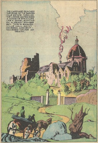
This full-page blast shows Holmes and Dr. Watson arriving at the Baskerville manor — the scene has a broad cinematic scale to it:
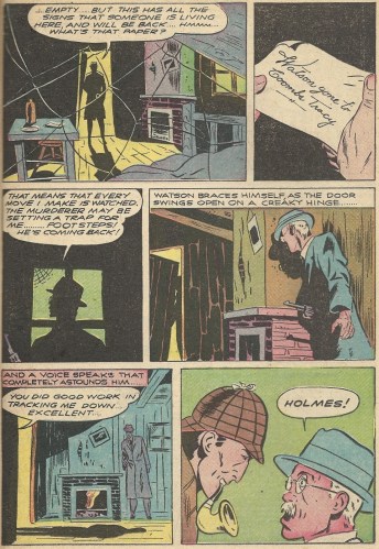
There’s plenty of room for spine-tingling moments throughout the pages of the comic:
Oh, that Sherlock — what a merry prankster.
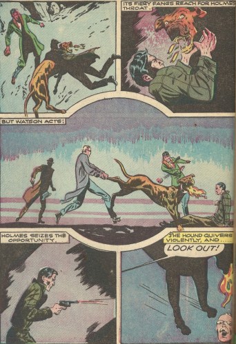
I very much liked the layout of the action in this page, as Holmes and his companions battle the eponymous hell-hound. Check out the championship-belt-shaped panel in the middle:
Bad dog!
This might just be another case of me being crazy, but I see a little bit of 80’s Keith Giffen in the art here. Something about the broad blacks and angular faces is evocative of his more abstract style (or perhaps it’s vice versa). In the past I’ve posted some scans of his art — you can find those here and here if you want to compare.
I could be imagining things. But, as Holmes himself would say, “Once you eliminate the impossible, whatever remains, no matter how improbable, must be the truth.”
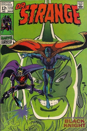
Bring back the ‘stache! – Doctor Strange #178
There have been many ill-advised costume changes in the history of comics. They usually tend to be the New Coke of graphic storytelling. Disasters.
For an oh-so brief moment in the Silver Age, Doctor Strange had himself a new set of duds. And a mask. The storytelling reason for this change was so that he could conceal his identity. I’d suggest some manner of spell might work and would also be right up his alley, but okay, a mask might do in a pinch. A big part of the good doctor’s appeal, though, such as it is, is his look. And that look includes a glorious moustache. And that moustache cannot be seen through a mask.
I think you understand the problem here.
The change didn’t last long, so I guess we can’t complain.
Roy Thomas, Gene Colan and Tom Palmer handled the respective scripting, pencilling and inking chores on this one. In “…With One Beside Me,” Strange has to travel to another dimension (what else is new?) to recruit some foot soldiers to aid him in battle against Surtur and Ymir the Frost Giant.
Tall order.
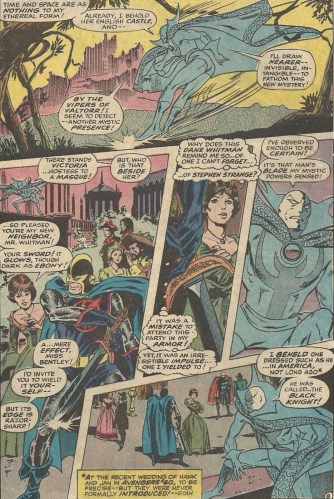
He needs another mystic to help him, so he zaps over to the British Isles to recruit fellow spellcaster Victoria Bentley to his cause. He finds her ogling the Black Night’s sword at a fancy soiree:
Yes, she’s admiring his long ebon sword, which is dangling betwixt his legs. This calls to mind all manner of humorous phrases, though I’ll refrain from writing them down. But why not let Burgess Meredith uncork a few, even if they aren’t all that germane?:
Moving on.
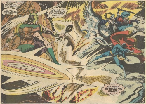
Strange gets a two for one bargain — while Victoria stays behind to anchor him in his home dimension, the Black Knight accompanies him to the realm of the evil Tiboro.
Huge two-page splashes weren’t all that common back in the Silver Age, but this one, which marks the opening of battle between the two heroes and this issue’s big bad, shows Colan at his fluid best:
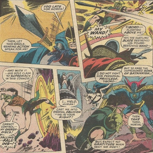
After some back and forth, the Knight uses that attention-getting sword of his to finish off Tiboro:
His mission accomplished, Strange moves on to the next stage of his quest and the next issue as well.
Costume misadventures aside, this issue had its moments, but reading it got me to thinking about Doctor Strange and the other Ditko Marvel co-creation, Spider-Man. When going through Doctor Strange comics I’m always struck by how they’ve never really lived up to Ditko’s original work on the character. Spider-Man doesn’t have that problem, at least for this reader. I love Colan, and his work is cool as always in this issue, but I found myself wondering how Ditko would have depicted Tiboro’s realm, and Colan’s version was lacking in that imagined comparison.
Perhaps John Romita’s biggest contribution to Spider-Man was making it kosher for other artists to draw Spidey in the future. His art was different from Ditko’s, and he made Peter Parker more robust and less the nerdy teenager that he had been. But his contribution was on par with (and maybe surpassed) Ditko’s, and he started bopping four hundred foot home runs and breaking the backboard and throwing bombs downfield — pick your sports comparison — as soon as he came on board. I think Doctor Strange may have suffered a bit in the post-Ditko issues. The work was creditable, but it wasn’t up to those hallucinogenic backgrounds of Ditko’s that transformed every panel (it seemed) into an acid trip. And Doctor Strange has never crawled back out of the lower rung of the Marvel Universe.
I’m sure there are folks out there, and perhaps you, dear reader, who’d disagree with me. And I’m not sure that I buy all this myself. It’s more an impression than a carefully thought out theory, but that’s what this issue kindled in my addled synapses.
I think we can all agree, however, that Strange needs the ‘stache. Do you think he and Tony Stark ever catch the other giving loving looks to their thickly haired upper lip? Or that they take a quiet moment to compare notes on trimming techniques? They have to, right?
Questies? Questers? What’s the terminology? – Yearnings #1
Sometimes the ephemera associated with fandom is more fascinating than the subject of the fandom itself, but ElfQuest on its own is an extremely interesting property. For many years I dismissed it. I found the look of the main characters to be a little disturbing — they were small like children, but the men were taught and muscular while the women were buxom, and they all seemed to be baring lot of skin. This hypersexuality of small, childlike figures smacked of something that trod, if not closely to, at least in the direction of, pedophilia. To me, at least. Maybe that was the subdued Puritan in me coming out, or maybe I was simply looking for a reason to hate the it, but that’s how I felt.
And then I read the damn things and liked the stories, so who the hell cares about all that.
With ElfQuest, Wendy and Richard Pini developed a rich universe, one that (no surprise) created a quite lively fanbase. It should come as no shock to anyone that such success necessitated a fanzine. So we have (had) Yearnings.
Yearnings was an official publication, but the material from the Pinis was limited to the art on the front and back of the book and (from what I can tell) some editorial oversight. Here’s the mission statement on the inside of the front cover:
And here’s the table of contents, just to give you the gist of what’s inside:
A lot of the fan art, and I’m being charitable here, is dreadful. I applaud the fans’ enthusiasm, and some admittedly came from youngsters, but oy vey. There are more than a few diamonds in the rough, though. Here’s one submission that I half-liked:
Awww.
I didn’t wade through any of the text fan fiction — not enough hours in the day (or life), you know? So I can’t give you a detailed play-by-play of all that. Besides, fan fiction has always rubbed me the wrong way. I wish people would pump their creative juices into developing their own little worlds, instead of giving us their non-canonical take on the further adventures of copyrighted characters. But, again, a part of me applauds their fervor, and I suppose there’s some validation when it gets published in a sanctioned mag.
One last thing, an observation about the front cover. It’s nice to see Cutter, Skywise and a couple other Wolfriders welcoming some fans to the party, but am I wrong to be a little disturbed that one of the elves is carrying a jug of XX brand moonshine to the reveling? The fans all look underage, don’t they? Isn’t this the sort of thing that got Michael Jackson in trouble? Is there going to be some “plying” going on? Jesus Juice, anyone?
Whatever. Yearnings is a neat look into the early and burgeoning ElfQuest community, elfwarts and all. And for a title, the word “yearnings” strikes one as apt for a property so bound up with hardly contained eroticism.
I can’t tell you how many times I’ve been in desperate need of a plastic Thor pillow
I’ve always admired the P.T. Barnum aspect of Stan Lee in his glory days. He was an inveterate promoter, a huckster shelling for the delightful snake oil that was the Mighty Marvel Manner. And while I’m sure others had input into the merchandising that broadened the Marvel brand, the puffery involved had Stan the Man’s scent all over it. I’ve always imagined him travelling to early comic book conventions and selling t-shirts and mugs and sweaters and bed sheets and blankets and toys and beach towels out of the back of some beat down station wagon.
There’s a charm to all that. A roll-your-eyes charm, but a charm nonetheless.
That said, the plastic pillows may be the proverbial straw that broke the you-know-what’s back. Either I had never seen this particular ad before or I had just never noticed it, but the pillows sucked me in this time. They seem to be on a different level of unnecessary and stupid. I’m not sure if they were meant for folks who had the salivary equivalent of nocturnal enuresis or what. I guess they’re for the beach, maybe.
A final thought… If you’re a longer term fan of the Howard Stern Show, you’re well aware of the ribbing that former show writer and whipping boy Jackie Martling took in his years on the program. A lot of it was spurred on by his outside businesses. He never passed up an opportunity to hawk some useless junk to his (really Howard’s) fanbase, and it was a neverending source of amusement (and bemusement) to his cohorts. I found a couple of audio clips that perfectly sum all of that up:
There are some similarities between Stan and Jackie on this, and, to be honest, I love ’em for this foible. But the pillows? Come on, Stan.
Of Mice and Mice – Mouse Guard: Winter 1152 #4
I’m afraid I don’t read much new material. Let me amend that — I don’t read much new material as it comes out. If I see something relatively fresh thrown into a bargain longbox like remaindered books at a Barnes & Noble, then I’ll give it a look. My reason for not going having a pull list at my favorite local comic shop? I can’t afford to shell out money for new comics. I recoil at that $2.99 cover price. In light of my willingness to spend relatively significant sums of money for older comics, there’s some irony there. And perhaps an ill omen for the comics industry — hopefully I’m not the canary in the coal mine.
But I digress. Anyway.
I was quite pleased to stumble upon this little (no pun intended) series while rummaging around in a box of stuff one day. I’d actually read about Mouse Guard in some random publication a few years ago, but I put it into the “I’ll probably never get around to reading it” side of the ledger. I’m certainly glad I opened up one of the issues to take a look. It’s quite good.
Thus far there have been two six-issue series (this particular issue is from the second volume), with each installment written and drawn by series creator David Petersen. Every issue is brief, but there’s an astonishing level of depth to the storytelling involved. Set in medieval times in a world devoid of humans, the central characters, brave and noble protectors of their fellow mice, are always near the precipice of death. They travel in a world which is (much like the real early days of the last millenium) unforgiving and unyieldingly harsh. Petersen invests the mice — both through his scripting and art — with a level of pathos that grabs you immediately.
The art is detailed and speaks volumes in the limited space available. On this page, two of the mice have been torn from their temporary snow-shelter by a vengeful one-eyed owl. Despite their respective sword and battle-axe, they’re in deep trouble:
Look at the ice that’s formed on the fur of the mice. It’s a minor detail, but so eloquent. It puts you right there in the freezing air and the soft, muffling snow.
In a parallel storyline, the most brash and cocksure member of the Guard, Saxon, has offended the Bats who rule the abandoned Weasel Kingdom (just roll with me here) and has been plunged into its darkened depths. After awakening on a towering mound of mouse bones (as seen on the cover), he sets out to wind his way back to freedom. In his meanderings he comes across a skeleton whose cloak and sword he recognizes as belonging to his old teacher. The resulting moment is one that — I’m not ashamed to admit — brought a tear to my jaded eye:
That one sepia toned panel is all we ever get of Loukas, but that and Saxon’s tears (and maybe his little feet poking out behind him) are enough.
The comparisons to other animal properties, whether Watership Down or Mice Templar or whatever else, are obvious, but there’s a searing truth in the Mouse Guard universe that’s quite unique. There’s a frank quality to all aspects that’s quite gripping. I’ve become a fan.
A final aside — My grandmother was a wonderful lady who I spent a lot of time with growing up. She was indomitable, but she had a terrible, and I mean terrible, fear of mice. I was the one charged with cleaning out the traps in her house. I hated that. I liked the mice, and whenever I found one alive I’d pick it up and carry it outside and hope that it’d hop a train to another town or something. Better to be a mouse-hobo than dead, I figured. I felt so bad for them. That could add to my empathy for the mice in this book, but I think the quality of the work on display transcends whatever baggage I or anyone else might bring to the table.
You can find both mini-series in collected editions or, if you’re lucky like me, in your local bargain bin. It might make a nice Christmas present for someone, young or old.
Cripes, just get the kid a real dog already
Not just another Dick – Dick Tracy #2
You won’t find any of the classic square features of Dick Tracy in this book. This is an adaptation of an adaptation, though it doesn’t suffer from the watered-down dreckiness that such a desciption would normally imply. It’s the middle chapter in a Disney-published three-part series from 1990 — the first two issues (“Big City Blues” and “Dick Tracy vs. The Underworld”) acted as a prequel, while the third was a straight translation of the Warren Beatty directed-and-starred-in Dick Tracy.
Remember that flick? It amazes me how completely it has disappeared from the American pop culture memory. In the summer of 1990 you couldn’t turn on a television without seeing either an ad for the movie or a McDonald’s commercial for the tie-in game:
It speaks to the saturation of these commercials that I could remember the beats of that particular one 2o years after its airing without having seen it in any of the intervening years. It’s burned into my brain like a brand on a steer’s haunches. I swear, the Amish probably knew that a Dick Tracy movie was opening in June. Good God almighty, I ate a lot of hamburgers in the summer of 1990. And I didn’t win a damn thing.
On to the comic.
I think that there’s kind of an interesting meta thing going on with it. To explain… You couldn’t help but notice when watching all the hype surrounding Beatty’s Dick Tracy that Tim Burton’s Batman from the year before factored into its crafting and marketing. Both venerable and beloved characters got a serious treatment (a little less so with Tracy) with lots of action, big stars chewing the scenery (Tracy had Beatty, Madonna and Al ****ing Pacino), Danny Elfman scores and a carpet-bombing level of promotion.
A big part of the Batman surge in the ’80’s that culminated in the 1989 film was The Dark Knight Returns. It was an enormous success, drew scads of attention and opened up broader pop possibilities for the Caped Crusader. And we all know the signature style that Frank Miller brought to that comic. It was distinct. Somewhat primal.
These Disney Dick Tracy comics look a lot like that Miller/Dark Knight style.
Just for a couple of scans…
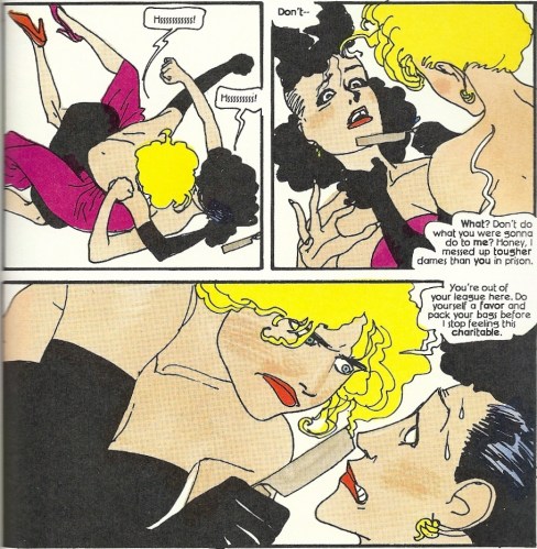
Here’s Madonna’s night club singer character in a blade-infused catfight with another broad:
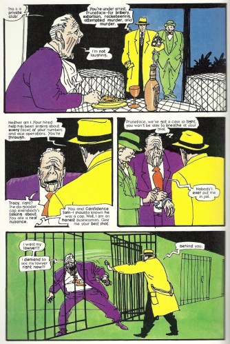
And here’s Beatty-Tracy hauling Pruneface to the hoosegow:
Kyle Baker handled all the art responsibilities on this title, from soup to nuts, pencils to colors. Am I crazy to see a bit of a similarity to Miller’s Dark Knight work? I don’t know whether any likeness was intentional (on the part of Baker or series scripter Len Wein) or whether it might have slipped in unconsciously, but the temporal juxtaposition between these two massive tentpole films makes me wonder. It’s as if they were trying to draft in the Batman franchise’s wake. I could be doing a disservice to the Tracy people by saying that, but this is, of course, only one schmuck’s opinion.
The two comic lead-ins are pretty good and are a nice trip through Depression-era avarice and crime, though the disconcertion of seeing Beatty’s face on a printed page Tracy never really lessens. The style that Baker employs, whether homage or not, is always interesting to the eye. They’re worthwhile reads.
Tracy the film wasn’t the big hit that it might have been, but it was by no means a flop. It was a colorful movie (And how could it not be, with a central character wearing a canary-yellow trenchcoat and fedora and a two-way wrist radio?) with lavish sets and costumes, but like I said above, it’s been largely forgotten.
Except for those damn McDonald’s commercials.
It’s hard for me to divorce any giant robot property from the Transformers. Just a consequence of the era in which I was raised, I guess. The 80’s were rife with giant ‘bots, whether they were autonomous like the Transformers and the Go-Bots, or were piloted, like Voltron, the Robotech mechs and (my personal favorite) Tranzor Z:
Throw the Shogun Warriors into the latter category.
I won’t rip or praise this particular comic — I don’t have the background with the property to really read “The Chaos Wars” in the proper context. And I always try very hard to separate these forerunners from the giant robots that I grew up with, but it’s hard. A weird mental gymnastics goes on in my head that somehow makes the older property a rip-off of the later. Know what I mean? And, as the cover would indicate, the main villain in this issue isn’t one that would exactly disassociate the Shoguns from Autobots:
Since he’s big, yellow and says “we,” you expect “We are Legion” to be his line. Green Lanterns beware.
The similarities continue — not only is the issue’s villain named Megatron, the hero robots transform:
By the way, Firehawk is called “Firebird” in the very next page. Oops?
Megatron even whips his arms together to form a gun, just like the Decepticon Megatron in the first live-action movie:
I’m all confused.
Herb Trimpe’s art isn’t at its best in this book, but perhaps that’s my bias for his stellar Hulk work coming through. I’m willing to consider that possibility. I will say that the first full-page interior scan that I posted has a nice scale to it. All things considered, the writing (Doug Moench) and art (Trimpe and Mike Esposito) aren’t bad in light of this being a simple vehicle to flog toys. Perhaps they made the best of it.
Shogun Warrriors, transform and roll out.
Worst Spider-Man drawing ever?
No, it’s not the worst. But when you consider that I pulled this ad out of an actual Marvel comic book, it’s pretty bad. You’d think that they might have some quality control when it comes to the Spider-Man image — I’m not saying that they have to have a John Romita Spider-Man for every squirt-gun glove or whatever else plastic garbage is being flogged, but still… This one is like the drawings I’d do as a little kid, where I’d get to the hands and say “screw it” and just draw round circles. And what’s going on with the face?
Remember when Wizard used to publish a few pages every month of drawings that fans would send in on envelopes? Maybe they still do, I don’t know. Some of the drawings were good, but some, well, some were awful. Bless the souls who sent them in, but geez. They didn’t hold up under close inspection.
Like this one.
Of gadgetry and fetishes – DC 100-Page Super Spectacular #14
These gigantic compendiums of reprints are sort of like the buffet platter of the comics world. You get a nice little sampling of material, some of which you may like, some of which you may not. In this particular installment, you get old tales from Batman, Robin, Wonder Woman, Wildcat, Blackhawk, Doll-Man and the Atom. The Blackhawk, Doll-Man and Atom stories are mind-numbingly dull, and the Robin appearance is in the lesser of the two Batman tales included. So we’ll take a quick look at the Batman (solo) and Wonder Woman entries, with a brief flyby of the Wildcat reprint. Sound good?
The theme of this collection seems to be the introduction of various trademark devices into each hero’s arsenal, and in Batman’s case we have a double dose. Called “Menace of the Monk” and “Showdown with the Monk” here, this two-part story, from Gardner Fox, Bob Kane and Shledon Moldoff, was originally entitled “Batman vs. the Vampire” and was published in Detective Comics #’s 31 and 32. It features the debut of the Monk and is filled with old old old-school Bat-things like a pipe-smoking Bruce Wayne and a fiancee, but its primary importance is the debut of the Batarang and a pecursor of the Batwing — here’s their first appearances:
Like any guy with a new piece of tech, Batman can’t wait to get the Batgyro out in the open air, and when he does he seemingly starts an Orson Welles/War of the Worlds-style panic:
That’s kind of an enigmatic look on his face there in the second panel — I wonder what’s going through his mind. Wait, I think I might have an idea:
A delightful gothic adventure ensues, and Batman squares off against the hypnotic powers of the Monk and some vampires and manages to rescue a kidnapped Julie, his aforementioned fiancee (that didn’t pan out, did it?). I found the events on the last page, after Batman melts down a silver statue to make some special bullets, to be rather startling:
Can you kill a vampire in cold blood? I suppose the “no guns” rule (and it should be noted that it hadn’t been developed at this point) could still be stretched a tad to allow for the delivery of some hot silver. The use of the gun makes you take a step back, though. But that’s one of the things I like about the earliest Batman stories — he could be one tough and cold S.O.B.
And then there’s Wonder Woman. “Invisible Ray” was orginally entitled “Diana’s Magic Lasso,” and was written by Charles Moulton with art from Harry G. Peter. I’ll give you one guess about what gift Diana gets from her Momma in this one, which first saw print in Sensation Comics #6. But before she receives that special gift she first travels to Themyscira, where she finds the Bondage/Lesbian/Amazonian Olympics in full swing:
Really, this is the kind of thing that knocked Kramer out of “The Contest”:
Diana gets in on the action, and wears a pert little mask to boot:
Lest we think that only Amazons behave thusly in a Wonder Woman story, there’s also the Nazi bitch villainess, who tests her invisibility ray in a most unique manner:
Why does she have to test the invisibility ray on her while she’s strapped to a bed? And why does the subject have to be in her underwear? Not that I’m complaining, but I ask you…
There’s some stuff in this story about Steve Trevor getting promoted and, along with Wonder Woman, foiling a Nazi scheme, but when you have Amazons lassoing each other while wearing variations of Madonna’s getup in “Truth or Dare,” who gives a *bleep* about all that?
One last thing… I’ve always respected the Ted Grant/Wildcat character because he’s just a guy with fists, pummeling evil one bad guy at a time. He’s testosterone wrapped in machismo. A man’s man.
And then I caught a glimpse of his motorcycle:
He might as well tie some tassels on the handlebars — the whiskers kind of outweigh the fangs, you know?
Good times.
Damn you, Alex Rodriguez! – Epic Illustrated #9
I was struck by the awesome majesty of this cover. Something about it calls back to my youth. I don’t know what. Something. And it makes one think — if they’re familiar with it — of one of the scariest “Oh ****!!!” moments in the history of film:
I think Jason and his Argonauts would have been in even deeper trouble if Talos had the lower body of a horse, don’t you?
Tim Conrad, the painter of the cover, also wrote a brief text story (“The Last Centaur”) that went with it. Though the prose half isn’t all that remarkable, I still think the painting rules. There’s also a concept sketch included on the inside, and the only difference between that and the finished product is that the statue of the centaur was headless in the planning stages. I’m not sure why the noggin was ultimately included — just one of those mysteries I’ll likely take to the grave with me.
And if you’re wondering about the title of this post, and have no idea about what it refers to, just do a Google search for “Alex Rodriguez” and “centaur.” That will tell you how a third baseman has forever ruined centaurs for me.
Superman and the Giant Cyclops Redux
A couple of months ago I posted a random ad that for an old World’s Fair exhibit that depicted Superman battling a big hairy cyclops. Here it is:
I was a bit bummed that I couldn’t find any pictures of the actual display and that my curiosity as to its actual appearance might remain forever unsated. I’m relieved to say that my cursory research wasn’t exhastive, and that a reader left a link in the earlier post’s comments section to a blog with a picture of the exhibit. Click here for enlightenment.
It doesn’t look as bad as I thought it would, but the cyclops is hairier than I imagined and far closer to being nude than I’d like. Thanks to “The Fandom Stranger” for the link.
Stay tuned for “Squirrel Girl-Venom” and “Pip-Venom” – What If…? #4
I’ve never cared much for the Venom character. I suppose it’s part of my superhero snobbery — he’s a part of the nouveau riche, parvenu class of characters that drove sales for a time but I could never get behind. Kind of like Cable. Venom’s a muscled up guy with Spider-Man’s old alien costume. And a long tongue. And saliva. Great. Fantastic. Can we move on now?
While “Venom” doesn’t appear in this What If…? comic per se, it still makes the character look a little ridiculous. Now that’s something I can get behind.
Danny Fingeroth, Mark Bagley and Keith Williams bring us “What if the Alien Costume had Possessed Spider-Man?” This may be some of Bagley’s earliest — if not the earliest — work on Spidey, a character he drew for roughly 10,927 issues. An added attraction, I suppose.
The title says it all when it comes to the story, and we learn that the divergence between realities (thanks to our pal Uatu’s narration) occurs when Reed Richards can’t quite figure out how to help Spider-man shake his tapeworm/costume. Before long the fully possessed Peter breaks free and lays the smack down on Richards and Doctor Strange:
Not so smart now, are you guys? Illuminati, Shmilluminati.
The symbiote trades up at the first opportunity, grabbing the mindless Hulk before Doctor Strange can banish him to the Crossroads (a Hulk storyline from back in the day, a part of which I covered in this post):
A pruney, prematurely aged Peter Parker is disgorged, and dies a little later on while trying to figure out a way to stop the symbiote. And if you’re curious as to what Hulk-Venom looks like, it’s pretty much the Venom you know and maybe love, except a little beefier.
The story moves towards a climax at Mount Rushmore (North by Northwest, eat your heart out), where an assemblage of heroes band together to corral the symbiote and its host. So who’s going to be the one to finally stop this rampaging Hulk-Venom? Why Thor, of course!:
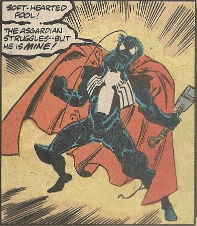
That wasn’t so hard. The symbiote slithers off Bruce Banner, who’s been drained of every last drop of Gamma radiation by the costume. Thor, being a dumb blond, never for a moment considers that the costume might be playing possum. Hey, Thor, look out!:
I’m not quite sure why the symbiote covers Thor’s whole body, including his hair, but leaves out the cape. Probably some weird reason, like why Superman’s cape gets torn to shreds while his costume-proper stays immaculate.
So the symbiote has sucked all the juice out of Spider-Man and the Hulk, and how possesses a Mjolnir-wielding Asgardian god. There’s no one left that can stop this Thor-Venom, right?
Wrong:
Black Bolt opens his trap, Mount Rushmore crumbles, and the symbiote deserts Thor and is rendered little more than a quivering puddle — a job well done. The heroes are still reluctant to kill it (kind of reminds me of that episode of Star Trek: The Next Generation when Picard couldn’t bring himself to drop a computer virus into the Borg that would kill every last one of them). Just as Doctor Strange is about to transport the insensate alien to the Crossroads, Black Cat shows up and zaps it with one of the weapons that Richards and Peter Parker were developing before the latter died. Then we have this melancholy final series of panels:
So she made a deal with the Kingpin to get her hands on one of the weapons. At the risk of sounding like a lecher, might I suggest that the Kingpin made a bad bargain? I realize that the Black Cat would be a valuable asset in his criminal empire, but I can think of other things I might *ahem* request of her. Then again, maybe that’s why the Kingpin is powerful and wealthy, and I operate a dopey blog — the man’s mind is always on business. I hope he at least got her to thrown in a lifetime supply of cigarette holders or something.
I think I could have lived a long, fruitful life without ever having beheld the silly wonder that is Thor-Venom. But that’s part of the joy of What If…? — you can dip into the preposterous without leaving any permanent marks on that precious little thing called “continuity.”
