Trading Card Set of the Week – Kingdom Come Xtra (1996, SkyBox)

Alex Ross has now settled into some vague plateau of ossified veneration, where his superhero artwork is appreciated in a circular way: it’s good because it’s good because it’s good. A cover here and there, a $20,000 appearance at a convention now and then, and everyone’s happy. There’s an unfortunate static quality to his brand, though, one perhaps appropriate for an artist whose figures are often frozen like statues, a bit too closely resembling the stiffly posed friends and family who serve as his models. Would it kill him to once, just once have a character whose eyes appear to actually be focused on something, and not staring off into the void?
But there was a time when Ross and his realistic watercolors of comic book heroes were fresh. New. Vibrant. Yeah, let’s hone in on that.
Marvels struck the comic world like a bolt of lighting in 1994. In an industry that felt by then like it had seen everything — and not just everything, but everything with a die-cut foil-enhanced chromium hologram polybagged cover to boot — it was unfathomably new. A retelling of Marvel’s rich history through the eyes (eye, actually) of a New York photographer, it made that milieu come alive as it never had before. Spider-Man scaling an office tower, Galactus hovering over Manhattan, hunted mutants and Gwen Stacy’s fall unfurled before us, so close it almost felt like you could reach out and touch the spandex. And, all respect to Kurt Busiek’s script, that was mainly Ross’s doing. This was a visual world that was wondrously terra incognita. (It also spawned an entertainingly bizarre spinoff from Warren Ellis, but that’s another post for another time.)
Then it was DC’s turn. That pantheon was and is Ross’s preferred stock, the universe he’s internalized and the one that contains his personal favorite character, Captain Marvel (he of the creepy flying model kit, not the cancer victim). Kingdom Come, co-created with scripter Mark Waid, wasn’t a recap either, but a new story. A future timeline found the familiar heroes gone, retired or underground, and a new breed battling villains with a level of mayhem and wanton disregard that the Justice League of old would never countenance. (Magog, the villain-hero at the outset, with his Cable-ish cyborg arm and gold coloring and bull horns, was a delicious meta-textual commentary on the hyper-violent false idols of 1990s comics.) So the old band gets back together (a bit more thick around the waist), but with a triangulation of alliances: Superman, Batman and Lex Luthor leading factions into battle, with the Dark Knight the wild card in the middle. It’s a solid story, well-served too by Ross’s work, and it has rightly become a comic standard — so much so that the upcoming Batman v Superman: Dawn of Justice (guh that title…) is taking a number of cues from it.
(Aside: When you step back and look at them, these two 1990s Ross books perfectly illustrate the differences between the respective universes. One very much places the chief characters in the Olympian sphere of gods, their own rivalries and hatreds operating on the mortals who are almost afterthoughts — well, at least until those mortals drop a nuke. The other ties them to the orbit of that most on-the-scene of humble men and women: the news photographer, who’s the focus (no pun) of the tale.)
This is all a roundabout way of getting to the subject of today’s post. There weren’t Marvels trading cards, but by god(s) there were Kingdom Come cards. And, not surprisingly, they’re fantastic, a testament both to the quality of the source material and the subsequent effort to not screw this thing up.
Kingdom Come Xtra was produced by SkyBox in 1996, the same year that the series was released. “Xtra” is an appellation SkyBox has used with some of their basketball cards, and it’s deployed here for no particular reason, other than to perhaps indicate that they offer a bonus dollop of the KC universe. Or perhaps their larger size, as, like the Sandman and Independence Day cards we’ve profiled, they were in an elongated format. They were released as a limited edition, a term which has a little more truth to it in this case: there were “only” 20,000 boxes of the cards produced. This sounds like a lot, but when you consider that other supposedly marquee products set a limit in the hundreds of thousands, it means a little more.
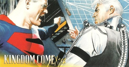
There were 50 cards in the base set, and a number of chase sets of varying scarcity. The base cards mainly follow the events of the four issues, reproducing Ross’s artwork with explanatory text on the back. For your perusal, here are a couple, with some particularly memorable moments. First, Superman and Batman having their umpteenth confrontation — “Drop that screwdriver and look at me when I’m talking to you!”:
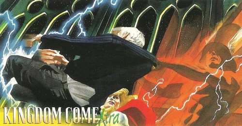
How about when the one-with-the-Speed-Force Wally West yoinked Norman McKay out of the Spectre’s protective shroud?:
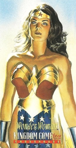
The last dozen-plus cards show individual characters, both new and old. Wonder Woman may have received the best visual treatment of all — by god(dess), she looked good:
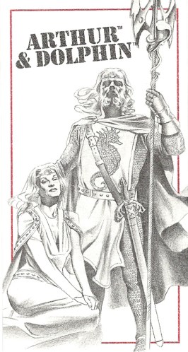
As for chase sets, the most common consists of 16 “Sketchboard” cards, which recreate Ross’s design sketches for the future characters and came one in every pack. The cardboard they’re printed on is textured like sketchbook paper, which is a nice touch — literally. Indeed, the best part of the giant Absolute Kingdom Come collection comes in the appendix, with the designs and thought processes that went into creating these new DC generations, so these are a welcome addition. Here’s future Aquaman, who’s not really in the story much, but who gets the full King Arthur treatment anyway:
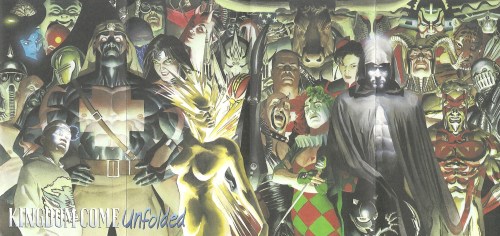
The rest of the chase cards came 1:9 packs. There are three poster cards, which unfold and show the cover images from the first three issues — and have a helpful key on the back to help you sort all the familiar and unfamiliar faces. Here’s the first:
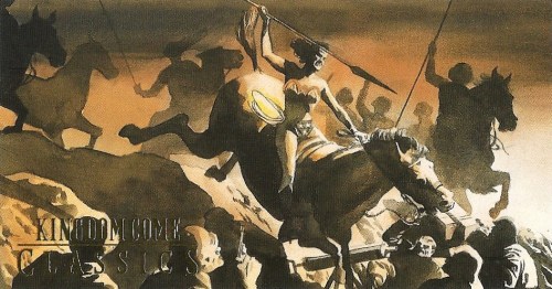
There are three “Kingdom Come Classics,” in which Ross recreates the first cover images of DC’s holy trinity. Wonder Woman probably has the best of this bunch, as it has a degree of novelty that Action #1 and Detective #27 with their gazillion swipes couldn’t (yes, it’s from Wonder Woman #1 and not Sensation Comics #1, but close enough):
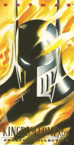
Finally there are six “Creator Collection” cards, which have new artwork of the series’ main players: Superman, Batman, Wonder Woman, Captain Marvel, McKay and the Spectre. Waid chimes in on the back with inside dope about what went into their KC personae. Batman’s Iron Manish armor gave Ross a rare chance to depict the Caped Crusader with his classic white eyes, so here’s his:
That’s the length and breadth of the set, and if you have all these pieces, it’s complete. But there’s another layer of chase cards out there to be had. Ross and Waid separately autographed and numbered 40 of each of the base cards, which were then placed in random boxes — so for every 10 boxes you opened, you’d in theory get one Ross and one Waid autographed card. They’re floating around out there, but they can get a bit pricey, and pursuing a full “set” of them wouldn’t be for the faint of heart, or wallet. (Would the OCD collector have to have a run of Ross autographed cards that all had the same number — all, say, 3/40? What a living nightmare.)
The relatively limited print run and the fandom around the original series has meant that the cards have retained and gained a lot of value in the past 18 years. Prices on eBay for sets with all the trimmings often go well beyond similar comics-themed sets, and unopened boxes, when you can find them, are similarly inflated. And you know what? You don’t begrudge it a bit. The full-bleed cards look great, with colors sharper than those found in the comic (which, for all its beauty, can look a bit washed out), and the chase sets feel like they have a point to them beyond just getting schmoes to plunk down more cash to accumulate them. It’s a solid, bright, enjoyable product.
Granted, I have a bias, a special fondness for Kingdom Come, as it’s the last comic series that I started reading before I headed off to college in 1996. Issue #4 was released after I had matriculated, and there were other things understandably on my mind than comics at that point. But the series stuck in my head. Who would win the Superman/Marvel showdown? Was humanity doomed? Could Lex Luthor look even more like Don Rickles? These questions remained unanswered until I got my hands on a collected edition in a book store and a read the last chapter there in the aisles. The book was thus a bridge series for me, as it was in a different way for a number of readers: it brought a degree of maturity to adventures known and loved, without going the clichéd route of sex and gore and graphic hyper-violence.
Ross has never topped Marvels and KC, and in fairness he’s never really tried all that hard. But both remain spectacular milestones for their respective universes and the broader reading public. The Kingdom Come Xtra cards are a worthy encapsulation of that moment in time, when watercolor realism brought beloved characters a pop art status they had never before known. Wrong company, but — Excelsior!


Good, insightful analysis of Alex Ross’ artwork, and how the differences between the Marvel and DC universes are epitomized by the approaches of Marvels and Kingdom Come.
When I was in high school I collected a lot of comic book trading cards. And then, next thing you knew, there were a bazillion sets coming out each year, and they became more & more expensive. By the time I started college in September 1994 I had pretty much given up on trading cards. So this Kingdom Come set was completely unknown to me until I read this post. Very cool, informative write-up.
Yeah, that “Creator Collection” card with Ross’ homage to the cover of Wonder Woman #1 is really beautiful.