Hmmm…Who am I rooting for here? – Blitzkrieg #1
I’m not much into war comics. Let me amend that – I’m not much into war comics yet. I’m sure I’ll one day add everything in the genre to my ever-growing want list. But for right now, I’m sticking to tights and capes. It might be that I still cling to the escapist fantasy that super-hero books provide.
Still, I couldn’t resist buying this premier issue of Blitzkrieg last year. How can you not stop and admire that great cover, put together by the wonderfully prolific Joe Kubert? Leave it to the damn Nazis to make you want to ball up your fists and punch something. This time they’re about to gun down some already bombed out civilians – just throw that on the pile of crimes against humanity, I guess. And lest you think this is a case of the cover offering up a scenario that the interior story doesn’t follow through with, they do indeed get gunned down.
I mean, we’re talking about Nazis here, after all. Well, technically it’s the Wehrmacht that we’re dealing with, but lets not let that distinction get in the way of some full-bodied loathing.
There are two stories in this first issue of the series, both scripted by Bob Kanigher with art by Ric Estrada. The first gives us the World War II Germans making there way through a crushed Warsaw, one that still has pockets of resistance. We focus on three soldiers, Franz, Hugo, and Ludwig, as they struggle to figure out who’s trying to kill them and who’s just trying to get by while living in a war zone. Franz shows the most evidence of restraint – he’s the one who disdains the shoot first attitude of his comrades. Don’t let that fool you, though. We’re not dealing with Enemy Ace-style stories here. These guys are all bad news.
The second story is much shorter and centers on Attila the Hun. The creative team wasn’t exactly subtle with the juxtaposition of conquest and resistance in the two eras, this time giving us a bloodthirsty boy in the service of Attila done in by the unyielding spirit of a subjugated people. Short but sweet, it provides us, if not a happy ending, at least one where there’s some comeuppance.
Like I said above, war comics aren’t my thing. Yet. But the highest compliment I can offer this book is that I’ll be adding them to my want list sooner rather than later.
Don’t let your daughters play with dolls on railroad tracks – Superman: The Secret Years #3
Superman: The Secret Years was a rather forgettable series that came out shortly before the first Crisis wiped the Silver Age Superman from the books. It dealt with the intermediate time between Superboy’s exploits in Smallville and his appearance as the full-fledged Superman in Metropolis. Written by Bob Rozakis and pencilled by Curt Swan, the series mainly revolved around Clark and his college friends.
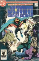
Issue #3 was the only one I had as a kid – in fact, the cover scan above is of my childhood copy. This particular issue focused on Clark’s friendship with Billy Cramer, his roommate and best friend. Billy knows that Clark is Superboy, or Super-Young-Adult or whatever the hell he is in The Secret Years, and Clark gives him a supersonic whistle so Billy can contact him if there’s trouble. Lori Lemaris and Pete Ross show up too, but it’s the relationship with Billy that moves things along. You see, Billy dies when Clark is off saving countless others from a giant tidal wave – Billy’s trapped in a burning building and blowing on the whistle but Supes opts to save the many instead of the few (I guess he watched The Wrath of Khan). He eventually pulls Billy out of the flames, but too late to save the young guy’s life.
Even going through it today, this clunky morality play leaves me with that deadly “meh” feeling. Something about it just doesn’t click.
The most memorable thing about this issue by far is the cover. Frank Miller handled all the cover art duties for the series, and this particular image really caught my eye as a kid, even though I didn’t know Miller from Adam. I remember not liking it – there was something about it that made me sort of recoil, but still I just couldn’t turn away. Maybe it’s Supes looking so tired and beat down that put me off. Maybe it’s his blue hair – I know blue is used in comics to “highlight” black, but it went a little over the line here. It made him look old. Or maybe it was just that Miller’s gritty, agressive art was a shock to a kid accustomed to the soft and elegant work of Curt Swan. I’m not entirely sure.
Now that I’m older and not a whole lot wiser, I actually really like what Miller did. He captures how exhausting it must be to carry the burden of being Superman. Every second you rest, every moment you sit down to catch a breather, there’s someone out there that needs you. And while Superboy/man doesn’t rescue a little girl in the issue like it’s depicted on the cover, the themes sync up quite nicely. It’s hard to help everybody, and Clark at the end of the issue questions whether the powers he enjoys are worth the burdens that he must endure.
That’s by no means an original theme in the Superman mythos, but I still dig that cover. Now it’s one of my favorite Superman images, period.
“Ain’t no monster clown…” Huh?
A couple of years ago I was rummaging around in the magic box known as Youtube when I stumbled across the old 1960’s Marvel cartoons. And no, not the “does whatever a spider can” Spider-Man series, but the first foray into Marvel on the small screen, The Marvel Super Heroes. These cartoons are the goofiest, most wonderful things ever created. I may have been born long after these things disappeared from syndication, but I can always rely on them to make me smile when I need a boost.
The “animation” is simply copied artwork from the books of the time that’s manipulated to make it move around. It’s crude but charming in its way, and its the closest we’ll ever get to seeing the work of the likes of Jack Kirby and Steve Ditko come alive. And not only that, they also have the niftiest opening theme songs you could ever come up with. Iron Man, Captain America, Thor, Namor, and the Hulk all get the royal treatment in these shorts.
Since Iron Man is currently the talk of the town, we’ll start with him. Here’s an episode where he battles Titanium Man:
I didn’t realize until I was getting ready to do this post that the late great John Vernon was the voice of Tony Stark/Iron Man. Now that I know, I keep expecting Stark to say “Fat, drunk and stupid is no way to go through life, son.” Or, at the very least, “Every Halloween, the trees are filled with underwear…every spring, the toilets explode.”
Here’s the intro to the Captain America episodes:
My favorite character of that era, Thor, has perhaps the most stirring intro and the best episode, an adaptation of his classic duel with Hercules. Here’s part 1:
And part 2:
I generally couldn’t care less about Namor, but in his opening there’s a rare bit of fluid motion (pardon the pun) as he flies out of the water and dives back in. Here it is:
And finally, there’s the Hulk:
Now, forgetting for a moment that this song commits the nigh-unpardonable sin of trying to rhyme “gamma rays” with “unglamorous” – can anyone tell me what a “monster clown” is? Because, according to this little ditty, the Hulk ain’t one.
Good golly, how I love these things.
Where do I even begin? – House of Mystery #146
I grew up on a later incarnation of the Manhunter from Mars, one who, even within the Keith Giffen inspired looniness of the Justice League books, maintained his poise and dignity. J’onn J’onzz was always the quiet and reserved straight man whose only silly trait was an occasional craving for an Oreo cookie (I wonder if anyone offered him a Hydrox instead?). He always came across as a powerhouse and a moral center for the team.
The guy on the cover here? Not so much.
There are three things about this issue of House of Mystery that caught my eye when I picked it up. First, J’onn is sprawled helpless like some damsel in distress. All that’s lacking are railroad tracks for him to be tied to and a moustached villain cackling off to the side. The way he has his hand over his chest makes me think that he’s about to blurt out in a woman’s voice with a delicate southern accent “I declare, I do believe I have the vapors…” Come on, big fella, pull yourself up by your bootstraps.
The second thing is Zook. I didn’t really know anything about Zook until recently – he had been largely removed from continuity by the time I started reading comics. A Zook-ectomy, if you will. Others have dissected the stupidity of J’onn’s sidekick much more effectively than I ever could, so please feel free to do a Google search or check out some of the links on the right. Here’s a quick summary of his power-set – he can generate heat and cold and can fly, and his weaknesses are articles and pronouns.
J’onn, you could do so much better.
I’m relieved to say that my last observation isn’t a gripe, just an odd connection. I was looking at the Chulko on the cover and he reminded me of Gossamer from the old Looney Tunes cartoons. You don’t remember Gossamer? Well, I didn’t know him by name until I did a Google search, so here’s a pic to jog your memory:
He was a giant hairy monster that tangled with Bugs Bunny. I can remember him being defeated on one occasion through the use of a pair of clippers – it turned out that he was nothing but hair. So, here’s a memo for J’onn – next time you tangle with the Chulko, head to the barbershop and arm yourself. You never know, lightning might strike twice.
The contents of this issue are a couple of mysteries and the J’onn story (one of the mysteries involves another green-skinned alien – weren’t there quotas on those sorts of things?). The Martian Manhunter installment, “The Doom Shadow,” is written by Jack Miller with art by Joe Certa. The Chulko hatches from a giant spotted egg and J’onn’s fists don’t save the day, so the insufferable Zook is the one who finally stops him. That’s pretty much the arc of the story.
I always like buying something like this because it challenges my preconceptions about the characters I know. The silliness of the Silver Age can still be a shock to the system, though, and even more so when you have a taciturn character like the modern J’onn J’onzz involved. You could say that the same would hold true for Batman, but I still had the reruns of the “BAM!” and “POW!” TV series to brace me for his Silver Age ridiculousness. There was no such luxury with the Martian Manhunter.
And of all the sidekicks he could have, why did it have to be Zook?
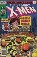
So I picked up this issue of The Uncanny X-Men today:
It got me thinking about everyone’s favorite elaborate-death-devising villain, Arcade. I was staring at his face on the cover and thinking “Who in the blue hell does this guy look like?” And then it hit me.
Now I’m not certain if noted conservative talking head and bow tie aficionado Tucker Carlson would be willing to take up the role of Arcade when Marvel Studios eventually gets to him on the villain merry-go-round, but he did slum around on Dancing with the Stars not too long ago. So maybe. We’ll just have to get him a bigger polka-dotted bow tie and a sinister grin.
And this isn’t a slam on Tucker – I actually like the guy. But I can’t be the first person to think of this, can I?
I picked this one up a couple of weeks ago at a local shop – it’s a nice, crisp copy with only a little wear on the sides. And I never, ever pass up a chance to buy some old issues of Detective Comics. The use of perspective on the cover was what caught my eye. The overall design, with Bats gazing upwards in the foreground, another Batman over the skylight and the moon and the upper reaches of some structure (not Wayne Manor) in the background, is nicely laid out. My only complaint is the Bat-shadow on the wall behind Robin – where’s it coming from? Batman’s sort of turned to the side, so he can’t be the source.
That’s the sort of thing that bugs me.
“Batman — Hunted or Haunted?” is your typical Silver Age fare. The opening panels show Batman in the Batmobile returning to the Batcave. It’s only inside that the cowl is removed and we’re greeted by a bald, egghead-y looking guy. This ain’t no Bruce Wayne. It turns out that we’re in the far future, and this “Batman” is arriving at a meeting of similarly costumed fellas, the “Batmaniacs.” A nuclear war wiped out all records of human history (though apparently geeks and cosplay survived), so all that they have left by this point are tales handed down through word of mouth. Batman is therefore the stuff of legend, though their costumes are exact recreations and they have models of various Bat-devices on the wall – it seems that they have the most precise oral histories ever.
The previously mentioned egghead, Tomas, goes on to tell the group about his trip back in time to see if Batman was real. He went as a non-corporeal entity, so he only observes during the long flashback. He watches as Batman and Robin track down a thief who stole Comissioner Gordon’s briefcase, and throughout the story Batman catches glimpses of someone watching him. The Dynamic Duo solves the case and Tomas returns to his own time just as Batman is about to unmask in the Batcave. D’oh!
The epilogue is some pseudo-science blather about how descendants can see the ghosts of their ancestors, though it turns out they apparently can also see the “ghosts” of their own descendants, because – wait for it – Tomas is Tomas Wayne, a direct descendant of Bruce’s. Hence Batman’s fleeting impressions.
And there you go.
The backup story with the Elongated Man is less than stellar – some more nonsense about thugs and voodoo dolls – so I won’t get into that. While it was silly, I did enjoy the Batman story. I wish I could give some solid info on the creative team, but I’ve found conflicting info on the web. I think Chic Stone handled the art on the Bat-story and Gardner Fox handled the scripting, though I’m not sure – but we can all be sure that Bob Kane, whose name appears on the first page, had little if anything to do with it. It was Irv Novick’s nice cover that drew me in, though, so maybe that’s where most of the credit should go.
But where is that shadow on the cover coming from?
As was the case with many others my age, E.T.: The Extra-Terrestrial had a big impact on me. It came out in 1982, when I was a whopping 4 years old, and Spielberg’s amped up sci-fi schmaltz was too much for me to resist. I had all the tie-ins. Of course there was the all-time worst video game ever produced, the E.T. game for the Atari – I can still remember its title screen on the TV one Christmas morning long ago. And most embarrassingly, I had an E.T. stuffed toy – like a teddy bear – that I dragged around so much my grandmother knitted a sweater and a hat for him. You know, so I wouldn’t have to worry about him getting cold in the winter.
I feel like I’m in confession. I was only 4, folks. Cut me some slack.
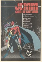
Flash forward a couple of years later, and this ad started popping up in my Flash, Batman and Superman comics:
Jemm had a cool look about him, but I’m thinking it was “The human story of a boy and his alien” that reeled me in. At the end of the first issue there was short piece about the creation of the character, and the writer, Greg Potter, made no bones about his appropriation of that hyper-successful dynamic (and more about that end-of-issue piece in a moment).
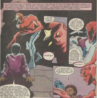
You have a young kid, Luther here instead of Elliot, and a somewhat frightened, very much out of place and telepathic alien in Jemm. Their relationship is, no surprise, at the heart of the series. Gene Colan and Klaus Janson did some really nice work together on the book – here’s a bit from the first meeting of our two main protagonists:
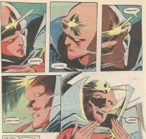
Later on in the first issue they finally get around to the obligatory name exchange, as Luther and his (conveniently) blind grandfather try to figure out what the deal is with this stranger:
Colan was never the biggest name in the Marvel bullpen back in the Kirby/Ditko years, but he’s had a much stronger twilight to his career. In the 80’s he was doing some wonderful work here and on A-list title like Batman, and he’s still going. I liked (and still like) his design for Jemm – the Saturnian’s long spindly fingers are such a simple but effective feature to convey the oddness of this guy. Not that the glowing jewel in the center of his head and the red skin, no shirt and blue cape didn’t get that across. But the fingers are a nice extra.
Jemm was a cool series and a cool character, but I do have a bone to pick with its author, the aforementioned Greg Potter. Here’s the end of issue piece on Jemm’s creation, with an extended quote from him:
My problem comes from what he says towards the bottom of the second column over into the third. To differentiate this storyline from others, he talks about having “some real, honest-to-God black people in the strip.”
Okay, let me list the “honest-to-God black people” that we meet in the first issue. There’s Luther, a sweet, smart young boy who’s apparently allowed to play in dark alleys at night – that’s where he first runs into Jemm. There’s Gramps, a blind old man who sits around the house all day. There’s Lincoln, Luther’s older brother who, while studying and working hard, is nonetheless a drug dealer. There’s Vin, an old friend of Lincoln’s who’s a thug and a bad infulence on Lincoln. And there’s Reginald, a knife-wielding enforcer who wears a purple hat. Here’s Reginald on the cover of issue #1 with his Joker-esque haberdashery:
There you have it, readers. “Honest-to-God black people.” I remember hearing some criticism of The Cosby Show years ago, criticism that said it presented a too-rosy picture of an African-American family. They were too affluent and not “black” enough. I guess this is the opposite end of the spectrum.
I don’t want to get all bogged down in some polemic on race in America. It’s admirable that a comic writer would think of including a few less lily-white characters in the already white-as-a-sheet world of comics. It’s also commendable to set a story in the grit and grime of a realistic inner city. But maybe using drug dealers and thugs as exemplars is a little much. End of rant.
A few final words on Jemm… The series ran for 12 issues and the character has been seldom seen since, but thanks to Colan’s wonderful style and the association with E.T., he’s always been stuck in the back of my head. And a little side-note – he was originally intended to be a Martian cousin of J’onn J’onzz, but editorial intervention blocked that. That was probably for the best.
It should come as no surprise that a character whose first title I borrowed/pilfered for this blog is near and dear to my heart. I love Thor. I love him for the odd amalgam of goofiness and grandeur that Stan Lee and Jack Kirby threw together in his adventures. You could go from the sci-fi mysticism of Asgard to Thor taking a ride in a New York City taxicab in the span of a page, and it all worked.
So here I am, finally getting around to featuring an issue of ol’ Goldilocks. Why The Mighty Thor #151? There’s no special reason, but last week we were all treated to the first look at Thor from the upcoming film adaptation, and there was also a leaked photo of the Destroyer as he’ll appear in the film. I liked what I saw, and I’m still battling disbelief that next year I’ll actually be plopping my rear end in a theater seat to see Mjonir up on the big screen. Crazy. The resultant anticipation is, I suppose, reason enough for me to pluck this one out of the box.
The Thor installment in this issue is actually the midpoint of a larger story. Poor Sif has had her soul or consciousness or katra or whatever placed inside the Destroyer (by the Queen of the Norns and Loki), though Thor doesn’t know that she’s in there. She’s trapped inside the machine’s body, and Thor has – once again – been deprived of his godly powers by Odin (no Father of the Year nominations for Odin, I guess). So both Sif and Thor are up the proverbial creek.
I’m hesitant to delve too deeply into the story since, like I said, this issue is right in the middle of a broader plot. So instead, just let me tell you why I love the Thor books so much. There’s really one thing that sets them apart from other contemporaneous titles, and that’s the dialogue. Here are some examples from just this ish, spoken by our favorite blond:
“I knew thy pose was but a ruse! But, ’twill avail thee naught!”
“O indescribable ignominy! He hurls me aside as a child doth hurl a plaything!”
“Get thee back, thou evil abomination!”
“If die I must, let it be ever thus…With hammer in hand…and the cry of battle on my lips! FOR ASGAAARD!”
I mean, come on. How can you not love that? It’s so wonderfully stilted, it has a “so bad it’s good” quality to it. It makes me smile just typing it.
Which brings me back to my anticipation for the movie – I’m a bit ambivalent as that kind of wordplay finding its way to the actors’ lips. As much joy as I get from Lee’s antiquarian vocabulary, seeing real flesh and blood people talking that way might make me squirm in my seat. But then again, the director, Kenneth Branagh, has made film adaptations of Shakespeare’s plays that are very much accessible to modern audiences (especially Much Ado About Nothing), so if anybody can pull such a thing off, I suppose it’s him. That may even be why they hired him. We’ll see.
I have my fingers crossed. Wait. Let me rephrase that. Mine fingers are crossed!
I just can’t shake the feeling when I look at this cover that the masked giant is making an obscene but hidden gesture. You know, one involving an upraised finger. Anyway…
This is the first issue of the old Silver Age Hawkman series that I’ve ever picked up. I bought it this past week and, I have to say, I was pleasantly surprised. My indifference to the winged lawman from Thanagar is usually almost palpable, but the goofy feature story inside was coupled with some very pleasant artwork. It was a good buy.
Both the feature and the backup are scripted by Gardner Fox and illustrated by Murphy Anderson. The first, “Giant in the Golden Mask,” deals with a coworker of Carter and Shiera Hall at the Midway City Museum who becomes possessed by the giant golden mask. This makes for a ridiculous visual, since he “wears” the mask, though the mask covers his entire upper body. The Halls get into their Hawkman and Hawkgirl getups and follow him to Greece, where the mask soon latches itself onto its original host – the giant statue from the cover. The Hawk-team soon figures out a way to defeat the giant and contain the mask and they cart it back to their museum, where I assume it can one day rise again and once more terrorize the world. Thanks, Halls.
The second story, “Battle of the Bird-man Bandits,” isn’t all that interesting, but I did learn from reading it that Hawkman could fly without his wings. That was kind of a “Huh?” moment for me. Turns out he only uses his wings to steer and his anti-gravity belt does all the lifting. Remember what I said about my indifference to the character? I guess that’s where this ignorance came from.
And the art… Like everyone else, I’m mainly familiar with Anderson through his inking of pencils from larger luminaries like Carmine Infantino and Curt Swan. I liked his pencils here, and I enjoyed the way he constructed his panels – they were very reminiscent of the structure used by Infantino in early Silver Age Flash issues. The similarity was so pronounced I had to check and see whether Infantino had a hand in this issue. He didn’t, but I guess maybe there was a DC “Guide to Style” back in those days, sort of like the Jack Kirby-inspired Marvel style around the same time.
Nice issue. Despite the imagined obscene gesture on the cover.
The softer side of Galactus – The Silver Surfer #48
In my youth the times when I was into buying comics came and went. I’m sure I wasn’t unique in that – we all go through phases where different things have appeal for us. There was a period when I was spending all my lawn-mowing money on baseball cards, another when I was buying those Star Trek paperbacks that seemed to be published every single week. And, of course, comics wove their way in and out of my life.
One of my comics phases was heavily focused on The Silver Surfer. That was something about the title in the early 90’s that I just dug. Maybe it was the cosmic storyline, or maybe it was Ron Lim’s wonderful rendition of the Surfer’s shiny metallic skin. I’m not sure, but it was most definitely one of the titles – if not the title – that I couldn’t wait to lay my hands on each and every month. There was a wonderful run around the time of The Infinity Gauntlet miniseries when a reborn Adam Warlock was bumming around the book – his original stay in the Marvel Universe was a bit before my time, so my introduction to the whole Jim Starlin Thanos/Warlock/Captain Marvel subsection of the MU came from these stories.
Ahhhh. Jim Starlin doing those cosmic storylines – back when they were still pretty fresh. Those are some good memories.
The story in the above book is one of my favorites from this era. Written by Starlin and pencilled by Lim, it marked the beginning of Thanos having possession of the Infinity Gems, but the real character beats come between the Surfer and Galactus. The Surfer finds out that when he was made Galactus’ herald the big guy tinkered with his soul. This makes the Sentinel of the Spaceways quite peeved, and he demands that his soul be put right. Galactus obliges, but it then becomes clear why the tinkering was done in the first place – the Surfer is immediately overwhelmed by guilt for the deaths that he caused in setting the table for the world-devourer all those years. He hallucinates that he’s drowning in blood until Galactus snaps him out of it, but the Surfer refuses to have the mental shield put back in place. There’s a good deal of nice dialogue between the two characters throughout all this – a lot of barbs, but underneath that you can tell there’s some mutual respect.
This mind alteration of course made Norrin Radd a more efficient servant (as Galactus notes), but a part of me likes to think that a little piece of Galactus wanted to spare him the psychic pain that his deeds would bring – images of the Grinch and his heart growing three sizes larger are popping into my head as I write this. That’s probably me putting too much into what’s on the pages, but a boy can dream, can’t he? Can’t Galactus have a heart?
The coda of the story is wonderfully ominous, with Thanos appearing before Galactus and warning him to stay out of his way. I like it when other villains threaten Galactus – the big fella’s “Who the *&#$ do you think you are?” reaction is always priceless, no matter who’s writing the script or who’s pencilling the panels. Thanos uses his new and infinite power to make the planet that is about to be Galactus’ dinner disappear. Ta-daaaa! The Devourer of Worlds is left with only his pride to swallow and moves on.
This whole ish plays into the reasons why I’ve always enjoyed Galactus as a character, and why I’ve found his portrayal over the years to be interesting. He’s a villain who’s not really evil. He’s just hungry. Really hungry. He’d just as soon feed off an uninhabited planet, but sometimes he just can’t find a suitable one. Sometimes he does things that may be interpreted as a good deeds, as in his shielding of the Surfer’s psyche. And now and again he finds himself allied with our usual heroes, as in the aforementioned Infinity Gauntlet series when he joined an army of heroes, villains and deities in challenging the by then all-powerful Thanos – maybe partly to get revenge for the vanishing repast. Galactus Gotta Eat!
Good stuff. And a cool character.
And one last note. I like the cover of this issue, but I’m always distracted by the fact that the Surfer’s board was colored the same as Galactus’ hand. I realize that this may have been a conscious choice to highlight the isolation and the pain of the Surfer, but it always comes across, at least to me, as an error and an oversight. Whatever. At least the story inside is well done.
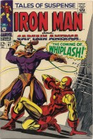
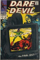
I was digging into my archives over the weekend to find the first appearance of Whiplash. I figured that, since the new Iron Man 2 movie is coming out in a week, it might be nice to familiarize myself with the history of the character before I get settled in with the Mickey Rourke version. So I pulled Tales of Suspense #97 out of the box and was greeted by a nice Gene Colan cover which more than makes up for the goofy costume that Whiplash sports. I’ve come to love Colan’s art – he worked on the Bat-titles for DC back in my youth and did some other books that stuck in my head (stay tuned for a post on some of that at a later date) and I’ve jumped at the chance to buy anything of his recently. All that got me to thinking, and I pulled out another cover of his (Daredevil #46) from those days at Marvel. Here are the two covers, side by side:
I’m probably stretching things a bit too far – I’m wont to do that – but these two covers seem to have some striking similarities. Both images are tilted and off balance. On each cover the villains (Whiplash and the Jester) are swinging their weapon of choice, an electrified whip and a … yo-yo? In both instances our hero is prone in the foreground. And to top it off, both books were published in the same year – 1968.
So there are some things in common – certainly not enough to make them cookie-cutter clones, but enough to make them reminiscent of one another. This all made me wonder whether artists have go-to moves, sort of like an NBA star that likes to drive to his left and pull up for a quick jumper. Something they know that they can pull off in a pinch, a wheelhouse, if you will, a design framework that makes things easy for the artist. It’s something I’ll keep a look out for in the future, to see if I can spot any further examples.
And really, how great is Gene Colan’s artwork?
This is currently the oldest Superman comic that I own. I paid more than I normally like for any single issue, but the temptation to get my hands on some 40’s Supes was too much to resist. Fortunately for my wallet it was made affordable by its less than immaculate condition – even from the scan of the front cover you can see the rusted staples and the wear on the spine, and on the back there are a couple of small chunks out. But it’s all intact, so I was good to go.
I’m not nuts about Golden Age comics in general, but I will say this for them – you certainly got a lot of bang for your buck back in the day. This issue has not one, not two, but three Supeman stories inside. Not bad for a dime. The first, Tiny Trix, the Bantam Bandit, deals with the miniature James Cagney on the cover. A comedic story, Superman catches a miniature crook, the crook pretends to be a kid to get released from prison, and then Superman has to recapture him. The second, Lois Lane Loves Clark Kent, features Lois as she follows a doctor’s orders to try and give up her crush on Superman. She transfers her Single White Female-esque obsession with Supes to Clark (seriously, Lois has issues), and our hero has to escape her clutches so that he can remain free to fight crime. The last, The Case of the Second Superman, follows the adventures of a hero on another planet who asks Superman for help.
It’s this last story that makes the ish worthwhile for me – and please bear in mind, this was back when Superman got his powers from the weaker gravity of Earth and the relative advancement of Krypton vis-a-vis his new world. It turns out that a rocket scientist here on Earth, to get his son away from a Volcanic eruption on a remote island, puts the kid in a rocket(!) to send him to America. The rocket winds up travelling through space (nice aim, Dad) and ends up on a planet called Uuz, an icy world with weaker gravity than Earth. He’s adopted by a family there and, because of his origins in Earth’s stronger gravity, becomes Regor, that world’s Superman. He’s strong, he has better vision than those around him, and he gets about by giant jumps (tall buildings in a single bound). He even has a secret identity as television interviewer Winki Lamm, complete with an L-named female coworker, Loria.
All goes well from him, until a villain named Bantor comes along and strengthens some hoods of his and whoops Regor, who leaves Uuz and winds up on Earth. Superman bumps into him and takes him to the Fortress of Solitude (I believe that this issue was the first time that this name was used, though it’s not the Fortress of the Silver Age, more a castle at one of the poles). There he puts Regor on a training regimen and the two travel back to Uuz, where Regor stays in his own personal hideout while Superman (disguised as Regor) tries to put an end to Bantor. Eventually, with the help of the real Regor, he triumphs. There’s a nice coda to the story as Loria is shown nagging “Winki Lamm” while, here on Earth, Lois is browbeating Clark. It’s reassuring to know that horrid shrews are a common occurrence in the universe.
The last story felt to me like it would have fit in quite nicely in the books of the late 50’s and 60’s, and I mean that as a compliment. I enjoy those stories, and I enjoyed the tale of Regor. I could easily picture Curt Swan pencilling this type of story, and that may be the highest praise I can give (though Wayne Boring drew this one, and I certainly can’t find any fault with his work). So this purchase, despite the heftier price tag, was more than worthwhile, and it was fun going though it for this post. Hell, I even get a kick out of the ads from this era.
I’ve always liked Kang as a character, but I hate the things that his plans do to my mind. His time travel schemes inevitably render my cerebral cortex a useless mush after several hours of puzzling over their implications. You know how it goes…”So if Kang kills X, Y will never live and thus Kang will win, but if Y never lives, then neither does Kang, so…” You get the picture.
Because of that lobotomizing complexity, I’ll try to keep this plot summary as simple as possible. Here goes nothing. Kang hatches a plan to defeat the Avengers, but is blocked from traveling to the appropriate time (World War I) by a time storm. The only being who can pierce the time storm? The Hulk, of course. He convinces the Hulk to go back and stop a WWI era hero/pilot named The Phantom Eagle from detroying a German supergun. If the gun isn’t destroyed, then its bombardment will kill an ancestor of Bruce Banner, thus preventing the advent of the Hulk, and thus preventing the Avengers from originally forming to combat the Hulk. Kang leaves these last details out – that Banner will be killed is enough to convince Hulk. Hulk not smart. Hulk dumb.
So Hulk bursts through the time storm and makes it back to WWI and manages to stop good ol’ Phantom Eagle from destroying the gun, but winds up destroying it himself when the Germans piss him off by firing on him. So much for Kang’s big plans. Hulk returns to 1971 and Kang, for reasons I don’t think even the writer (Roy Thomas) knew, ends up in sort of a time limbo. And so our story ends.
Despite the Rube Goldberg-esque machinations of Kang, I liked this issue a lot. Herb Trimpe’s pencils are a perfect fit for the Hulk, and the cover, with The Green Goliath crushed under stone dates, is a cool visual. The Phantom Eagle, a creation of Trimpe’s that has popped up a few times in other comics, was a bit of a throwaway, but his inclusion hinted at a Marvel Universe even broader than the one that had been depicted to that point in the comics.
On a side note, I bought this book a couple of weeks ago, and then found out that Trimpe will be at the local D.C. Comic-Con next weekend. For a second I considered having him sign this issue, but then I thought better of it. The signature would only mar the condition – I know, that’s a little picky of me, but that’s how I roll when it comes to my comics. Maybe I’ll just stop and say “Hi” to him instead.
Hello, Mr. A. – Mr. A.: Right to Kill!
Sometimes you buy a book just for its import to comics geneology. Such was the case this past weekend when I picked up this little number:
I was aware of this creation of Steve Ditko mainly from the great Jonathan Ross documentary, In Search of Steve Ditko. The comics geneology comes into play with Alan Moore’s use of Mr. A.’s stark morality in the creation of Rorschach from Watchmen, when he sort of glommed that stark ethos onto Charlton’s The Question. Rather than plagiarize what smarter men than I have to say about Mr. A., why not let you listen to them? Here’s where the Ross ducumentary starts talking about Mr. A. – the relevant discussion comes about halfway through the video:
And the rest comes here, including a funny little story from Alan Moore about Ditko’s take on Rorschach:
As for my take on Mr. A., I kind of agree with Gaiman – as “stories” they don’t work very well since there isn’t much of an arc to them. They simply act as vehicles for the presentation of Ditko’s Objectivist views. The art itself is, like all of Ditko’s work, quite attractive, and I liked how Mr. A.’s unmasked alter-ego, journalist Rex Graine, looked a lot like what I’d imagine a Ditko-rendered grown up version of Peter Parker to be. But you feel like you’re listening to a sandwich board carrying loony the entire time you’re reading Mr. A.’s ramblings. I guess my indifference makes me a weak-kneed moral relativist, destined to succumb to the darkness of overwhelming evil. So be it. When I’m bored, I’m bored.
I think I’ve mentioned before that I really don’t need any extra impetus to pick up a nice Silver Age Marvel issue, no matter the title. Though this was no exception, there was something else that forced my hand:
You see that Nazi giant head/flying wing monstrosity on there? You want to know what it made me think of? You really want to know? All right, you asked for it. This:
Thank you, comic book, for bringing an image of Sean Connery in thigh-highs and a red diaper to the forefront of my thoughts.
Lest you think I’m too crazy, there’s a simple reason for this mental association. The image of Sir Sean (yes, he was knighted after he posed thusly) comes from a largely forgotten film called Zardoz. I’ve just watched the whole movie once, and there are really only two things I can remember from the flick. One, there was a giant flying stone head in the movie, which is, of course, the association it has with the above TOS ish. Two, there was much hubbub at one point in the flick about Connery’s character getting an erection. If you want to know more about this big sprawling bag of celluloid weirdness, I recommend reading its Wikipedia entry. I think I’ve said about as much as I want to about it.
The Captain America/Flying Nazi Head story is the second feature. The flying head is a doomsday weapon designed by the Red Skull during World War II and awakened in the present (well, the 60’s present). It has the potential to blow up the Earth, and, naturally, Cap stops it. The Iron Man feature comes first, and I found that one to be a bit more enjoyable. IM is low on power and summons Pepper to come help him get recharged. He has to power up and get to an operating room where an experimental machine called an Enervator, if used, will turn the patient (Happy Hogan) into a freak. IM gets juiced up but arrives too late at the hospital and Freak Hogan escapes, leaving us to wait until next time for the final showdown.
I liked “Adam Austin’s” art (Austin was a psudonym used at the time by the great and IMO historically underrated Gene Colan) in the Iron Man story and Kirby’s “layouts” in the Cap installment packed the usual visual punch. The real highlight for me was IM/Stark getting a phone call from a U.S. Senator while he’s getting charged up and the pissed off pol demands the specs for the IM armor. I understand that there’s going to be a similar plotline in the upcoming Iron Man 2, and I’m gratified to know that Favreau, Downey and Co. are mining material from these classic stories (though I’m sure the government has at many times wanted to get their hands on the IM blueprints in the character’s fictional history).
All in all, a solid issue. It was even good enough to knock images of a bediapered Sean Connery out of my head, and thank heavens for that.


