Do artists have wheelhouses? – Tales of Suspense #97 and Daredevil #46
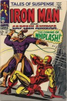
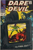
I was digging into my archives over the weekend to find the first appearance of Whiplash. I figured that, since the new Iron Man 2 movie is coming out in a week, it might be nice to familiarize myself with the history of the character before I get settled in with the Mickey Rourke version. So I pulled Tales of Suspense #97 out of the box and was greeted by a nice Gene Colan cover which more than makes up for the goofy costume that Whiplash sports. I’ve come to love Colan’s art – he worked on the Bat-titles for DC back in my youth and did some other books that stuck in my head (stay tuned for a post on some of that at a later date) and I’ve jumped at the chance to buy anything of his recently. All that got me to thinking, and I pulled out another cover of his (Daredevil #46) from those days at Marvel. Here are the two covers, side by side:
I’m probably stretching things a bit too far – I’m wont to do that – but these two covers seem to have some striking similarities. Both images are tilted and off balance. On each cover the villains (Whiplash and the Jester) are swinging their weapon of choice, an electrified whip and a … yo-yo? In both instances our hero is prone in the foreground. And to top it off, both books were published in the same year – 1968.
So there are some things in common – certainly not enough to make them cookie-cutter clones, but enough to make them reminiscent of one another. This all made me wonder whether artists have go-to moves, sort of like an NBA star that likes to drive to his left and pull up for a quick jumper. Something they know that they can pull off in a pinch, a wheelhouse, if you will, a design framework that makes things easy for the artist. It’s something I’ll keep a look out for in the future, to see if I can spot any further examples.
And really, how great is Gene Colan’s artwork?


